Quantitative Easing and Tightening Explained: How the Fed “Prints Money” and Takes It Back
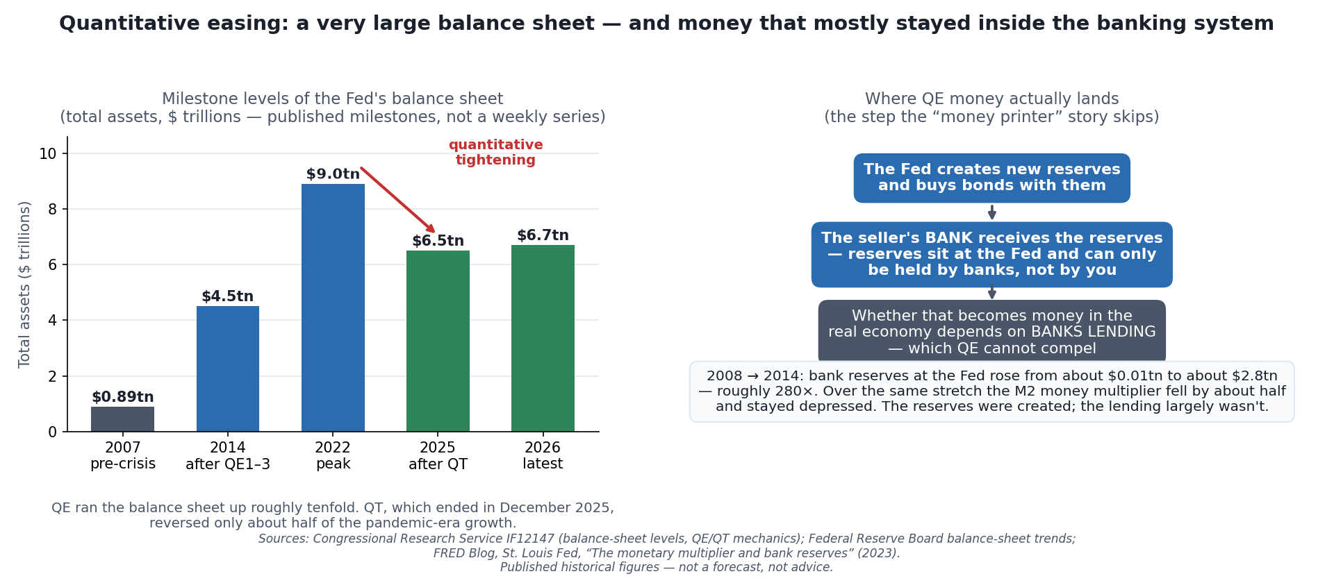 The two halves of the story. The Fed’s balance sheet really did grow roughly tenfold (left) — that part of the popular account is true. What the popular account gets wrong is the second half (right): the money QE creates is a special kind that lives inside the banking system, and whether it becomes money in your economy depends on a step the Fed does not control.
On April 13, 2022, the Federal Reserve’s balance sheet reached $8,965 billion, about ten times its 2007 size. By the time the Fed stopped shrinking it on December 1, 2025, about $2.4 trillion had run back off. Both halves of that round trip, quantitative easing (QE) and quantitative tightening (QT), run on the same machine.
“The Fed is printing money” is the most repeated sentence in modern macro commentary and one of the least examined. It is not exactly wrong — something is definitely being created — but the mental image it produces (a machine spitting out banknotes that somehow reach the public) is wrong enough to make you misread the next decade. QE built the largest central-bank balance sheet in history and it did not produce immediate hyperinflation, and both of those facts are explained by the same mechanic. This article is about that mechanic: what actually happens, where the money goes, what the evidence says it did and didn’t do, and where the honest debate still is. It then runs the machine backward, measuring every round of QE and QT from the Fed’s own weekly balance sheet.
What QE Is, Concretely
The Fed’s ordinary tool is a short-term interest rate. In a crisis, that tool runs out: once the policy rate is at (or near) zero, you cannot cut further, and the economy may still need help. Quantitative easing is what a central bank does when it has run out of room to cut. Instead of setting a short rate, it goes into the market and buys large quantities of longer-dated assets — mostly government bonds and mortgage-backed securities — with money it creates for the purpose.
Two questions decide whether you understand QE. Where does the money come from, and where does it go?
Where it comes from: the Fed creates it, as a balance-sheet entry. When the Fed buys a security, it pays by crediting new bank reserves into existence. Mechanically, the asset side of its balance sheet (the bonds it now owns) and the liability side (the reserves it now owes) grow by exactly the same amount; assets always equal liabilities [source: Congressional Research Service, “The Federal Reserve’s Balance Sheet,” IF12147]. No printing press runs. It is the same keystroke-creation described from the commercial bank’s side in How Banks Actually Create Money — just one level up, at the top of the system.
Where it goes: into a bank’s account at the Fed. This is the step almost every explanation skips, and it is the step that matters. Reserves are not ordinary money. They are a special kind of deposit that only banks can hold, in accounts at the central bank. When the Fed buys a bond from a pension fund, the fund’s bank receives the new reserves and credits the fund’s deposit account. The pension fund now holds a deposit instead of a bond; the bank holds new reserves it cannot spend into your economy, because you cannot hold reserves. Whether that new central-bank money turns into money in the real economy depends on the next step — banks lending — which QE can encourage but cannot compel.
That is the entire right-hand panel of the chart above, and it is why “printing money” is a misleading shorthand. The Fed did not put money in anyone’s pocket. It swapped an asset (a bond) for a different asset (a deposit backed by reserves) and hoped the swap would push people toward riskier, more useful lending and investing.
Why a Central Bank Would Want to Do This
The point is not the reserves. The reserves are a by-product. QE is aimed at prices and portfolios.
The rate channel. By buying huge quantities of long-dated bonds, the Fed pushes their prices up and therefore their yields down. Long yields are the reference for mortgages, corporate borrowing, and investment decisions. The explicit goal is to lower long-term interest rates in order to stimulate borrowing when the short rate can no longer do the job [source: CRS IF12147]. If you want the mechanics of why cheaper money moves asset prices, that’s the subject of Why Interest Rates Move Markets.
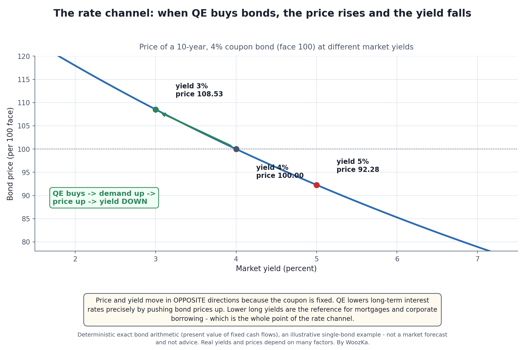 Why buying bonds lowers interest rates — the mechanism, made exact. A bond’s coupon is fixed, so the only way its yield can fall is for its price to rise. When QE becomes an enormous new buyer, it bids prices up, and lower long-term yields are the reference rate for mortgages and corporate borrowing. That is the rate channel in one line: the Fed does not “set” the long rate, it buys until the price moves it.
The portfolio-balance channel. Take a trillion dollars of safe bonds out of the market and the investors who wanted them must hold something else — corporate credit, equities, real estate. Money crowded out of Treasuries goes hunting, and asset prices rise. This is not a side effect; it is a designed mechanism, and it is the most defensible explanation for why QE eras have tended to be kind to asset owners.
The signal. A central bank buying bonds for years is a public promise that policy will stay loose. Expectations move markets even before a single bond is bought.
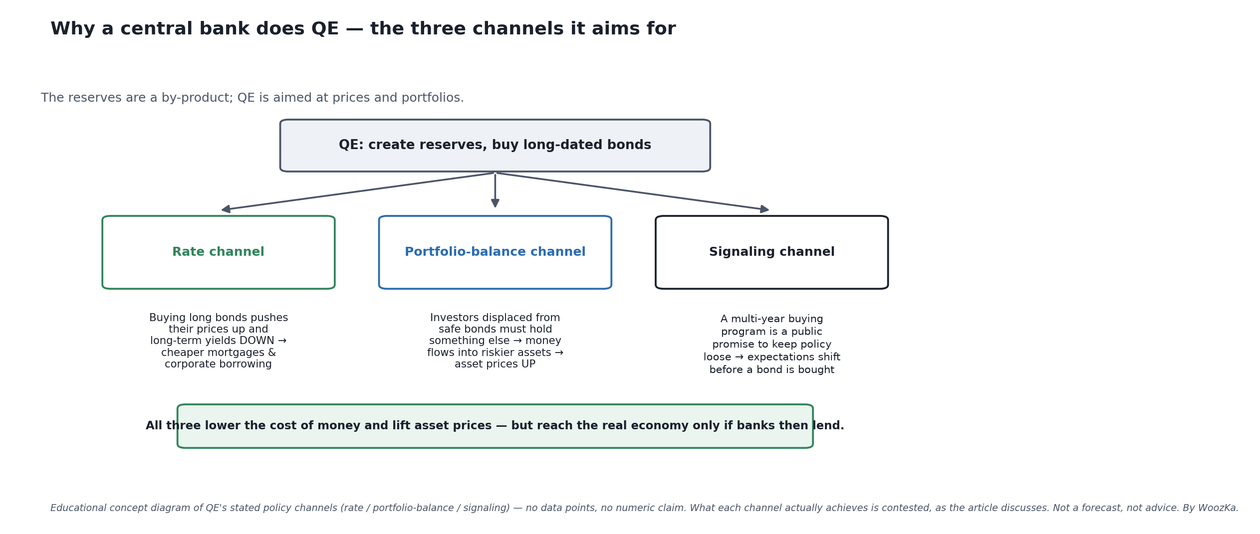 Why a central bank bothers, in one diagram. QE is aimed at three channels at once — pushing long-term yields down, crowding investors out of safe bonds and into riskier assets, and signaling that policy will stay loose — but all three reach your economy only if banks then lend. This is a labeled schematic of the stated mechanisms, not a claim about how large their effects were, which the article treats as genuinely contested.
The Evidence: A Tenfold Balance Sheet
The size is genuinely historic, and the milestones are worth knowing.
| Moment | Fed total assets, weekly data ($bn) | Rounded, as in the chart |
|---|---|---|
| 2007, before the crisis | 853 to 892 | about $0.89 trillion |
| Oct 29, 2014, QE3 buying ends | 4,487 | about $4.5 trillion |
| Apr 13, 2022, the peak | 8,965 | about $9.0 trillion |
| Dec 3, 2025, the low after QT | 6,536 | about $6.5 trillion |
| Sep 9, 2026, latest | 6,741 | about $6.7 trillion |
[source: Federal Reserve Board, H.4.1 data, Wednesday levels. The 2007 row is the range across that year’s Wednesdays.] The chart at the top rounds the peak to $9.0 trillion.
Roughly a tenfold expansion from the pre-crisis baseline to the peak. The reversal, quantitative tightening, in which the Fed lets maturing bonds roll off rather than reinvesting them, began in June 2022 and ran until December 2025. It undid only about half of the pandemic-era growth, and the balance sheet has since edged higher again. That asymmetry is itself a lesson: expansion is fast, and shrinking the balance sheet turns out to be slower and harder than growing it. The next section measures exactly how much slower.
Quantitative Tightening: The Same Machine, Run Backward
If QE is the Fed creating reserves to buy bonds, quantitative tightening is the Fed letting those bonds go away. It almost never sells them. It simply stops replacing them.
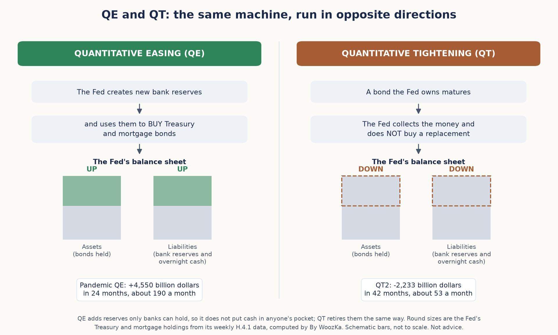 The whole idea in one picture. QE buys bonds with new reserves and the balance sheet grows; QT lets bonds mature without replacing them and the balance sheet shrinks. The latest QT ran at under a third of the pace of the QE before it.
- Runoff, not sales. When a bond the Fed owns matures, the Fed collects the principal and does not buy a new one. The plan the Fed published for its second round says it would shrink its holdings “primarily by adjusting the amounts reinvested of principal payments” [source: Federal Reserve Board, “Plans for Reducing the Size of the Federal Reserve’s Balance Sheet,” May 4, 2022].
- Monthly caps set the maximum pace. From June 1, 2022, only principal above $30 billion a month in Treasuries and $17.5 billion in agency debt and mortgage-backed securities (MBS) was reinvested. After three months the caps rose to $60 billion and $35 billion. The Treasury cap was cut to $25 billion from June 1, 2024, and to $5 billion from April 2025.
- The money leaves on the other side of the ledger. When a Treasury bond held by the Fed matures, the Treasury pays it off from its account at the Fed and borrows the money again from the public. As those buyers pay, the cash comes out of bank reserves or out of money parked at the Fed overnight. QE’s new reserves are retired the same way they were created: as a balance-sheet entry.
- It has a stopping point. On October 29, 2025, the Fed said it would “conclude the reduction of its aggregate securities holdings on December 1” [source: Federal Reserve Board, FOMC statement, October 29, 2025]. On December 10 it judged that reserves had “declined to ample levels” and announced purchases of shorter-term Treasury securities to keep them there.
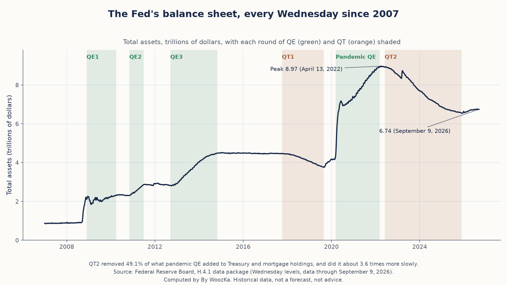 The whole round trip, week by week. Each green block adds holdings faster than the orange block after it takes them away.
Every Round, From the Fed’s Own Weekly Balance Sheet
The Fed publishes its balance sheet every week in the H.4.1 release [source: Federal Reserve Board, H.4.1, “Factors Affecting Reserve Balances”]. Measuring each round by the Treasuries and MBS the Fed held at its start and end, in billions of dollars:
| Round | Window | Start | End | Change | Per month |
|---|---|---|---|---|---|
| QE1 | Nov 2008 to Mar 2010 | 476 | 1,845 | +1,369 | +85 |
| QE2 | Nov 2010 to Jun 2011 | 1,893 | 2,526 | +633 | +81 |
| QE3 | Sep 2012 to Oct 2014 | 2,495 | 4,179 | +1,685 | +66 |
| QT1 | Oct 2017 to Aug 2019 | 4,234 | 3,585 | −649 | −29 |
| Pandemic QE | Mar 2020 to Mar 2022 | 3,895 | 8,445 | +4,550 | +190 |
| QT2 | Jun 2022 to Nov 2025 | 8,478 | 6,245 | −2,233 | −53 |
| Since QT2 | Nov 2025 to Sep 2026 | 6,245 | 6,466 | +221 | +23 |
- The first tightening barely dented the first easing. QE1 through QE3 added $3,687 billion. QT1 took back 17.6% of that before the Fed ended it in August 2019, “two months earlier than previously indicated” [source: Federal Reserve Board, FOMC statement, July 31, 2019].
- Pandemic QE ran at more than twice the pace of any earlier round: about $190 billion a month for two years, 2.24 times QE1’s pace.
- QT2 took back 49.1% of it, over 42 months, at a pace 3.57 times slower than the buying. Measured on total assets from the April 2022 peak instead, the share is 51.9%, a drop of $2,413 billion. Either way, “about half” is the right description.
- Since QT2 ended, holdings are growing again, by $221 billion through September 9, 2026, as the Fed buys short-term Treasury bills to hold reserves steady.
The Caps Were Ceilings, and Only the Treasury Cap Came Close
A cap is a maximum. Whether runoff reaches it depends on how much principal comes due. Comparing each cap with the actual average monthly decline, in billions of dollars:
| Cap period | Treasury cap | Treasury runoff | MBS cap | MBS runoff |
|---|---|---|---|---|
| Jun to Aug 2022 | 30.0 | 26.7 | 17.5 | −0.6 |
| Sep 2022 to May 2024 | 60.0 | 58.5 | 35.0 | 16.9 |
| Jun 2024 to Mar 2025 | 25.0 | 24.2 | 35.0 | 16.6 |
| Apr to Nov 2025 | 5.0 | 3.8 | 35.0 | 16.9 |
- Treasuries ran at or just under every cap. The small gaps partly reflect inflation compensation on inflation-protected Treasuries, which the H.4.1 counts inside the Treasury total and which grows with prices.
- MBS never came close. Across all 42 months, MBS holdings fell by an average of $15.6 billion a month, 46% of the cap. That is $654 billion of runoff against $1,418 billion the caps allowed, leaving $764 billion of permitted tightening that never happened.
- The reason is who pays the principal. MBS principal comes back only as homeowners make payments, sell or refinance, so the mortgage market set the pace, not the Fed. In the first three months holdings even edged up, most likely because mortgage purchases made before the caps began were still settling.
- By the end, the mix had flipped. From April to November 2025, MBS ran off 4.5 times as fast as Treasuries. Since December 1, 2025, the Fed has reinvested MBS principal into Treasury bills, so its mortgage holdings keep shrinking even though its total holdings do not.
Where $2.36 Trillion of Tightening Came From
The asset side says how much QT removed. The liability side says whose money it removed. Change over each round, in billions of dollars:
| Balance-sheet line | QT1 | QT2 |
|---|---|---|
| Total assets | −700 | −2,363 |
| Bank reserve balances | −724 | −459 |
| Overnight reverse repos (non-foreign) | −174 | −1,963 |
| Treasury General Account | −4 | +119 |
| Currency in circulation | +172 | +147 |
The lines do not sum to the total, because the balance sheet has other liabilities and capital. The three that matter most are shown.
- QT1 came straight out of bank reserves. Reserves fell $724 billion, more than the $700 billion the balance sheet shrank, because growing demand for paper currency drained another $172 billion at the same time. That round ended after less than two years.
- QT2 drained a different pool first. Counterparties such as money market funds had parked $1,965 billion at the Fed’s overnight reverse repo facility on June 1, 2022. By November 26, 2025, $2 billion was left. That one line accounts for 83.1% of QT2’s shrinkage.
- Bank reserves fell only $459 billion, 19.4% of the total. That buffer is the biggest difference between the two rounds on the Fed’s own books.
Method and limits, so this can be checked rather than taken on trust. Every figure was computed in code that reads the Federal Reserve Board’s H.4.1 data package (Wednesday levels, data through September 9, 2026) and checks each result before reporting it. Round windows run between Wednesday levels nearest the policy dates in the Fed’s own releases; cap periods run from the first Wednesday of each period to the first Wednesday after it, so each window holds only that period’s redemption dates. The balance sheet is a stock, so a settlement lag of a few days moves a figure slightly and moves no conclusion. “Holdings” means Treasuries plus MBS held outright; the Fed’s small remaining agency debt is excluded. Nothing here measures what QE or QT did to asset prices or the economy, which the rest of this article treats as genuinely contested. This is historical data, not a forecast and not a recommendation.
The Puzzle: Why Wasn’t There Instant Hyperinflation?
If a central bank creates trillions and inflation is “too much money chasing too few goods,” the 2010s should have been an inflationary bonfire. They weren’t — US inflation ran persistently below the Fed’s 2% target for most of that decade. This is the single strongest piece of evidence that the “money printer” model is wrong, and the reserve mechanic explains it.
The numbers are stark. Bank reserve balances at the Fed averaged about $10 billion across the Wednesdays of August 2008 and peaked at $2.82 trillion in 2014, roughly 270 times as much [source: Federal Reserve Board, H.4.1 data, Wednesday levels; the chart at the top rounds these to about $0.01 trillion and $2.8 trillion, or roughly 280 times]. Under the textbook money-multiplier model, that should have produced a proportional explosion in lending and in the broad money supply. It did not: the money multiplier dropped by about half during the 2008 crisis and has stayed lower since [source: FRED Blog, Federal Reserve Bank of St. Louis, “The monetary multiplier and bank reserves,” July 2023]. Banks sat on the reserves.
Why? Partly because in a post-crisis balance-sheet recession, creditworthy borrowers don’t want loans and banks don’t want risk. Partly because the Fed began paying interest on reserves, giving banks a safe return for simply holding them rather than lending them out [source: CRS IF12147]. The money was created. The lending — the step that turns central-bank money into economy money — largely did not happen. Broad money (M1, M2) did not grow anywhere near proportionally with the monetary base.
This is the payoff of understanding the mechanic. QE did not fail to cause inflation by luck. It failed to cause consumer-price inflation because the channel from reserves to prices runs through bank lending and spending, and that channel was blocked. It is exactly the same insight that makes the money multiplier a bad model of the modern banking system, covered from the commercial-bank side in How Banks Actually Create Money.
So What Did It Do? The Honest Debate
Here is where an honest article has to stop asserting and start distinguishing. The mechanics above are settled. The effects are not, and anyone who tells you otherwise — in either direction — is selling something.
What’s reasonably well-supported:
- QE lowers long-term interest rates and supports asset prices, largely through the rate and portfolio-balance channels [source: CRS IF12147, describing the stated policy objective and mechanism].
- QE alone, with the lending channel blocked, does not mechanically produce consumer-price inflation — the 2008–2014 reserve explosion alongside a collapsing money multiplier is the cleanest evidence there is [source: FRED Blog 2023].
What is genuinely contested:
- How much QE actually stimulated real growth and employment, versus mainly re-pricing financial assets. Serious economists disagree.
- Its distributional effect. If a policy works primarily by raising asset prices, it works primarily for people who own assets. Whether that’s an acceptable price for stabilizing a crisis is a value judgment, not an empirical finding — but it’s a real critique, and it deserves to be stated plainly rather than waved away.
- The role of the 2021–2022 episode. Inflation did arrive then, alongside pandemic-era balance-sheet expansion — but also alongside enormous fiscal transfers that put money directly into household bank accounts (a different mechanism entirely, and one that does bypass the bank-lending bottleneck) and severe supply-chain disruption. Untangling those causes is an active dispute, and the fact that the 2010s QE produced no inflation while the 2020s episode coincided with plenty is precisely why the “QE = inflation” equation is too crude to be useful.
- What the long-run “right” size of the balance sheet even is. QT’s early end suggests the system now needs far more reserves to function than it did in 2007 — the “ample reserves” regime — and that the pre-crisis balance sheet may never return.
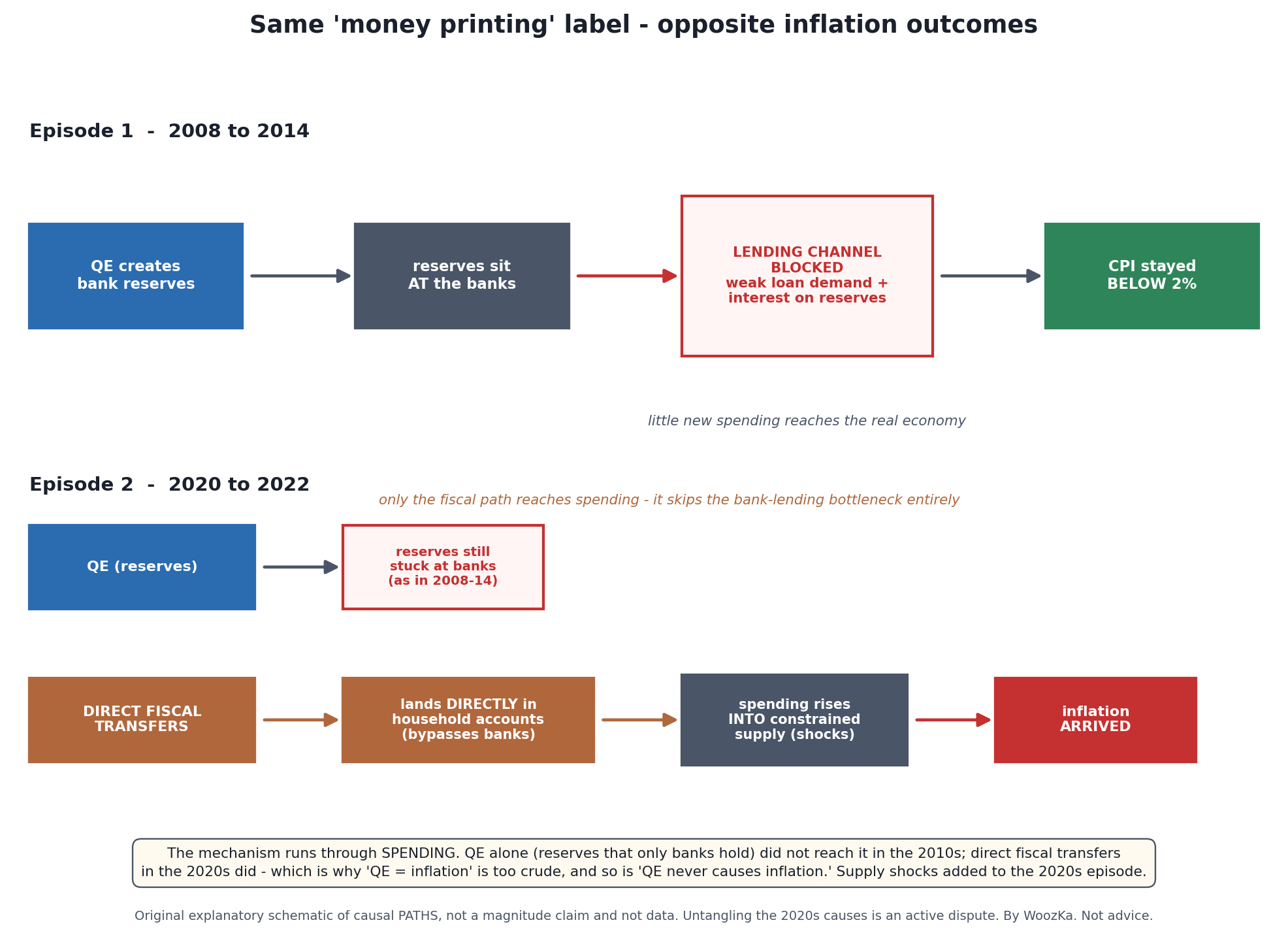 The whole “did QE cause inflation?” argument in one picture — and why both crude answers are wrong. QE builds reserves that only banks can hold, so on its own it stops at the blocked lending channel, exactly as it did for a decade with no inflation. What broke the pattern in the 2020s was a different mechanism entirely — money placed directly in household accounts, meeting constrained supply. Same “money printing” headline; opposite results, because the paths are not the same.
For a lot of people the QE era produced a specific, disorienting kind of confusion. The headlines said “money printing” and “hyperinflation is coming,” and the sensible-sounding response was to sit in cash and wait for the reckoning. The reckoning did not come — not for years, and not in the way the headlines described. Asset prices went up instead, which is exactly what the portfolio-balance channel predicts and exactly what the money-printer story does not. The cost of holding a bad model isn’t that you sound wrong at dinner. It’s that you spend a decade positioned for a thing that the mechanism you’re describing cannot actually produce on its own.
What to Take Away
- QE is an asset swap, not a helicopter drop. The Fed creates reserves and buys bonds. Reserves are money that only banks can hold.
- The balance sheet really did grow roughly tenfold, from about $0.89 trillion (2007) to $8,965 billion (April 2022), and QT reversed about half of the pandemic-era growth before it ended on December 1, 2025.
- QT is slower than QE. Pandemic QE added about $190 billion a month; QT2 removed about $53 billion a month, 3.57 times slower.
- A cap is not a pace. The Treasury caps were nearly reached; mortgage runoff averaged 46% of its cap, because homeowners, not the Fed, decide when that principal comes back.
- QT2 drained money market cash before bank reserves. The overnight reverse repo line accounted for 83.1% of the shrinkage; reserves fell $459 billion.
- Central-bank money becomes economy money only if banks lend it. From 2008 to 2014, reserves rose roughly 270 times while the money multiplier halved. That’s why the inflation forecast that followed from “printing” was wrong.
- The strongest effect of QE is on asset prices; the effect on the real economy is genuinely contested — as is who benefits.
- “QE causes inflation” is too crude. So is “QE never causes inflation.” The mechanism runs through lending and spending; when money reaches households directly, by a different channel, the conclusion changes.
Understanding this doesn’t tell you what to buy — nothing here does. It tells you how to read the next crisis when the announcements start, instead of reaching for a metaphor that was never accurate in the first place.
Keep Going
- The Economic Machine Explained — the pillar. Credit, debt, and the cycles they drive; QE is the central bank’s most powerful lever inside that machine.
- How Banks Actually Create Money (It’s Not What You Think) — the commercial-bank half of the same story, and where the money multiplier really breaks down.
- Why Interest Rates Move Markets — the channel QE is aimed at, and what happens when rates go the other way.
- The Fed’s Dot Plot vs. Reality — the Fed’s other lever, the policy rate, and how far its own projections of it have missed.
- What Is Inflation, Really? — what QE was supposed to cause, and mostly didn’t.
- Short-Term vs Long-Term Debt Cycles — the bigger cycle in which “the central bank has run out of room to cut” is a recurring, predictable moment.
If you want plain-English, source-first explanations of how money and the economy actually work — the version with the honest disagreements left in — that’s what the newsletter is for. Subscribe below.
Quantitative easing is a lever a central bank reaches for during one specific phase of the debt cycle, which is why its effects look so different depending on when it is used. The Economic Cycles Explorer shows that phase in the wider loop, alongside the other levers.
Disclaimer: This article is educational content, not financial advice. I am not a licensed financial advisor, and nothing here is a recommendation to buy or sell any security or asset. Investing and trading involve risk, including the possible loss of the money you invest. Do your own research and consider consulting a licensed financial professional before making investment decisions. Read the full Disclaimer.
Historical and backtested results are hypothetical, carry inherent limitations, and do not guarantee future results. Figures were accurate to the best of my knowledge as of this article’s last-updated date and may have changed.
