Nominal vs Real Return: Why Your 7% Isn’t 7%
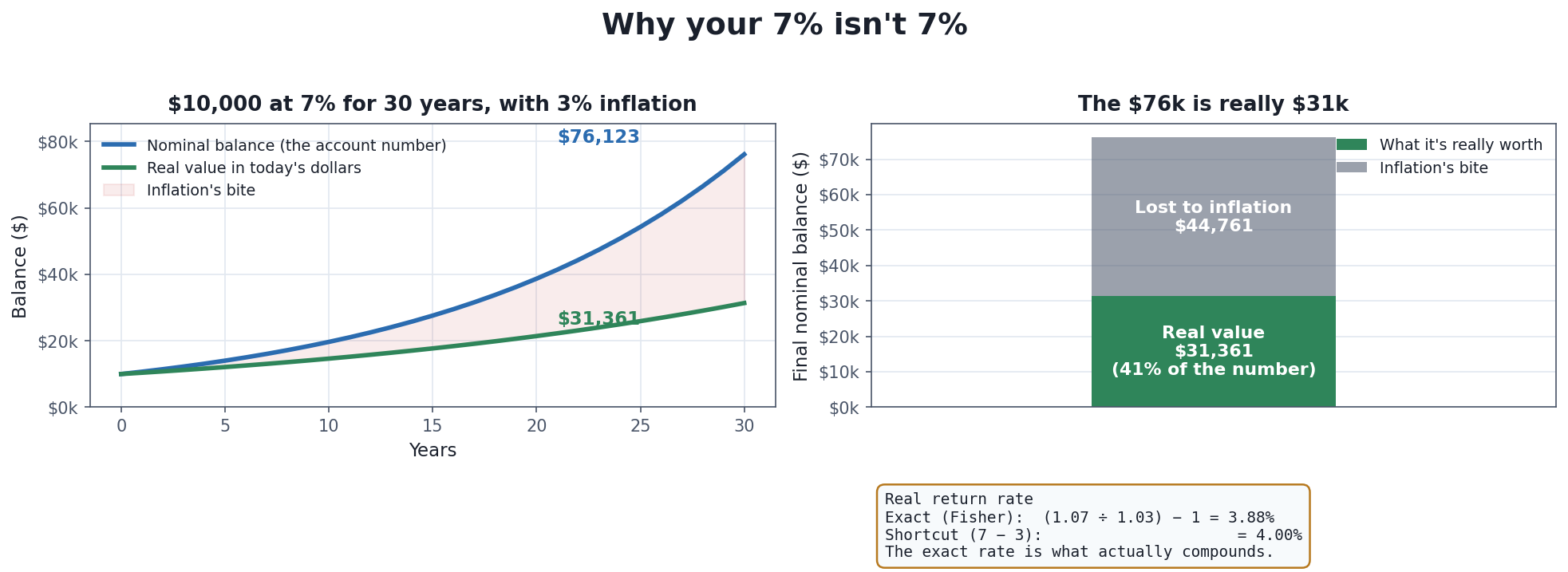
Everything this article argues, in one picture. The blue line is the number your statement will show; the green line is what that number can actually buy. They start together and drift apart for thirty years, until the impressive-looking $76,000 is really about $31,000 in the money you spend today. The whole job of “real” versus “nominal” is to keep your eye on the green line.
Suppose an investment grows your money by 7% a year for thirty years, and someone shows you the ending balance: a satisfying $76,000 built from a $10,000 start. It feels like wealth. But there’s a quiet question hiding under that number, and it’s the most important question in personal finance that almost nobody asks out loud: $76,000 that can buy what? A dollar thirty years from now will not buy what a dollar buys today, and until you translate that ending balance into today’s purchasing power, you don’t actually know whether you got richer or just accumulated a larger pile of shrinking dollars. That translation is the difference between a nominal return and a real return, and getting it wrong is how people mistake keeping-up for getting-ahead.
Two Questions People Constantly Conflate
“Nominal” means the plain, uncorrected number — the figure on your statement, the rate the bank advertises, the balance in your account. “Real” means that same number adjusted for inflation, so it’s expressed in constant purchasing power. The reason this trips people up is that “adjusting for inflation” actually answers two different questions, and mixing them up is where the confusion starts:
- Purchasing power: what will a fixed sum of money be able to buy in the future, after inflation eats at it? (What is $10,000 stuffed under a mattress worth in 30 years?)
- Real return: when my money grows at some nominal rate, how much did my purchasing power actually increase, after inflation? (My account grew 7%, but did I get 7% richer?)
The first question is about money standing still while prices rise. The second is about money growing while prices also rise, and asking who won the race. This article takes them one at a time, because the arithmetic — and the trap — is a little different for each.
Purchasing Power: What a Fixed Sum Is Worth Later
Inflation is a rise in the general price level over time, which is the same thing as a fall in what each dollar can buy. If prices rise at a rate i per year, then a sum of money A held for y years buys, in today’s terms:
Real value = A ÷ (1 + i)^y
The dividing — compounding the erosion year after year — is the part people underestimate. At a modest 3% inflation, $10,000 kept perfectly safe and completely uninvested is worth about $4,120 in today’s purchasing power after 30 years — a 59% loss of buying power, achieved by doing nothing wrong, just holding “safe” cash while the world got more expensive [source: purchasing-power formula A÷(1+i)^y; example computed at i=3%, y=30 → 10000÷1.03^30 = 10000÷2.42726 ≈ $4,120]. Flip the same fact around and it says: to buy in 30 years what $10,000 buys today, you’ll need about $24,273. “Safe” cash is not safe from inflation; it is merely safe from visible loss, while it loses purchasing power on a schedule.
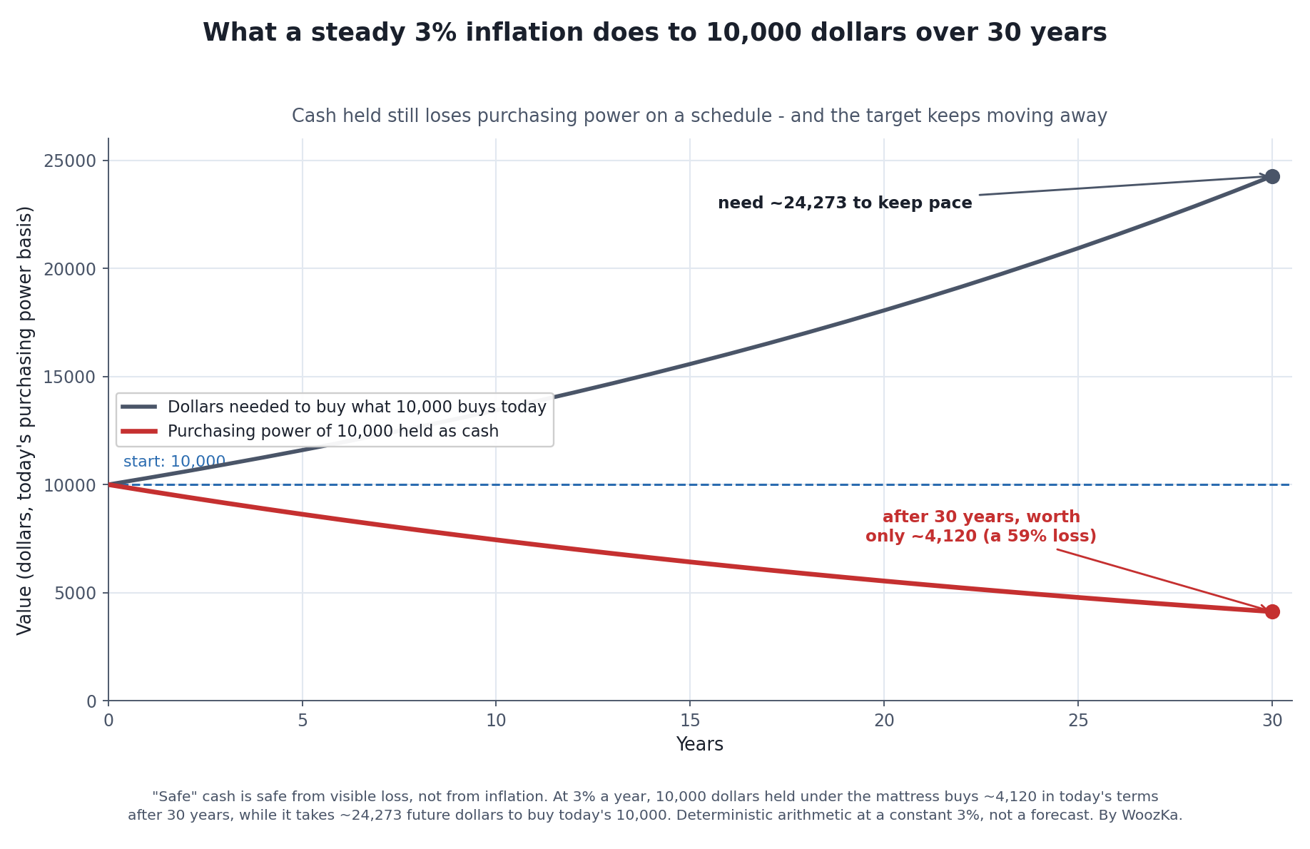
The same fact told twice. Money standing still doesn’t hold its value — it bleeds purchasing power on a fixed schedule (red), and the finish line moves away from you at the same time (dark). Both lines are the identical 3% erosion, seen from the two ends people actually feel: what your cash will buy, and what you’ll need to buy the same basket.
This is why the roughly 3% long-run average U.S. inflation rate — the ballpark figure for consumer prices over the century-plus the Bureau of Labor Statistics has tracked the CPI since 1913 — matters even though 3% sounds small. Small-but-compounding is exactly how inflation does its damage: unnoticed year to year, enormous over a working life [source: long-run U.S. CPI inflation has averaged roughly 3% per year since 1913 per BLS/Federal Reserve Bank of Minneapolis CPI data; treat ~3% as a long-run average, not a constant — see the caveats below]. And 3% is only an average: individual years have ranged from outright deflation to double digits, so the “average” is a smooth story told about a bumpy reality.
Real Return: Did Your Money Actually Grow?
Now the second question, which is where most people quietly cheat. Your money grows at a nominal rate n, prices grow at i, and you want the real rate r — how much your purchasing power genuinely increased. The instinct is to just subtract:
Shortcut (approximate): r ≈ n − i
So a 7% return with 3% inflation “feels like” 4%. That shortcut is close enough for back-of-the-envelope work at small rates, but it is not the real definition, and it drifts further from the truth as rates get larger. The exact relationship is the Fisher equation, named for the American economist Irving Fisher, who formalized it in his 1930 book The Theory of Interest [source: the Fisher equation is named for Irving Fisher, who formalized it in The Theory of Interest (1930); definition per standard references incl. Wikipedia and Corporate Finance Institute — verified via web search 2026-07-09]:
Exact: (1 + n) = (1 + r) × (1 + i), which rearranges to r = (1 + n) ÷ (1 + i) − 1
Run our numbers through it: r = (1.07 ÷ 1.03) − 1 = 3.8835%, not the 4.00% the shortcut gave. Where did the missing 0.12% go? Multiply the exact equation out and you get n = r + i + (r × i) — the shortcut simply drops that last cross-term, r × i, the little piece where the real return itself gets inflated too [source: multiplying out the Fisher equation gives n = r + i + r·i; the approximation n ≈ r + i omits the r·i cross-term and is less accurate at higher rates — standard derivation, verified via web search 2026-07-09]. At 7% and 3% the cross-term is tiny. At 12% returns and 9% inflation it is not, and the subtraction shortcut can mislead by a full percentage point or more — which, compounded over decades, is real money.
The reason to care about the exact rate rather than the convenient one is that the exact real rate is what actually compounds. Your purchasing power over many years grows at the real rate, year after year:
Real future value = A × (1 + n)^y ÷ (1 + i)^y
For $10,000 at 7% nominal over 30 years with 3% inflation, that’s a nominal $76,123 that in today’s dollars is worth about $31,361 — which is exactly $10,000 compounded at the exact real rate of 3.88% for 30 years, not at 4% [source: real FV = 10000 × 1.07^30 ÷ 1.03^30 ≈ $31,361; equals 10000 × 1.038835^30; computed by this site and matching the calculator]. That is the whole story of the featured chart: the blue line grows at the nominal rate you brag about, the green line grows at the real rate you actually live on, and thirty years of a 3% wedge turns a $76k number into $31k of spending power. You retire on the green line.
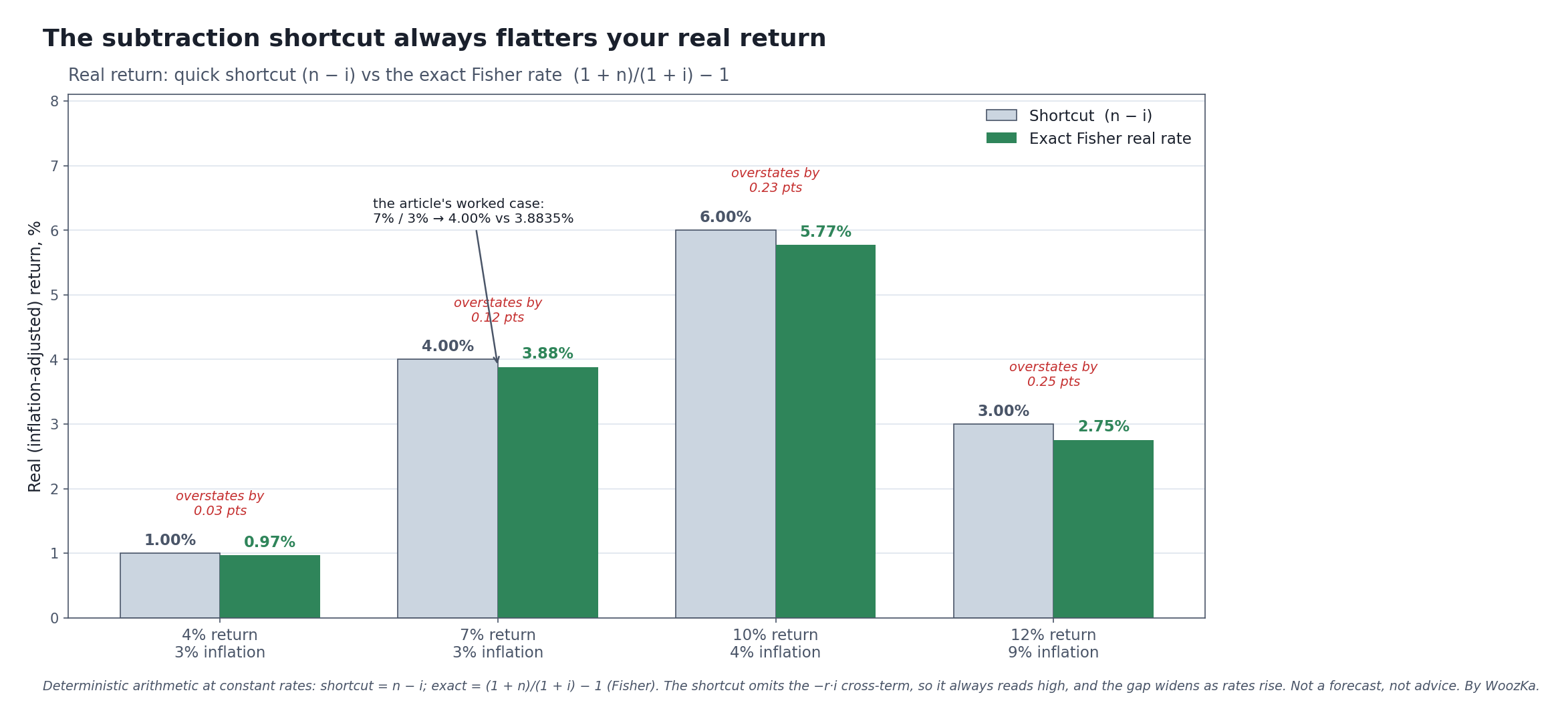
Why the exact rate is worth the trouble. The quick subtraction (n − i) always overstates your real return, because it drops the small cross-term the Fisher equation keeps — and the overstatement grows as rates climb. The 7% / 3% pair is the article’s worked case (4.00% shortcut vs 3.88% exact). Deterministic arithmetic at constant assumed rates, not a forecast.
What This Changes About How You Read Every Rate
Once “real vs nominal” clicks, a lot of everyday financial numbers read differently:
Cash and “high-yield” savings. A savings account paying 4% while inflation runs 4% has a real return of essentially zero — you are treading water, your money growing in name only. When the advertised rate is below inflation, your “safe” savings are losing real value every day despite the balance ticking up. The number going up is not the same as your purchasing power going up.
Bonds and “safe” yields. The same logic governs a bond yield: a nominal yield minus inflation gives you roughly the real yield, and there have been long stretches where supposedly safe government bonds delivered negative real returns — investors got their money back, worth less than when they lent it. (This is tightly connected to why interest rates move markets: rates and inflation expectations are two sides of one coin.)
Stock market “average returns.” When you hear that stocks have historically returned some healthy long-run average, that’s usually a nominal figure, and the real (inflation-adjusted) long-run number is meaningfully lower. Neither figure is a promise about your investing lifetime — markets don’t hand out averages on schedule — but the real number is the one that tells you what those returns did for your purchasing power. Always ask whether a quoted “average return” is nominal or real; they are different claims.
None of that is a recommendation to hold or avoid any of these things — it’s simply what the numbers mean once you look at them in real terms. What you do about it depends on your own situation, and, as always, is a decision to make with your own research and, if you want it, a licensed professional.
The Traps That Make Your Real Return Even Smaller
The clean formulas above are already sobering, and reality is a little worse, in three specific ways worth knowing before you trust any real-return number:
Taxes come out of the nominal gain, not the real one. This is the cruelest detail. When you’re taxed on an investment or on interest, you’re generally taxed on the nominal gain — including the part that was merely inflation keeping you even. If cash pays 4% and inflation is 4%, your real return is zero, but you can still owe tax on that 4% of nominal interest, pushing your after-tax real return below zero. Inflation plus taxation can quietly turn a break-even into a loss. (The calculator this article accompanies deliberately ignores taxes so the inflation effect is isolated — but real life doesn’t.)
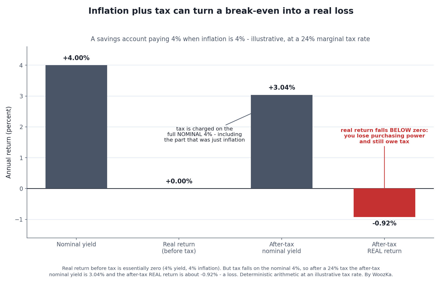
Why “my savings keep up with inflation” can still be a loss. Before tax, 4% earned against 4% inflation is a wash — zero real return. But the tax collector bills the whole nominal 4%, including the part that was only inflation standing still, and that levy pushes the after-tax real return below zero. The account balance rises every month; the purchasing power quietly falls.
CPI is a basket average; your personal inflation may differ. The official inflation rate measures a broad basket of goods and services. Your own inflation rate depends on what you actually buy — and if your spending is heavy in categories rising faster than the average (housing, healthcare, education in various periods), your personal purchasing power can erode faster than the headline number suggests. The 3% you plug into a formula is an economy-wide average, not a personalized measurement.
The constant-rate assumption never holds. Every formula here — and every retirement calculator you’ll ever use — assumes a steady inflation rate and a steady return. Neither is steady. Inflation has swung from deflation to double digits; returns arrive in a jagged, unpredictable order. The smooth curves are a planning tool for building intuition, not a prediction of your actual path, and treating a projected real balance as a number you’ll definitely hit is its own kind of mistake.
Compute It on Your Own Numbers
The point of all this is to make you translate reflexively — to hear “7%” and immediately ask “real or nominal?” Run the numbers yourself with the calculators — carrying the same caveats laid out here: constant-rate, pre-tax, CPI-average, and, like everything on the site, an educational model for building intuition, not a forecast of your future.
Where to Go Next
Real-vs-nominal is one of the load-bearing ideas in the Money & Economics pillar. These build on it:
- What Is Inflation, Really? — where the i in every formula on this page comes from: what inflation actually is, what causes it, and how it’s measured.
- The Economic Machine Explained — the pillar. Inflation, growth, and interest rates as one connected system, so “real vs nominal” stops being a formula and becomes a way of seeing.
- Why Interest Rates Move Markets — nominal rates, real rates, and inflation expectations are inseparable; this is the other half of the same idea.
- What Is APR vs APY? — the same “the number isn’t the number” instinct, applied to borrowing and saving rates.
- Emergency Fund Math — why cash you need to hold liquid is worth its inflation cost, and cash you don’t isn’t.
If you want the plain-English, no-jargon read on money and the economy — the version that always tells you what a number really means — that’s what the newsletter is for. Subscribe below.
Disclaimer: This article is educational content, not financial advice. I am not a licensed financial advisor, and nothing here is a recommendation to buy or sell any security or asset. Investing and trading involve risk, including the possible loss of the money you invest. Do your own research and consider consulting a licensed financial professional before making investment decisions. Read the full Disclaimer.
Historical and backtested results are hypothetical, carry inherent limitations, and do not guarantee future results. Figures were accurate to the best of my knowledge as of this article’s last-updated date and may have changed.
