The Economic Machine Explained: How Credit, Debt, and Cycles Actually Work
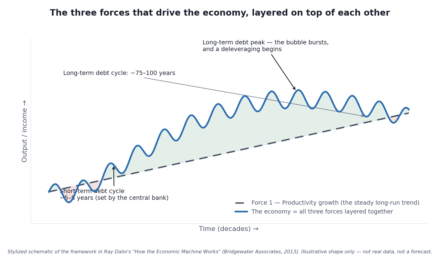 The whole economy, in one picture: a steady productivity trend, short-term debt cycles rippling on top of it, and a slow long-term debt cycle underneath both. Stylized schematic of the framework in Ray Dalio’s “How the Economic Machine Works” (Bridgewater Associates, 2013) — an illustrative shape, not real data and not a forecast.
Here is a fact that reorders how most people think about money: in Ray Dalio’s widely watched 2013 explainer, the total amount of credit in the United States was about $50 trillion, while the total amount of actual money was only about $3 trillion [source: Ray Dalio, “How the Economic Machine Works,” Bridgewater Associates, 2013]. Those specific dollar figures are more than a decade old and both numbers are far larger today — but the ratio is the point, and it still holds: most of what we casually call “money” is not money at all. It is credit. And once you understand how credit behaves, the confusing sweep of booms, busts, inflation spikes, and interest-rate drama stops looking like chaos and starts looking like a machine.
This is the foundational article for the entire Money & Economics section of this blog. Everything else here — inflation, interest rates, the yield curve, recession indicators, good debt versus bad debt — is a component of the one system this piece lays out. If you read only one explainer to make the rest make sense, read this one.
There’s a particular shift that happens once this framework clicks. Before it, economic news arrives as a stream of disconnected alarms — a rate hike here, an inflation number there, a scary recession headline. After it, the same news reads as recognizable stages of a cycle that has turned many times before. That reframing doesn’t make anyone a forecaster, but it does replace panic with pattern-recognition — which is most of what a beginner actually needs from economics.
Whose Framework This Is (and Why That Matters)
Nothing in this article is an original economic theory of mine. The “economic machine” framing comes directly from Ray Dalio, founder of the investment firm Bridgewater Associates, who laid it out in a roughly 30-minute video and accompanying essay titled “How the Economic Machine Works” (2013) [source: Ray Dalio / Bridgewater Associates, 2013; economicprinciples.org]. It is one of the most widely taught plain-English models of the economy precisely because it is simple, mechanical, and well-sourced. My job here is to re-teach it in my own words, credit it clearly, and point you to the primary source and the interactive tool — not to dress up a borrowed idea as a personal discovery.
That attribution matters for a second reason, too. This framework explains how the economic machine works mechanically and historically. It does not tell you where the economy is right now or what happens next. Anyone claiming to time the next recession with it — including anyone quoting me — has stepped outside what the model can honestly deliver. Keep that boundary in mind for the whole article.
The Building Block: A Transaction
Start with the smallest possible piece. An economy is nothing more than the sum of all the transactions inside it, and a transaction is simple: a buyer hands over money or credit to a seller in exchange for goods, services, or financial assets [source: Dalio, 2013].
That “or credit” is the whole game. Because credit spends exactly like money in a transaction, total spending in an economy equals money spent plus credit spent. And total spending is what drives everything — it’s the fuel. Divide spending by the quantity of stuff sold and you get prices. That’s it. Every cycle and every crisis you’ll ever read about is built out of these ordinary transactions, repeated billions of times.
One buyer is unlike all the others: the central bank (in the U.S., the Federal Reserve). It doesn’t just participate in the economy — it controls the quantity of money and credit by setting interest rates and, when needed, creating new money. That single lever is why the central bank sits at the center of every story that follows.
Credit: The Biggest and Most Volatile Part
Dalio calls credit “the most important part of the economy, and probably the least understood,” because it is the biggest and most volatile part [source: Dalio, 2013]. Here’s the mechanism, stripped down.
When a borrower and a lender agree, credit is created out of thin air. The instant it’s created, that credit becomes debt — an asset to the lender, a liability to the borrower. Why does this drive growth? Because credit lets a borrower spend more than they earn. And — this is the hinge the entire machine turns on — one person’s spending is another person’s income. Every dollar you spend, someone else earns. So when credit lets you spend more, someone else earns more, which makes them more creditworthy, which lets them borrow and spend more, and so on. That self-reinforcing loop is exactly why economies grow in cycles rather than smooth lines.
Credit isn’t inherently good or bad. It’s destructive when it funds consumption that produces no income to repay it (borrowing for a big TV), and productive when it funds things that generate enough income to pay the debt back and then some (borrowing for a tractor that harvests more crops) [source: Dalio, 2013]. Same tool, opposite outcomes.
The Three Forces, Layered
Dalio’s core move is to say the economy is driven by three forces stacked on top of one another (this is the picture at the top of the article) [source: Dalio, 2013]:
- Productivity growth — the slow, steady upward trend.
- The short-term debt cycle — roughly 5 to 8 years long, repeated over and over for decades.
- The long-term debt cycle — roughly 75 to 100 years long.
Lay the two debt cycles on top of the productivity trend and you get a “reasonably good template for seeing where we’ve been, where we are now, and where we are probably headed,” in Dalio’s words. Let’s take each force in turn.
Force 1 — Productivity Growth
Over the long run, living standards rise because we learn: accumulated knowledge makes us more productive, and productivity is the only thing that raises output without borrowing [source: Dalio, 2013]. But productivity growth is steady — it doesn’t swing much year to year. Because it doesn’t swing, it isn’t what causes booms and busts. It’s the trend line the cycles wobble around. Productivity matters most in the long run; credit matters most in the short run. Hold that sentence — it’s the key to the next two sections.
Force 2 — The Short-Term Debt Cycle (~5–8 Years)
This is the cycle you live through most often, and the central bank runs it. Here’s the loop [source: Dalio, 2013]:
- Credit is easy, so spending and incomes rise faster than the production of goods. When spending outruns goods, prices rise — that’s inflation.
- The central bank doesn’t want too much inflation, so it raises interest rates. Higher rates mean fewer people can afford to borrow, and existing debts cost more to service, so people have less left to spend.
- Because one person’s spending is another’s income, spending falls, incomes fall, and activity slows into a recession.
- Once inflation is no longer the problem, the central bank lowers rates, borrowing and spending pick back up, and a new expansion begins.
The short-term debt cycle typically lasts 5 to 8 years and repeats for decades [source: Dalio, 2013]. You don’t have to imagine this abstractly — the 2020s handed us a textbook run of it. As spending surged and supply chains strained, U.S. consumer prices rose 9.1% over the 12 months ending June 2022, the largest 12-month increase since the period ending November 1981 [source: U.S. Bureau of Labor Statistics, July 2022]. The Federal Reserve responded exactly as the model predicts: it raised its benchmark interest rate 11 times between March 2022 and July 2023, lifting the target range from near zero (0–0.25%) to 5.25–5.50% — the highest in more than two decades [source: Federal Reserve; CBS News, July 2023]. Rates up, borrowing costlier, spending cooler. That’s Force 2, in real time.
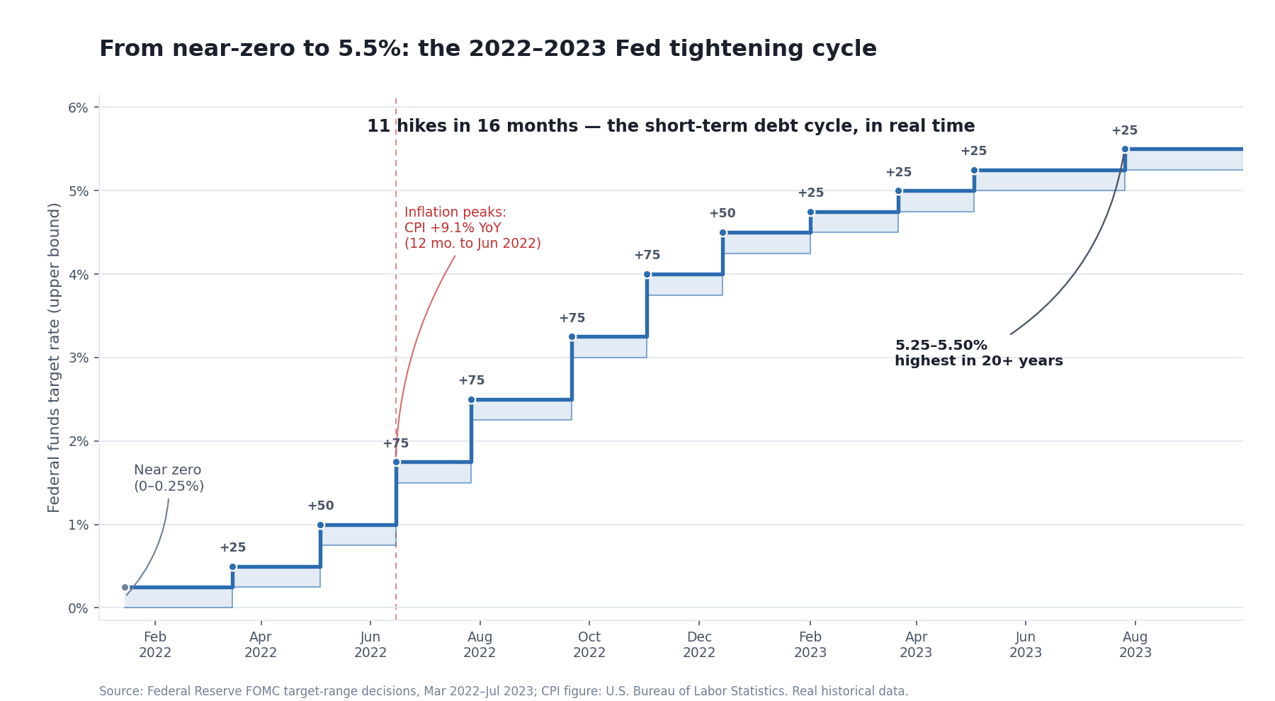 Force 2, made concrete: as inflation peaked at 9.1% year over year in the 12 months ending June 2022, the Federal Reserve raised its benchmark rate eleven times in sixteen months — from near zero to 5.25–5.50%, the highest in more than two decades. This is real historical data (Federal Reserve FOMC target-range decisions; CPI from the U.S. Bureau of Labor Statistics), shown to illustrate the short-term debt cycle’s mechanism — not a forecast of what rates do next.
Consider how the 2022–2023 tightening actually felt on the ground, because it makes the mechanics concrete: borrowing costs that had sat near historic lows rose sharply, so mortgages, car loans, and business credit all became materially more expensive within a matter of months, and anyone who had planned around cheap money had to rethink. That is Force 2 — the short-term debt cycle — not as a diagram but as a lived squeeze on real budgets.
Note the limit: the model explains the mechanism of the cycle. It does not tell you the exact month rates peak or the economy turns. Recessions get dated only in hindsight — the U.S. body that officially calls them, the National Bureau of Economic Research, dated the brief COVID recession as running from February to April 2020, a call it didn’t finalize until well afterward [source: NBER business cycle dates].
“5 to 8 years”, checked against the official record
That range is Dalio’s, and unlike most of what this article relays it is a hard number — which means it can be checked rather than repeated. The body quoted just above has dated every U.S. business cycle peak and trough back to 1854 and publishes the durations [source: National Bureau of Economic Research, “US Business Cycle Expansions and Contractions”]. So the number does not have to be taken on trust.
One limit first, because it sets how much the tables are worth. NBER dates business cycles; Dalio describes a debt cycle. His mechanism runs through credit, interest rates and recession, so the two are closely related — but they are not the same construct, and NBER does not claim to measure his. Read this as the closest official measurement available, not as a verdict. Nothing below dates any cycle we are in now.
| Era | Complete cycles | Avg contraction (months) | Avg expansion (months) | Avg full cycle (months) | Contraction’s share of the cycle |
|---|---|---|---|---|---|
| 1854–1919 | 16 | 21.6 | 26.6 | 48.2 (4.0 yr) | 44.7% |
| 1919–1945 | 6 | 18.2 | 35.0 | 53.2 (4.4 yr) | 34.2% |
| 1945–2020 | 12 | 10.3 | 64.2 | 74.5 (6.2 yr) | 13.9% |
| All 1854–2020 | 34 | 17.0 | 41.4 | 58.4 (4.9 yr) | 29.1% |
Now the same question one cycle at a time, for the 12 complete cycles since 1945 — the era Dalio’s range actually fits:
| Cycle beginning at the peak of | Full cycle (months) | In years | Inside 5–8 years? |
|---|---|---|---|
| November 1948 | 48 | 4.0 | no |
| July 1953 | 55 | 4.6 | no |
| August 1957 | 47 | 3.9 | no |
| April 1960 | 34 | 2.8 | no |
| December 1969 | 117 | 9.8 | no |
| November 1973 | 52 | 4.3 | no |
| January 1980 | 64 | 5.3 | yes |
| July 1981 | 28 | 2.3 | no |
| July 1990 | 100 | 8.3 | no |
| March 2001 | 128 | 10.7 | no |
| December 2007 | 91 | 7.6 | yes |
| February 2020 | 130 | 10.8 | no |
The average vindicates the number and the individual cycles demolish it. Post-war cycles average 74.5 months — 6.2 years — which sits comfortably inside Dalio’s 5-to-8. But only 2 of the 12 actual cycles landed there. The shortest ran 28 months (2.3 years) and the longest 130 months (10.8 years), a 4.6× spread. Measuring peak-to-peak instead of trough-to-trough gives the same 2-of-12, so this is not an artifact of which end you count from.
That is worth sitting with, because it is the difference between a number that describes a population and a number that describes a case. “5 to 8 years” is a fair summary of the post-war average and a poor prediction of any particular cycle — which is exactly the caution the rest of this article keeps making about the framework as a whole, now with a measurement behind it.
Two more things fall out of the first table that the video does not mention. Before the Second World War the cycle was shorter, not longer: 4.0 years on average before 1919 and 4.4 years between the wars, both below Dalio’s floor. His range describes the modern United States specifically, not economies in general.
And the shape changed more than the length did. Average contractions fell from 21.6 months to 10.3 while average expansions grew from 26.6 months to 64.2. Put as a share: downturns were 44.7% of a pre-1919 cycle and are 13.9% of a modern one. The modern economy does not merely cycle more slowly — it spends far more of its time expanding. That is consistent with the article’s central claim that a central bank now runs the short-term cycle and cuts downturns short, though the record on its own establishes the pattern, not the cause.
Method, so it can be checked rather than taken on trust: the durations are NBER’s own, transcribed from the table linked above on August 25, 2026, and not recalculated from dates. The transcription is not trusted either — NBER publishes its own era averages, and the script recomputes all sixteen of them from the transcribed rows and asserts a match to the published decimal. That check earned its keep: it caught that the February 1945 cycle belongs to NBER’s 1919–1945 era rather than the post-war one. Every cycle figure above is produced by that code, never typed by hand.
Force 3 — The Long-Term Debt Cycle (~75–100 Years)
Here’s the twist that makes the machine more than a metronome. Look closely at a run of short-term cycles and you’ll notice each peak and each trough tends to finish with a little more debt than the last. Why? Human nature: given the choice, people lean toward borrowing and spending more rather than paying debt down [source: Dalio, 2013]. Over decades, that tendency stacks up, and debt slowly rises faster than income. That long, slow accumulation is the long-term debt cycle, and it runs roughly 75 to 100 years.
During the long boom, rising incomes and rising asset prices keep borrowers looking creditworthy even as their debts balloon — sometimes into an outright bubble. But debt burdens can’t outrun income forever. Eventually debt-service payments grow faster than incomes, people are forced to cut spending, and because one person’s spending is another’s income, the whole self-reinforcing loop runs in reverse. That turning point is the long-term debt peak, and what follows is a deleveraging [source: Dalio, 2013].
A deleveraging looks like a recession but with one brutal difference: the central bank’s usual rescue — cutting interest rates to spark borrowing — stops working, because rates are already near zero. Dalio notes this is exactly what happened in the U.S. in both the 1930s and in 2008, when interest rates hit 0% and the normal stimulus ran out of room [source: Dalio, 2013]. These long-term peaks are rare and historic. Dalio points to the United States in 1929, Japan in 1989, and the United States and much of the world in 2008 [source: Dalio, 2013]. The U.S. Great Recession is officially dated by the NBER from a peak in December 2007 to a trough in June 2009 — 18 months, the longest U.S. downturn since World War II [source: NBER]. The Great Depression before it ran, in NBER’s dating, from a peak in August 1929 to a trough in March 1933 [source: NBER].
So how does an economy get out of a deleveraging? Dalio lays out four levers, and the mix is everything [source: Dalio, 2013]:
- Austerity — people, businesses, and governments cut spending. (Painful, and paradoxically it can make the debt burden worse at first, because cutting spending cuts incomes even faster.)
- Debt reduction — defaults and restructurings, where lenders accept less than they were promised.
- Wealth redistribution — governments, collecting fewer taxes and spending more on support, tend to raise taxes on the wealthy.
- Printing money — the central bank creates new money and uses it to buy financial assets and government bonds. In 2008, the Federal Reserve printed over $2 trillion doing exactly this [source: Dalio, 2013].
The first three are deflationary (they shrink spending); the fourth is inflationary (it adds it back). Balance them well and you get what Dalio calls a “beautiful deleveraging”: debt burdens fall, growth stays positive, and inflation stays contained. Balance them badly — print too much, and you risk the kind of runaway inflation Germany suffered in the 1920s [source: Dalio, 2013]. Either way, working through a long-term debt peak typically takes a decade or more — hence the phrase “lost decade.”
The three forces on one page. The sections above explain them one at a time; this is the comparison the framework is actually built on. All three are Dalio’s [source: Ray Dalio, "How the Economic Machine Works," Bridgewater Associates, 2013].
| Productivity growth | Short-term debt cycle | Long-term debt cycle | |
|---|---|---|---|
| Period | No cycle — a trend line | About 5 to 8 years | About 75 to 100 years |
| What runs it | Accumulated knowledge | The central bank, through interest rates | Human nature: the lean toward borrowing rather than paying down |
| The loop | None. It does not swing, which is why it causes no booms or busts | Easy credit → spending outruns goods → inflation → rates rise → borrowing and spending fall → recession → rates cut → new expansion | Each peak and trough finishes with a little more debt than the last, until debt service grows faster than income |
| What it explains | Why living standards rise at all over the long run | The booms and busts you actually live through | Why a deleveraging is a different animal from an ordinary recession |
| What it cannot tell you | Where in either cycle we sit today, or when the next turn arrives. Turning points are only ever confirmed in hindsight, and none of this converts into a timing tool. | ||
The Three Rules of Thumb
Dalio closes his explainer with three rules that fall straight out of the machine — good advice for a household and for a country alike [source: Dalio, 2013]:
- Don’t let debt rise faster than income — eventually the debt burden crushes you.
- Don’t let income rise faster than productivity — eventually you become uncompetitive.
- Do all you can to raise productivity — in the long run, it’s what matters most.
Read those again with your own finances in mind. The same mechanics that govern a $50-trillion credit system govern your household budget. That’s not a coincidence — it’s the whole reason the framework is worth learning.
Rule 1, with a clock on it
“Eventually” is doing a lot of work in that first rule, and it does not have to. A debt burden is a ratio, so its path is fixed by two growth rates and nothing else: each year it is multiplied by (1 + debt growth) divided by (1 + income growth). That is enough to put a number on how long a gap takes to become a problem.
This is not a forecast and contains no economic data. Nothing here predicts any economy, interest rate or outcome; the growth rates are inputs. The question is narrower and answerable: if these two rates persist, when has the burden doubled?
| If debt grows | and income grows +1% | and income grows +2% | and income grows +3% | and income grows +4% |
|---|---|---|---|---|
| +2% a year | 70 years | never | never | never |
| +4% a year | 24 years | 36 years | 72 years | never |
| +6% a year | 14 years | 18 years | 24 years | 36 years |
| +8% a year | 10 years | 12 years | 15 years | 18 years |
Two things stand out. First, the size of the debt never appears in the answer. Only the gap between the two rates matters, which is why the rule works identically for a household and for a country — exactly as the post above claims, and here is why that is not a loose analogy but the same arithmetic.
Second, the gaps that do the damage are unremarkable. Debt growing 6% against income growing 3% is not a crisis in any single year — it is three percentage points — and it doubles the burden in 24 years. That is the whole mechanism behind a long-term debt cycle measured in generations rather than quarters: nothing dramatic ever has to happen.
Why cutting back can make the burden worse
The framework’s least intuitive claim is that in a deleveraging, spending less can leave everyone more indebted — because one person’s spending is another person’s income, so the cutting reduces the denominator too. This is not a theory that needs testing; it is an identity, and it can simply be shown.
Below, debt is repaid while income falls. Each cell is what happens to the debt-to-income ratio:
| Debt repaid | Income falls 0% | Income falls 5% | Income falls 10% | Income falls 20% |
|---|---|---|---|---|
| 0% | +0.0% | +5.3% | +11.1% | +25.0% |
| 5% | -5.0% | +0.0% | +5.6% | +18.7% |
| 10% | -10.0% | -5.3% | +0.0% | +12.5% |
Read the top-left corner down and the picture is ordinary: repay 10% of the debt with income flat and the burden falls 10%. Read across and it inverts. Repay 10% of your debt while income falls 20%, and the burden is 12.5% heavier than when you started. The debt is genuinely smaller. The ratio is genuinely worse.
The boundary is exact and worth remembering: the burden improves only when debt falls faster than income. Every cell where income is falling faster is a case of doing the responsible-looking thing and going backwards — which is precisely why the framework treats austerity as one lever among several rather than the answer, and why a deleveraging is described as something to be balanced rather than simply endured.
Method, so it can be checked rather than taken on trust: the doubling time is ln 2 divided by the natural log of (1 + debt growth) ÷ (1 + income growth), and the script verifies each entry by compounding that ratio for the stated number of years and confirming it lands on exactly two. The second table is checked against an explicit simulation of debt and income levels rather than trusting the identity. Both tables are that code’s direct output; nothing was retyped.
What This Framework Can and Can’t Do
This model is a lens, not a crystal ball. It explains, with remarkable clarity, why economies move in credit-driven cycles, why inflation and interest rates are joined at the hip, and why a deleveraging is a fundamentally different animal from an ordinary recession. Used that way, it will make every economic headline you read more legible.
What it cannot do is tell you where in either cycle we sit today or when the next turn arrives — and this article makes no such claim. The economy is more complicated than any single template, turning points are only ever confirmed in hindsight, and no framework, however elegant, converts into a trading signal or a timing tool. Treat this as education about the mechanism, and make any actual financial decisions with a licensed professional and your own full research.
And if you’d like the weekly plain-English read on how these forces are showing up in the news — explained, never predicted — that’s what the newsletter is for. Subscribe below.
Everything above, in a form you can click through: the Economic Cycles Explorer runs the same argument as twelve short lessons — transactions, credit, the two debt cycles, and the three rules of thumb at the end — then lets you test it.
Disclaimer: This article is educational content, not financial advice. I am not a licensed financial advisor, and nothing here is a recommendation to buy or sell any security or asset. Investing and trading involve risk, including the possible loss of the money you invest. Do your own research and consider consulting a licensed financial professional before making investment decisions. Read the full Disclaimer.
Historical and backtested results are hypothetical, carry inherent limitations, and do not guarantee future results. Figures were accurate to the best of my knowledge as of this article’s last-updated date and may have changed.
