Stagflation 101: What It Is and Why Everyone’s Talking About It Again
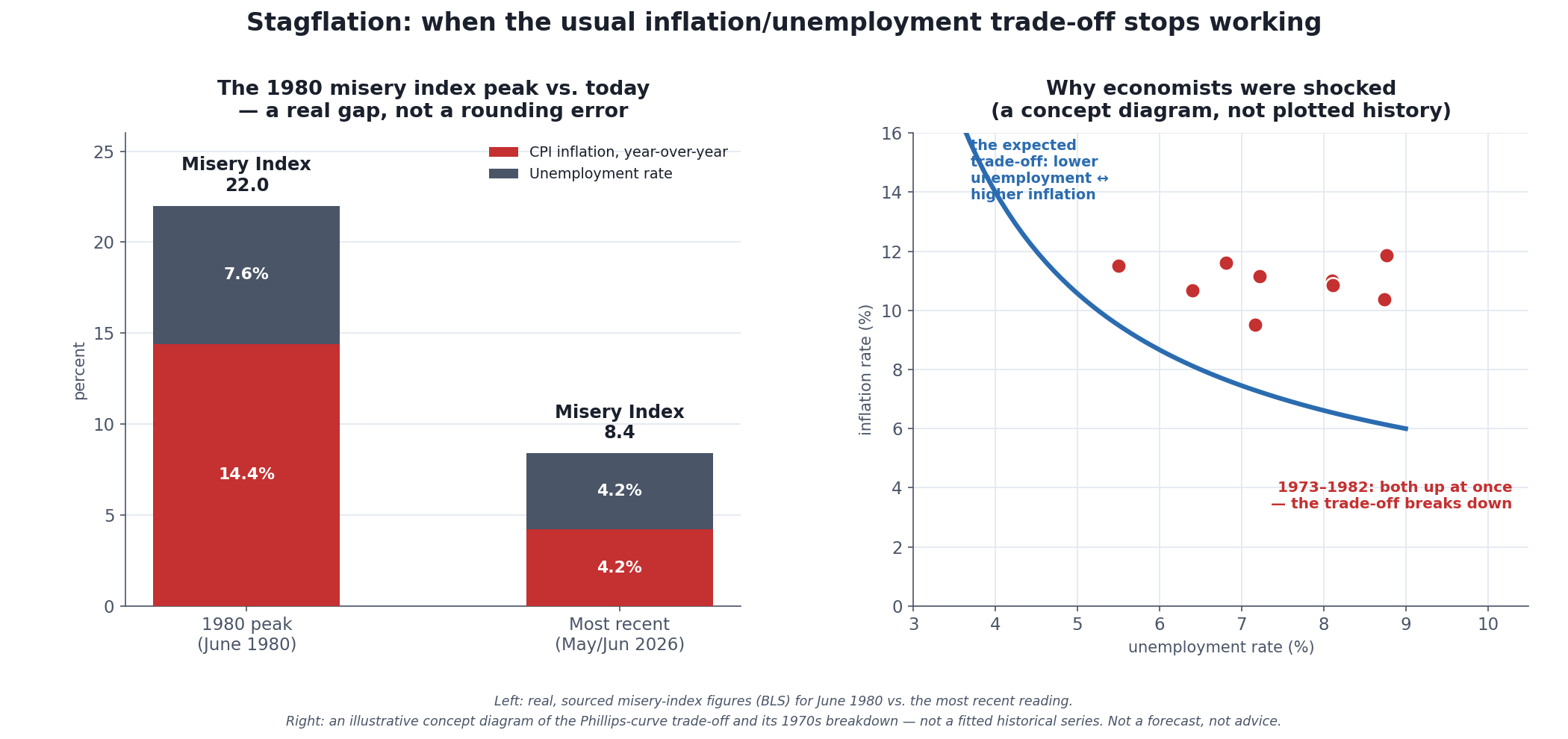 Left: the real numbers behind the two most memorable “misery” readings in modern U.S. history, decades apart. Right: a conceptual illustration — not real plotted data — of why the 1970s broke economists’ assumptions. Not a forecast, not investment advice.
Every few years, a word from a decade most readers weren’t alive for comes roaring back into headlines: stagflation. It shows up whenever inflation runs hot at the same time growth looks shaky, and it carries an almost folkloric weight, because the textbook version of economics said this particular combination of problems wasn’t supposed to happen. This article explains what stagflation actually is, why it broke the rules economists thought were reliable, what happened the one time it hit the U.S. hard, and why the word is circulating again in 2026 — without pretending anyone can tell you whether the “lite” version some analysts describe today will turn into anything like 1979.
The one-sentence version: stagflation is the simultaneous combination of high inflation, weak economic growth, and rising unemployment — a mix that ordinary economic theory says shouldn’t coexist, because fighting one of those problems is supposed to make the other better, not worse. This is a companion piece to the section’s foundation, The Economic Machine Explained, and it pairs directly with What Is Inflation, Really? and Recession Indicators: Which Ones Actually Predict Downturns? — read together, the three cover the vocabulary this section keeps coming back to.
What Stagflation Actually Is
Stagflation is a portmanteau of “stagnation” and “inflation,” and it describes an economy experiencing three things at once: persistently high inflation, stagnant or slow economic growth, and elevated unemployment [source: Britannica Money, “What Is Stagflation?”; Economics Help, “Stagflation”]. The word itself is credited to Iain Macleod, a British Conservative politician, who coined or at least popularized it in a 1965 speech to the UK Parliament while describing exactly this kind of economic bind [source: Wikipedia, “Stagflation”].
What makes the definition worth sitting with is why it’s notable at all. In ordinary times, an overheating economy (strong growth, low unemployment) tends to run higher inflation, while a weak economy (soft growth, high unemployment) tends to run lower inflation, because slack in the labor market and in factory capacity takes the pressure off prices. Stagflation is what happens when that logic stops holding — inflation stays high even as the economy stalls and people lose jobs. It’s not just “a bad economy”; it’s a bad economy behaving in the wrong direction for the tools policymakers normally reach for, which is exactly what makes it hard to fix.
There’s a companion statistic worth knowing here: the Misery Index, a simple sum of the inflation rate and the unemployment rate, developed by economist Arthur Okun (Yale, and later a Brookings Institution scholar) as a rough, one-number “economic discomfort” gauge [source: Brookings Institution, “The Brookings Institution’s Arthur Okun – Father of the ‘Misery Index’”]. It isn’t a scientific instrument — it treats a point of inflation and a point of unemployment as equally painful, which economists debate — but it’s a useful, easy-to-track single number for exactly the two ingredients stagflation combines. The featured chart’s left panel puts the mid-2026 reading next to the worst one this index has ever recorded.
Why Economists Thought This Couldn’t Happen
To understand why stagflation was treated as close to impossible, you have to meet the Phillips curve. In 1958, economist A.W. Phillips published a study of nearly a century of UK wage and unemployment data and found a clear historical pattern: when unemployment was low, wage (and later, price) inflation tended to be high, and vice versa [source: standard macroeconomics history; A.W. Phillips, 1958]. Through the 1960s, this hardened into policy orthodoxy: a stable, exploitable trade-off between inflation and unemployment, one policymakers believed they could dial along, accepting a bit more inflation to buy a bit less unemployment, or the reverse.
Two economists argued this was an illusion before the 1970s proved it. In his December 1967 presidential address to the American Economic Association, Milton Friedman proposed that the Phillips-curve trade-off only holds in the short run, when workers and businesses haven’t yet adjusted their expectations to rising prices; once people build inflation into their expectations — demanding raises and setting prices to keep pace — the trade-off with unemployment disappears, and you’re left with the same “natural rate” of unemployment plus more inflation. Edmund Phelps developed a closely related argument independently around the same time. Together their work became known as the expectations-augmented Phillips curve and the natural-rate hypothesis [source: Friedman, “The Role of Monetary Policy,” American Economic Review, 1968 (delivered Dec. 29, 1967); Phelps, 1967/1968; summarized in standard histories of the natural-rate hypothesis]. Friedman’s broader body of work, including this argument, contributed to his 1976 Nobel Memorial Prize in Economic Sciences; Phelps won the 2006 Nobel specifically for his analysis of the intertemporal trade-offs this idea rests on [source: Nobel Prize citations, 1976 and 2006].
At the time, this was a theoretical prediction, not yet a lived experience — and then the 1970s arrived and appeared to confirm it in the most painful way possible.
The 1970s: The Case Study Everyone Means
When people invoke “stagflation,” they are almost always picturing one specific stretch of U.S. economic history, and it’s worth knowing the actual sequence.
The 1973 oil embargo is the conventional starting gun. After the Yom Kippur War, Arab oil-producing nations cut off shipments to the U.S. and other countries supporting Israel. Oil prices roughly quadrupled worldwide, rising from around $3 to nearly $12 a barrel by March 1974 [source: Wikipedia, “1973 oil crisis”]. The economic damage that followed was severe and came from both directions at once: U.S. unemployment climbed from 4.6% in October 1973 to 9% by May 1975, while inflation hit 12.3% in 1974, up sharply from 3.4% just two years earlier [source: Wikipedia, “1973 oil crisis”].
A second shock followed before the economy had fully recovered. The 1979 Iranian Revolution sharply curtailed output from one of the world’s largest oil producers, and prices spiked again — from around $15.85 a barrel in April 1979 to roughly $39.50 a barrel within a year [source: EBSCO Research Starters, “Oil embargo and energy crises of 1973 and 1979”; general accounts of the 1979 oil crisis]. Inflation exceeded 13%, and unemployment, still elevated from the first shock, kept climbing.
The single most-cited number from this era is the Misery Index’s all-time peak: 22.0 in June 1980, built from 14.4% CPI inflation and a 7.6% unemployment rate that same month, during the final year of the Carter administration [source: inflationdata.com, “U.S. Misery Index”; Wikipedia, “Misery index (economics)”]. That reading — inflation and unemployment both painfully high, at the same time — is the single clearest snapshot of what “stagflation” concretely looked like, and it’s the benchmark the featured chart uses for comparison.
Ending it required genuinely brutal medicine. Federal Reserve Chair Paul Volcker, appointed in 1979, pushed the federal funds rate to roughly 20% by 1981 in a deliberate campaign to break inflation’s back, even though doing so was virtually guaranteed to cause a recession [source: Federal Reserve History, “The Great Inflation” and “Recession of 1981-82”; general accounts of the Volcker disinflation]. It worked on inflation — CPI eventually came down from its 1980 peak — but at a steep cost: unemployment climbed to 10.8% by late 1982, one of the highest readings of the postwar era [source: general economic-history accounts of the early-1980s recession]. The 1970s-into-1982 episode is, in miniature, the whole stagflation problem: the tool that crushes inflation (much higher interest rates) is also the tool that crushes employment, and there was no version of the medicine that avoided both.
Why This Combination Is a Policy Nightmare
Here’s the mechanism worth actually understanding, because it’s the reason stagflation is treated as uniquely hard to fix rather than just “a bad economy.”
A central bank like the Federal Reserve has essentially one primary lever for managing the economy: the interest rate (more precisely, the federal funds rate, which ripples out to mortgages, credit cards, business loans, and more — see Why Interest Rates Move Markets for the mechanics). In a normal downturn, the playbook is straightforward: cut rates to make borrowing cheaper, encourage spending and hiring, and pull the economy out of its slump — and because inflation is usually low or falling in a downturn, rate cuts don’t carry much of an inflation cost. In a normal overheating boom, the playbook flips: raise rates to cool spending and bring inflation down, accepting some softening in hiring as the price.
Stagflation breaks both playbooks at once. Growth is weak and unemployment is rising — which argues for cutting rates to help — but inflation is also high — which argues for raising rates to fight it. Whichever direction the Fed moves, it makes one problem worse in the name of fixing the other. There is no interest-rate move that addresses both simultaneously, which is precisely why economists consider this the hardest environment a central bank can face, and precisely why Volcker’s solution was to prioritize inflation and accept a brutal recession as the cost, rather than split the difference.
Why Everyone’s Talking About It Again in 2026
None of this is ancient history to a lot of current commentary. Heading into and through 2026, a real, sourced strand of financial and economic commentary has revived the word — while being explicit that today’s numbers are nowhere close to the 1970s. Some analysts have framed 2026 as carrying a genuine, if modest, stagflation risk [source: Forbes, “Is Stagflation The Biggest Global Risk In 2026?,” December 2025], and at least one closely watched research shop described the risk of tariff-driven “stagflation lite” as “brewing” [source: BCA Research commentary, as reported in 2025–2026 financial press].
The actual U.S. data as of mid-2026 tells a more measured story than the headlines. CPI inflation ran at 4.2% year-over-year as of May 2026 — well above the Federal Reserve’s 2% target, though core inflation (excluding food and energy) was somewhat lower at 2.9% [source: U.S. Bureau of Labor Statistics, Consumer Price Index Summary, May 2026 release]. The unemployment rate stood at 4.2% in June 2026, up from cyclical lows earlier in the decade, as hiring cooled [source: U.S. Bureau of Labor Statistics, Employment Situation, June 2026]. And real GDP grew at a 2.1% annualized rate in the first quarter of 2026 — positive growth, not the outright stagnation or contraction the word “stagflation” technically implies [source: U.S. Bureau of Economic Analysis, “GDP (Third Estimate),” Q1 2026, released June 25, 2026].
Tariffs are the specific mechanism most of this commentary points to. The Yale Budget Lab, which tracks the fiscal and economic effects of U.S. tariff policy in detail, estimated that 2025–2026 tariffs would drag real GDP growth down by roughly 0.5 percentage points in 2025 and 0.4 points in 2026, while pushing consumer prices up somewhere in the range of about 0.5% to 1.1% in the short run, depending on which tariffs remain in effect and how much of the cost businesses pass on to shoppers [source: The Budget Lab at Yale, “State of U.S. Tariffs,” various 2025–2026 releases]. That combination — a modest growth drag plus a modest price increase, both coming from the same policy lever — is the textbook mechanical description of a mild stagflationary pressure, even if it falls far short of a 1970s-scale event.
Put plainly: the honest 2026 reading is “inflation running uncomfortably above target, a labor market that’s cooling rather than crashing, and growth that’s positive but facing a real headwind” — a combination some analysts have reasonably labeled “stagflation-lite” chatter. It is not a claim that the U.S. economy is in stagflation by the standards of 1974 or 1980, and nothing in this section should be read as a forecast of what comes next; that’s precisely the line this article won’t cross.
Today vs. the 1970s: What’s Different (and What Isn’t)
Put the two eras side by side and the scale gap is the first thing that jumps out. The featured chart’s left panel shows it plainly: a Misery Index of roughly 8.4 in mid-2026 (4.2% inflation plus 4.2% unemployment) against 22.0 at the June 1980 peak (14.4% inflation plus 7.6% unemployment) [source: BLS figures as cited above; inflationdata.com]. That’s not a rounding difference — the 1980 reading is more than two and a half times the mid-2026 one. The newest releases widen that gap rather than close it: CPI inflation was 3.4% year-over-year in August 2026, with core at 2.4%, and unemployment was 4.1% [source: U.S. Bureau of Labor Statistics, Consumer Price Index and Employment Situation, August 2026 releases], for a Misery Index of about 7.5. The 1980 peak is almost three times that.
A few structural differences help explain why. Central bank credibility is much stronger today than in the late 1970s: the Federal Reserve has operated under an explicit 2% inflation target since 2012, has decades of Volcker-era and post-Volcker experience to draw on, and financial markets have generally expected the Fed to eventually bring inflation back down rather than let it spiral — a very different starting point than 1979, when the Fed’s inflation-fighting resolve was genuinely in doubt. The Fed also entered this period with its policy rate already well above the near-zero levels of 2020–21, giving it a demonstrated willingness to use that tool [source: Federal Reserve policy statements; general accounts of Fed credibility post-Volcker]. None of this guarantees an outcome — it’s context, not a prediction — but it’s a real and relevant difference, not wishful thinking.
What hasn’t changed is the mechanism. If inflation stays elevated while growth and hiring weaken further, the Fed would face the same fundamental bind Volcker faced: no single interest-rate move fixes both problems at once. That’s the part of the 1970s story that’s a permanent feature of how central banking works, not a historical curiosity.
Ask someone who lived through the early 1980s what stagflation felt like day to day, and the answers rarely start with a chart. They start with a mortgage rate that looked like a typo, a grocery bill that visibly changed month to month, and a job market where losing work and losing purchasing power seemed to be happening at the same time, for reasons no single villain seemed to explain. That lived texture — two kinds of financial stress arriving together, with no obvious fix — is exactly why the word still lands as more than academic jargon whenever it resurfaces.
Putting Numbers on the Comparison This Page Keeps Making
Three of the sections above hand the reader a comparison and stop one step short of the arithmetic. The Misery Index is introduced together with the objection to it — that it treats a point of inflation and a point of unemployment as equally painful — and then used to compare two eras as though the objection had been settled. The 1970s section calls one oil shock a quadrupling and the next one a spike, while printing a much larger dollar figure for the second. And the tariff estimate is described as “the textbook mechanical description of a mild stagflationary pressure” without ever being applied to the 2026 readings printed a few paragraphs earlier. Everything below is arithmetic on numbers already on this page. No new figure is introduced, nothing is forecast, and every result was recomputed in code that checks this article’s own published values before reporting anything.
How Much of the 1980-vs-Today Gap Is an Assumption?
The index is a sum, so it silently splits the weight fifty-fifty. Nothing forces that. The table re-weights the same four published percentages toward inflation and away from unemployment, normalized so the middle row returns the exact readings this article publishes.
| Weight on inflation | June 1980 | 2026 | 1980 ÷ 2026 |
|---|---|---|---|
| 0% (unemployment only) | 15.2 | 8.4 | 1.81× |
| 25% | 18.6 | 8.4 | 2.21× |
| 50% (the published index) | 22.0 | 8.4 | 2.62× |
| 75% | 25.4 | 8.4 | 3.02× |
| 100% (inflation only) | 28.8 | 8.4 | 3.43× |
The 2026 column never moves. That is not a rounding accident: the mid-2026 reading’s two ingredients are both 4.2%, so any weighted average of them is 4.2% and the reading is 8.4 at every weight. The whole sensitivity of the comparison sits in 1980, where the two ingredients were 14.4% and 7.6% and the answer runs from 15.2 to 28.8 depending only on which of them you decide hurts more.
So the comparison has two halves and they behave differently. Its direction is robust — 1980 is at least twice as bad as mid-2026 for any inflation weight above 11.8%, and worse on every weighting in the table. Its size is not: the honest answer is a range of 1.81× to 3.43×, a spread of 1.89×, and the 2.62× the article settles on is the midpoint of that range by construction rather than by evidence. A reader who cares mainly about lost purchasing power and a reader who cares mainly about lost jobs are looking at genuinely different numbers, and the index hands them both the same one.
Which Oil Shock Was Bigger Depends Entirely on What You Count
The article gives both shocks their own prices and dates and never puts them beside each other. Doing so produces three answers that disagree.
| Shock | Move in dollars | Price multiple | Per month |
|---|---|---|---|
| Oct 1973 – Mar 1974 | $9.00 | 4.00× | 31.95% |
| Apr 1979 – Apr 1980 | $23.65 | 2.49× | 7.91% |
The second shock moved 2.63 times as many dollars as the first. It was also a multiple 1.61 times smaller, spread over more than twice as long, and it climbed at a quarter of the monthly pace. At the 1979 rate, reaching a quadrupling would have taken 18.2 months rather than five. Dollar amounts and multiples point in opposite directions here for the same reason they do everywhere: the second shock started from a base almost five times higher, so the same proportional move buys a much bigger headline number. Both monthly rates are the ones a reader can re-run — feeding them into the Compound Growth Calculator’s computeCompound returns exactly $12.00 and $39.50, the two prices this article publishes.
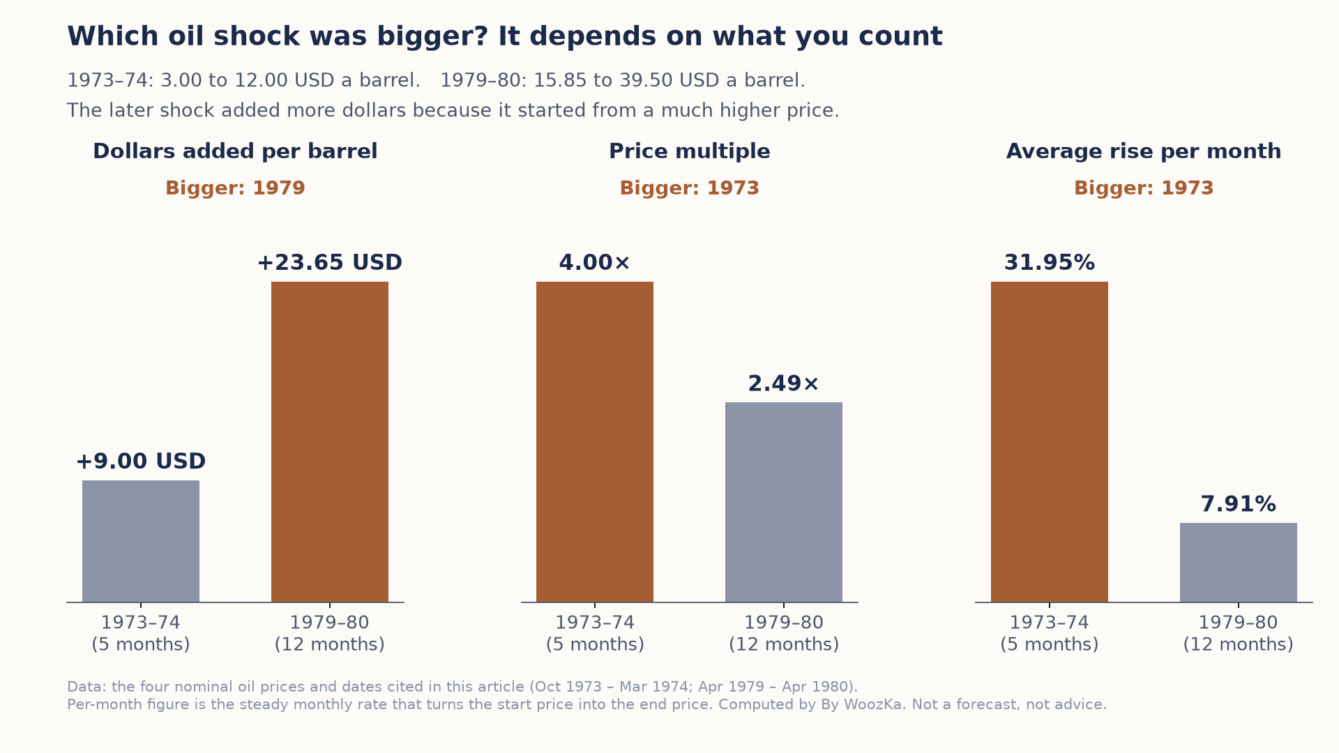 Count dollars and the 1979 shock looks larger; count the multiple or the monthly pace and 1973 was the bigger shock by far. The later shock started from a much higher price, so the same kind of move produced a bigger dollar figure.
The Tariff Estimate, Applied to This Page’s Own 2026 Readings
The Budget Lab range is a short-run effect on the price level, so it can be subtracted straight out of the CPI figure this article already prints. The unemployment side is deliberately left untouched, for a reason given below.
| Price effect assumed | CPI without it | Misery Index | Share of the 8.4 |
|---|---|---|---|
| 0.5 points (low pass-through) | 3.7% | 7.9 | 6.0% |
| 0.8 points (midpoint) | 3.4% | 7.6 | 9.5% |
| 1.1 points (high pass-through) | 3.1% | 7.3 | 13.1% |
On the estimate’s own range, tariffs account for 6.0% to 13.1% of the mid-2026 reading and for 3.7% to 8.1% of the whole distance back to 1980. That is a real contribution and a small one, and it leaves the great majority of both numbers to everything else.
The more useful result is what a single policy lever is doing to both ingredients at once. Measured against its own baseline, the price push is 11.9% to 26.2% of a 4.2% CPI, while the growth drag is 16.0% of the 2.5% that would otherwise have been reported for the first quarter — comparable in size, 0.74 to 1.64 times as large depending on pass-through, and pointing the wrong way on each side simultaneously. That is what makes an estimate like this stagflationary in shape rather than merely bad: an ordinary shock moves prices and output in opposite directions, which is exactly the trade-off the policy lever described above is built to exploit. This one moves them the same way, and that is the condition the whole article is about.
What is checkable here, and what is not. Every input is a figure this page already publishes with its own source — the 4.2% May 2026 CPI and 4.2% June 2026 unemployment rate, the 14.4% and 7.6% of June 1980, the four oil prices with their dates, the 2.1% first-quarter growth rate, and the Budget Lab’s 0.5-to-1.1-point price range and 0.4-point 2026 growth drag. Four limits are worth stating plainly. The 8.4 pairs a May inflation reading with a June unemployment reading, one month apart, which is the article’s own construction and is carried forward unchanged rather than adjusted. The 1973–75 figures quoted earlier — 4.6% unemployment in October 1973, 9% in May 1975, 12.3% inflation in 1974 — are measured at four different dates, so they are deliberately not combined into an index reading here; adding numbers from different months is how a real-looking figure gets manufactured. The tariff rows are counterfactual estimates from the cited source, not observations, and the unemployment column is held at 4.2% because that source estimates a growth effect rather than a labor-market one, and converting between the two would require a coefficient this article does not publish. Oil prices are nominal, as published. Nothing above is a forecast, a recommendation, or a claim about what any of these numbers will do next.
How to Actually Use This Word
Understanding stagflation is genuinely useful — it’s one of the more instructive stories in modern economic history, and it explains a real and permanent limit on what a central bank can do. What it is not is a signal to act on. This article cannot tell you whether 2026’s “stagflation-lite” chatter fades the way the 2022–2024 recession scares did (see Recession Indicators for that full story) or develops into something more serious, and no honest article can.
The practical response to that uncertainty isn’t to guess which way it breaks. It’s the same answer this site keeps returning to for every macro uncertainty: a diversified, broad-market portfolio and a steady, rules-based investing habit — like the dollar-cost-averaging approach covered elsewhere on this site — are built to keep working across a wide range of economic environments, including ones nobody labeled correctly in advance. You don’t need to correctly diagnose whether the economy is heading toward stagflation to build a plan that survives it either way.
The Beginner’s Takeaway
Stagflation is the simultaneous combination of high inflation, weak growth, and rising unemployment — a mix that ordinary economic theory says shouldn’t persist, because fighting one problem is supposed to help the other. The 1970s U.S. experience, capped by a record Misery Index reading of 22.0 in June 1980, is the real, sourced case study everyone means when they use the word, and it took a deliberately induced recession under Paul Volcker to break it. The word has resurfaced in 2026 commentary alongside real, dated figures — inflation above target, a cooling labor market, positive-but-pressured growth, and a measurable tariff drag — but the Misery Index, roughly 8.4 in mid-2026 and about 7.5 by August, sits nowhere near 1980’s 22.0, and nothing here should be read as a prediction of which way this decade’s story goes. To see how this fits into the larger system of credit, debt, and cycles, the pillar for this section — The Economic Machine Explained — is the natural next read. For the weekly plain-English read on what the economy is actually doing, the newsletter is below.
Stagflation is what happens when the cycle’s usual trade-off breaks. For how that trade-off normally works — and what a central bank reaches for once its main lever stops responding — see the Economic Cycles Explorer.
Disclaimer: This article is educational content, not financial advice. I am not a licensed financial advisor, and nothing here is a recommendation to buy or sell any security or asset. Investing and trading involve risk, including the possible loss of the money you invest. Do your own research and consider consulting a licensed financial professional before making investment decisions. Read the full Disclaimer.
Historical and backtested results are hypothetical, carry inherent limitations, and do not guarantee future results. Figures were accurate to the best of my knowledge as of this article’s last-updated date and may have changed.
