The Yield Curve Inversion, Explained Without the Jargon
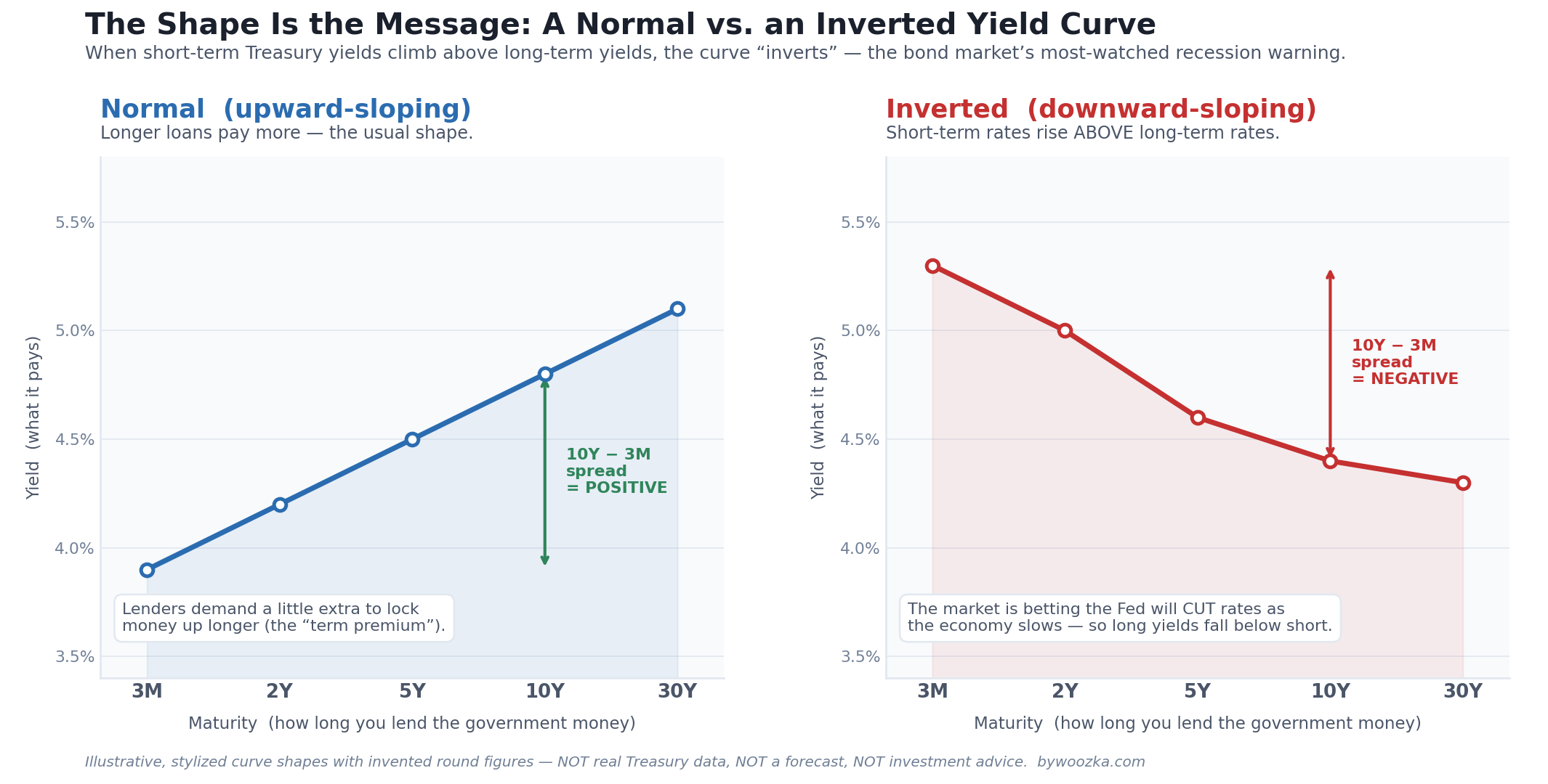 Two shapes, one message. A normal yield curve rises from left to right; an inverted one falls. This is an educational schematic to make the shapes concrete — not real market data, not a forecast, and not investment advice.
Every year or two, a chart of government interest rates does something unusual, and the financial press erupts: the yield curve has inverted, and it has predicted almost every recession. It sounds like a crystal ball. It is not. The inverted yield curve is simultaneously the most respected recession warning we have and one of the most widely misunderstood — treated by headlines as a “sell” alarm when it is really a slow-burning, sometimes-wrong hint that can take a year and a half to mean anything, if it means anything at all.
The one-sentence version: the yield curve is just a picture of what different-length government loans pay, it normally slopes upward, and when it flips upside down — short-term rates paying more than long-term rates — the bond market is quietly betting that rates, and the economy, are headed lower. This article unpacks that sentence in plain English, and, just as important, marks exactly where the honest explanation stops and guesswork would begin. If you want the bigger system these ideas sit inside, this is a companion to the section’s foundation, The Economic Machine Explained.
First, What Is a Yield Curve?
Start with the building block: a Treasury. When the U.S. government borrows money, it sells IOUs called Treasury securities, and they come in many lengths — from a 3-month bill to a 2-year note to a 10-year or 30-year bond. Each one pays an interest rate, called its yield, and because these are backed by the U.S. government they’re treated as among the safest, lowest-credit-risk instruments in the world — the baseline against which nearly every other interest rate is measured.
A yield curve is nothing more exotic than plotting those yields on a chart: maturity (how long the loan lasts) along the bottom, yield (what it pays) up the side. Connect the dots and you get a curve. On any given day it’s a snapshot of what the market will pay to lend the government money for three months versus two years versus ten. That’s the whole idea. The reason professionals stare at it is that its shape — not any single yield — carries information about what the market expects to happen next.
There’s one bit of vocabulary worth owning here, because you’ll see it everywhere: the spread. The spread is just the difference between two yields — say, the 10-year yield minus the 2-year yield. When people say “the curve inverted,” they mean a spread that’s normally positive went negative. Yields and spreads are quoted in basis points, where one basis point is one-hundredth of a percentage point (so 50 basis points is 0.50%). Jargon demystified; now the rest of the article is downhill.
Why the Curve Normally Slopes Up
In normal times, longer loans pay more than shorter ones, so the curve rises from left to right. Two forces explain why.
The first is expectations. A long-term yield is, roughly, the market’s best guess of the average short-term interest rate over the life of the loan. If investors expect the economy to keep growing and short-term rates to hold steady or drift up, longer yields sit above shorter ones [source: standard term-structure theory; see Brookings, “The Hutchins Center Explains: The yield curve,” and general finance texts].
The second — and the one that makes “up” the default shape rather than a coin flip — is the term premium. Lending money for ten years is riskier than lending it for three months: more can go wrong, inflation can erode your repayment, and you’re locked in while prices swing. So investors generally demand a little extra yield to compensate for tying money up longer and bearing that uncertainty. That extra compensation is the term premium, and it nudges long yields above short yields even when rates aren’t expected to rise [source: liquidity-preference and preferred-habitat theories of the term structure; Wikipedia, “Yield curve”; CFA curriculum term-structure notes]. Picture the intuition: if a friend asked to borrow $100 for a week you’d shrug, but for ten years you’d want a better deal. Bond investors feel the same way, and the upward slope is the result.
What “Inverted” Actually Means
An inverted yield curve is simply that normal picture turned upside down: short-term yields rise above long-term yields, and the curve slopes down from left to right. The spread that’s usually positive goes negative.
That’s strange enough to demand an explanation — why would anyone accept less yield to lend for longer? The answer is that the long-term yield is being dragged down by expectations. When investors believe the economy is slowing and the Federal Reserve will have to cut short-term rates in the future, they rush to lock in today’s longer-term yields before they fall, which pushes long-term yields down. At the same time, the Fed may be holding short-term rates high to fight inflation. High short rates now, plus an expectation of lower rates later, is exactly the recipe for short-above-long — an inversion [source: U.S. Bank, “What Does an Inverted Yield Curve Signal About the Economy?”; Federal Reserve Bank of St. Louis, “The Yield Curve as a Forecasting Tool”].
So an inversion isn’t a mysterious omen. It’s a readout of a collective bet: the bond market, in aggregate, is pricing in weaker growth and lower rates ahead. That’s why it draws so much attention — it’s one of the few places you can watch the market’s expectation about the future path of the economy expressed as a single, clean number.
Which Curve? Meet the 2-Year and the 3-Month
Here’s a wrinkle the headlines usually skip: there is no single “the” yield curve spread. Two versions dominate, and they don’t always agree.
The one the financial media quotes most is the 10-year minus 2-year spread (often written “2s10s”). It’s popular partly because both maturities are heavily traded and easy to follow.
The one the economists trust most is the 10-year minus 3-month spread. This is the version the Federal Reserve Bank of New York uses in its published recession-probability model, and it has the stronger academic pedigree. The yield curve’s power to foreshadow recessions was first documented by Campbell Harvey in his 1986 University of Chicago dissertation, and economists Arturo Estrella and Frederic Mishkin later built the 10-year-minus-3-month version into the probit model the New York Fed still publishes monthly [source: Federal Reserve Bank of New York recession-probability model; Estrella & Mishkin, “Predicting U.S. Recessions: Financial Variables as Leading Indicators,” 1998; Campbell Harvey 1986 dissertation, University of Chicago].
Why care about the distinction? Because the two spreads can invert at different times and by different amounts, so “the curve inverted” can be true on one measure and not the other. When you read that “the yield curve un-inverted” but “the Fed’s favorite recession gauge is still flashing,” that’s usually the 2-year and 3-month versions telling slightly different stories. For a beginner, the takeaway is simple: know that more than one curve exists, and that the 3-month version is the one with the model behind it.
Why an Inversion Is Tied to Recessions
An inversion’s track record is genuinely impressive. Measured by the 10-year-minus-3-month spread, an inversion has preceded essentially every U.S. recession since the 1950s, with only one widely cited false alarm in the mid-1960s [source: Federal Reserve Bank of New York recession-probability model, building on Estrella & Mishkin; Congressional Research Service, “Does a Yield Curve Inversion Predict a Recession?,” 2019]. Few economic indicators can claim a record like that. But why should the shape of a bond chart have anything to do with whether factories slow down and people lose jobs? There are two threads, and it helps to hold both.
The first thread is the one we’ve already met: the inversion is a reflection. It reflects a market that expects the Fed to cut rates because growth is weakening. In that view, the curve isn’t causing anything — it’s a very well-informed thermometer reading the economy’s temperature.
The second thread is subtler and more interesting: the inversion may also be a cause, through the banking system. Banks make money by maturity transformation — they borrow short (your deposits, which they can be asked to return at any time) and lend long (mortgages, business loans that run for years). Normally they profit on the gap between the higher long-term rate they charge and the lower short-term rate they pay. When the curve inverts, that gap — the bank’s net interest margin — compresses or disappears, and lending becomes less profitable. So banks tighten their standards and extend less credit, which starves the economy of the loans that fuel spending and investment, which slows growth [source: Federal Reserve Bank of Chicago, “How Have Banks Responded to Changes in the Yield Curve?,” 2018; Capital Advisors Group, “The Yield Curve as a Recession Indicator and its Effect on Bank Credit Quality”]. In this view the inverted curve doesn’t just predict a slowdown — it helps produce one, which is part of why the signal has been more than a coincidence. This causal channel is a well-argued hypothesis, not settled law, so treat it as one credible reason the signal works, not proof of mechanism.
Either way, the honest summary is the same: an inversion tells you the conditions that have historically preceded recessions are present. It does not tell you a recession is guaranteed, and — as the next section shows — it certainly doesn’t tell you when.
The Catch: It’s Slow, and It Just Missed
Two limits keep an inversion from being the “sell” bell that headlines imply.
First, the lead time is long and wildly variable. The gap between an inversion and the recession it precedes has typically run somewhere in the range of about 12 to 24 months, and has landed outside that range too [source: Federal Reserve Bank of St. Louis, “Who Wants to Bet against the Yield Curve: Is This Time Different?,” September 30, 2019 — an inversion has occurred within two years of every U.S. recession since at least 1960; Federal Reserve Bank of New York, “The Yield Curve as a Leading Indicator: Frequently Asked Questions,” for the twelve-month model horizon. The Congressional Research Service, “The Yield Curve and Predicting Recessions,” April 11, 2019, describes the lag as considerable and variable but publishes no numeric range]. An inversion is not a starting gun; it’s a slow-burning warning that might take a year and a half to matter, or might fade. And “predicts recessions” is not the same as “predicts markets” — stocks have at times climbed for a long stretch after a curve inverted, so an investor who bailed on the signal alone could have sat out substantial gains.
Second, and most humbling, it just missed. The curve inverted in 2022 — one of the deepest and longest inversions in decades. On the 2-year-versus-10-year measure it stayed inverted for a record run of roughly 783 consecutive days, the longest in U.S. history, before turning positive again around September 2024; the 3-month-versus-10-year version the Fed watches ran negative from late 2022 into December 2024 [source: Federal Reserve H.15 daily Treasury yields since June 1976 — 2s10s inverted July 6, 2022 to August 26, 2024, 783 days (the next longest, 623 days, ran from 1978 to 1980), and 3-month vs 10-year October 25, 2022 to December 12, 2024; CNN Business, “The most well-known recession indicator stopped flashing red…,” September 2024; CNBC, “The Federal Reserve’s favorite recession indicator is flashing danger again,” February 2025]. And as of mid-2026, more than a year after the curve normalized, no recession had been dated by the National Bureau of Economic Research, which remains the official U.S. arbiter of when recessions begin and end [source: NBER, Business Cycle Dating; no recession declared since April 2020]. The single best recession indicator we have gave a very public, very prolonged false signal in this cycle. That doesn’t erase its record — but it should permanently cure anyone of treating it as a timer.
This piece is the mechanism deep-dive on the yield curve alone. For how it stacks up against the other recession signals — the Sahm rule, the Leading Economic Index, jobless claims, credit spreads — and why even three of them flashing red at once in 2022–2024 produced no downturn, the companion article Recession Indicators: Which Ones Actually Predict Downturns? is the fuller comparison.
The Un-Inversion Paradox
Here’s the twist that trips up even seasoned market-watchers: historically, recessions have tended to begin not when the curve inverts, but months after it un-inverts — when the spread climbs back above zero.
The logic follows from everything above. The curve steepens back to normal because the market now expects, or sees, the Fed cutting rates — and the Fed usually cuts rates precisely because the economy is weakening. So the return to a “normal-looking” upward curve, which feels reassuring, has often been the part of the cycle that sat closest to the actual downturn [source: U.S. Bank, “What Does an Inverted Yield Curve Signal…”; Current Market Valuation, “Yield Curve Valuation Model”]. The inversion is the distant warning; the un-inversion has historically been the nearer one.
That makes the 2024 normalization worth watching rather than celebrating — though, as always, “worth watching” is a long way from “act now,” and the 2022–2024 miss is a standing reminder that these historical rhythms are tendencies, not schedules.
Picture a reader who saw the “yield curve un-inverts!” headlines in the fall of 2024, read it as an all-clear, and felt relieved the recession scare was over — without realizing that the un-inversion is, if anything, the historically later-stage signal. The lesson isn’t that they should have panicked instead; it’s that a single chart, read as a green or red light, will mislead you in both directions.
Where the Curve Is Now — and How to Actually Use It
As of early July 2026, the curve has returned to a normal, upward shape: the 10-year Treasury yield finished around 4.49% and the 2-year around 4.14% on July 2, 2026, leaving both the 2s10s and the 3-month-versus-10-year spreads positive — though the 2s10s was still narrower than the roughly 100-to-150-basis-point gap typical of a healthy expansion, and the New York Fed’s model still put 12-month-ahead recession odds at an elevated-but-not-alarming level [source: Advisor Perspectives / dshort, “Treasury Yields Snapshot: July 2, 2026”; centralbank.watch, “US Treasury Yield Curve 2026”]. Curves move constantly, so always confirm the current shape at a primary source like the St. Louis Fed’s FRED (series T10Y2Y and T10Y3M) before relying on any figure here; the mechanism in this article is what lasts, not today’s spread.
So how should a normal investor actually use the yield curve? Mostly, as weather, not a timer. Understanding it means that the next time headlines shout “the recession indicator just inverted,” you’ll know it’s a real-but-slow warning with a variable lead time and a recent, embarrassing miss — not a reason to dump your portfolio before lunch. You’ll know to ask which curve, and you’ll know that the reassuring un-inversion can be the later-stage signal. That understanding is genuinely worth having. What it is not is a license to rebuild your finances around one chart.
The practical response isn’t to trade the curve. It’s the opposite: because the timing is so unreliable, a steady, rules-based habit — like the dollar-cost-averaging approach covered elsewhere on this site — is a way to keep investing through every shape the curve takes, without having to guess which one comes next. The curve will keep inverting and un-inverting for the rest of your investing life; the goal is to build something that doesn’t depend on you calling those turns.
The Timing, Put in Numbers
Three of the sections above make quantitative promises and then hand the reader adjectives instead: the lead time is “long and wildly variable,” the two curves tell “slightly different stories,” and today’s spread is “still narrower” than a healthy one. Each of those has a number sitting in the article already, unmultiplied. Setting them out does not add a claim — it makes this article’s own conclusion, respect the signal and distrust the timing, concrete rather than rhetorical.
The Inversion Outlasted Its Own Lead Time
The article gives a typical lead of roughly 12 to 24 months, and separately reports a 783-day inversion. Those two figures are never set against each other, and they belong in the same units.
| Window | Months | Days |
|---|---|---|
| Typical lead, low end | 12.00 | 365.25 |
| Typical lead, high end | 24.00 | 730.50 |
| The 2022–24 inversion | 25.72 | 783.00 |
The record inversion ran longer than the top of its own typical lead range — by 52.50 days, about 1.72 months — and lasted 2.1437× the low end. Put plainly: the warning light stayed on for longer than the maximum time the warning is usually supposed to take to be proved right. That is what the heading above means by “it just missed,” expressed as a quantity rather than an impression, and it is a sharper statement of the article’s point than “slow” manages on its own.
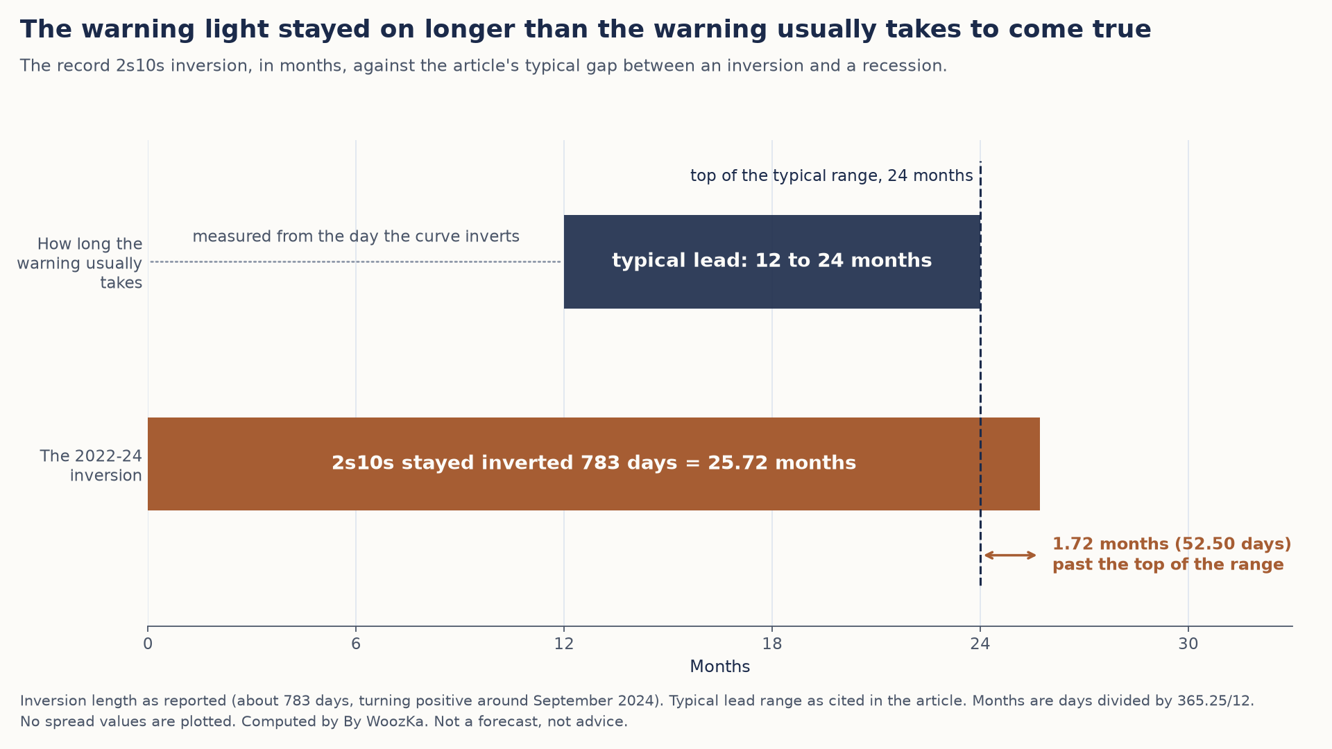 The inversion alone lasted longer than the longest typical wait between an inversion and a recession, which is why the curve works as a warning but not as a timer.
Which Curve You Watch Moves the Signal
The article notes that the 2-year and 3-month versions can disagree, and leaves the size of the disagreement unstated. Both dates below are approximate in the source text — “around” September and “into” December — so this is a check on scale, not a dated claim.
| Item | Value |
|---|---|
| 2s10s turned positive | around September 2024 |
| 3m10y ran negative until | December 2024 |
| Approximate difference | 3 months |
| Share of a 12-month lead | 25.00% |
| Share of a 24-month lead | 12.50% |
Three months is 12.50% to 25.00% of the entire 12-to-24-month window the signal is measured in. So the answer to the article’s own question — which curve? — is not a technicality: choosing one spread over the other can shift the starting line by up to a quarter of the whole window, before any argument about the economy begins. An indicator whose clock can be moved that far by the choice of which version to read is one to hold loosely, which is exactly the article’s advice.
How Far “Positive” Sits From “Normal”
The section above publishes two yields and a typical range, and never subtracts them. The subtraction is worth doing, because “the curve has un-inverted” and “the curve looks healthy” turn out to be a long way apart.
| Item | Value |
|---|---|
| 10-year, July 2, 2026 | 4.49% |
| 2-year, July 2, 2026 | 4.14% |
| 2s10s spread | 35 bp |
| Typical expansion gap | 100–150 bp |
| Distance to that range | 65–115 bp |
| Spread as share of normal | 23.33–35.00% |
The spread the article describes as “still narrower” is 35 basis points, which is between 23.33% and 35.00% of the range it calls typical for a healthy expansion. To reach that range it would have to widen by 65 to 115 basis points — multiplying by 2.8571× to 4.2857×. That is the quantitative content of the article’s point that a return to a normal-looking curve is not the same as a return to a normal one, and it is why the un-inversion section reads the 2024 normalization as something to watch rather than to celebrate. It is also a single published day’s reading, which the article already tells you to re-check at the source before relying on.
Lead-time arithmetic: its inputs, and what it cannot tell you. Every input above is a figure this article already publishes and sources — the 12-to-24-month lead range, the 783-day inversion, the two approximate un-inversion dates, the July 2, 2026 yields of 4.49% and 4.14%, and the 100-to-150-basis-point expansion range — and every one of them is re-checked in code before the tables report it. Months are converted at 365.25 ÷ 12 days, which is why 24 months reads as 730.50 rather than 730. Nothing here forecasts a recession, dates one, or projects a spread; every figure describes something that has already been measured and published, and the arithmetic is subtraction and division on those figures. The two 2024 dates are approximate in the source and are used only for scale, never as a dated claim. The spread figure is one day’s snapshot and moves constantly — confirm the current shape at FRED, as the section above says. How the curve compares with other recession indicators, and the 2022–24 episode read across the whole dashboard, belong to the recession-indicators article already linked above and are deliberately not repeated here. No shipped calculator computes a yield spread, so nothing here comes from a tool and none is linked. Nothing above recommends any action, security, or allocation.
The Beginner’s Takeaway
An inverted yield curve is short-term interest rates paying more than long-term ones — a picture of a bond market betting on slower growth and lower rates ahead. It has an excellent historical record of preceding recessions, better than almost any rival signal, and there’s a plausible mechanism (squeezed bank lending) for why it might be more than luck. But its lead time is long and erratic, it doesn’t predict markets, it just produced a record-long false alarm in 2022–2024, and the reassuring un-inversion has historically sat closer to trouble than the scary inversion did.
Hold both halves at once — respect the signal, distrust the timing — and you’ll read the yield curve the way professionals actually do: as one meaningful piece of the economic weather, never as a clock. To see how these dynamics fit into the larger story of credit, debt, and expansion and contraction, the pillar for this section — The Economic Machine Explained — is the natural next read. For the weekly plain-English read on what the curve and the economy are actually doing, the newsletter is below.
Compare the four shapes: normal, flat, inverted and steep, side by side in the Economic Cycles Explorer — alongside the inversion’s real record, including at least one false signal and a lead time anywhere from six months to two years.
Disclaimer: This article is educational content, not financial advice. I am not a licensed financial advisor, and nothing here is a recommendation to buy or sell any security or asset. Investing and trading involve risk, including the possible loss of the money you invest. Do your own research and consider consulting a licensed financial professional before making investment decisions. Read the full Disclaimer.
Historical and backtested results are hypothetical, carry inherent limitations, and do not guarantee future results. Figures were accurate to the best of my knowledge as of this article’s last-updated date and may have changed.
