How to Analyze a Company Before You Buy the Stock
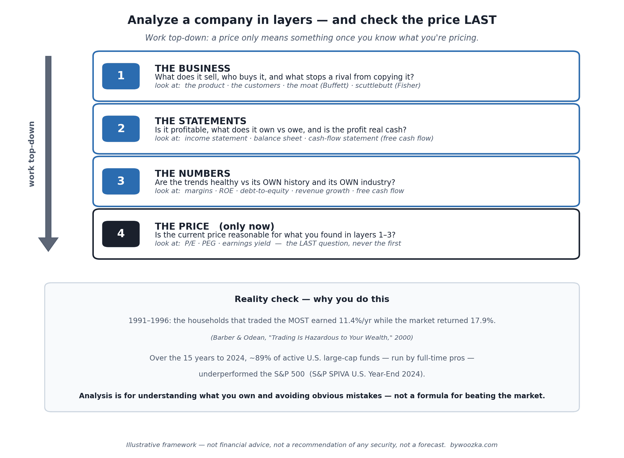
Analyzing a company is not a magic formula that grades a stock “buy” or “sell.” It’s a disciplined way of understanding a business well enough to know what you actually own — worked top-down, with the price checked last, not first. Illustrative framework, not advice.
Most people do this exactly backwards. They hear a ticker, glance at the price and maybe the P/E, decide it’s “cheap” or “expensive,” and buy. Actually analyzing a company means starting several steps earlier — with the business itself — and treating the price as the last question you ask, not the first.
This guide walks through that framework in the order a careful investor actually uses it: understand the business, read the three financial statements, check the handful of numbers that genuinely matter, and only then look at the price. It’s written for someone who has already opened a brokerage account and understands the basics — if you’re brand new, start with the pillar. And before we go a single step further, one honest disclaimer that shapes everything below.
First, a Reality Check About What This Can and Can’t Do
Analysis is genuinely useful, but it is not a money printer, and anyone who tells you otherwise is selling something. Two well-documented facts should set your expectations honestly.
First, individual investors who trade individual stocks a lot tend to underperform, not outperform. In the most-cited study of retail behavior, Brad Barber and Terrance Odean tracked 66,465 households at a large discount broker from 1991 to 1996. The households that traded the most earned an average annual return of 11.4%, while the market returned 17.9% over the same period; the average household earned 16.4% [source: Barber & Odean, “Trading Is Hazardous to Your Wealth,” Journal of Finance 55(2), 2000]. The gap wasn’t bad luck — it was mostly the cost and overconfidence of trading too much.
Second, this is a hard game even for professionals. According to S&P’s SPIVA scorecard, over the 15 years ending December 2024, roughly 89% of actively managed U.S. large-cap funds underperformed the S&P 500 — and over 10 years, about 84% did [source: S&P Dow Jones Indices, SPIVA U.S. Year-End 2024 Scorecard]. These are full-time analysts with Bloomberg terminals and research teams, and most still can’t beat a simple index fund over time.
So why analyze companies at all? Not to guarantee you’ll beat the market — you probably won’t, and neither will most pros. You do it to understand what you own, to avoid the obvious mistakes that wreck beginners (buying a business you can’t explain, or one quietly drowning in debt), and to make deliberate decisions instead of emotional ones. If that framing sounds too modest, it’s the honest one — and it’s also why, for most people, a low-cost index fund built on dollar-cost averaging is the sensible default, with individual stock analysis as the thing you layer on after you understand the base game. Nothing in this article is a recommendation to buy any particular stock.
With that settled, here’s the framework.
Layer 1: Start With the Business, Not the Ticker
Before a single ratio, ask the most basic question there is: what does this company actually do, and how does it make money? If you can’t explain the business to a friend in a couple of plain sentences — what it sells, who buys it, and why they keep coming back — you are not ready to analyze the stock. Peter Lynch, who ran Fidelity’s Magellan fund from 1977 to 1990, built an entire investing philosophy around “know what you own,” popularized in his 1989 book One Up on Wall Street [source: Peter Lynch, One Up on Wall Street; Fidelity].
The test in that last paragraph is one I failed with real money. Between 2018 and 2022 I ran 13F-tracking portfolios that rebalanced themselves, and I took positions simply because a name appeared in Berkshire Hathaway’s filings. Costco is the one I remember most clearly. I knew it as a good company that treated its staff well, and once the ticker showed up in a filing that vague impression was allowed to stand in for analysis. The sentence in my head was roughly good company, therefore it goes up eventually, and I bought about $3,000 of it. The position fell to around $2,200 — a loss of roughly 27% — and that is where I closed it. At no point in between could I have told you the actual thesis, or the number of years it was supposed to take. A filing shows you what somebody already did, published on a delay — the position could have been closed the day after it was disclosed. I hadn’t written down what would make me sell, so when the price moved against me there was nothing to hold on to.
The qualitative layer has a long pedigree. Philip Fisher’s 1958 classic Common Stocks and Uncommon Profits introduced the “scuttlebutt” method — learning about a company by talking to its customers, suppliers, competitors, and former employees rather than staring only at financial statements [source: Philip A. Fisher, Common Stocks and Uncommon Profits, 1958]. You may not interview a supply chain, but the modern equivalent is doable: read the company’s own product pages, use the product if you can, skim customer reviews, and check what competitors say about it.
The single most important qualitative question is about durability — what Warren Buffett popularized in his Berkshire Hathaway shareholder letters (starting in 1986) as an economic moat: a lasting competitive advantage that stops rivals from simply copying the business and competing away its profits [source: Warren Buffett, Berkshire Hathaway shareholder letters; Investopedia, “Economic Moat”]. Common moat sources are network effects, hard-to-replace brands or intangible assets, structural cost advantages, and high customer switching costs. A company with a real moat can defend its earnings for years; one without a moat is a candle in the wind, no matter how good this quarter’s numbers look. None of this is a claim that any particular company has or lacks a moat — that’s the judgment you have to make.
Layer 2: The Three Financial Statements (What Each One Answers)
Once you understand the business, you check whether the money story holds up. Every public company files three financial statements, and each answers a different question — you need all three, because any one alone can mislead you [source: standard financial accounting; SEC investor education; Investopedia, “Financial Statements”].
The income statement answers “Is it profitable?” It runs from revenue (sales) at the top down through costs to net income (profit) at the bottom — which is why profit is called “the bottom line.” It’s where earnings per share (EPS) comes from.
The balance sheet answers “What does it own, and what does it owe?” It’s a snapshot at a moment in time: assets on one side, liabilities (debt and obligations) and shareholders’ equity on the other. The two sides always balance, by construction. This is where you find how much debt the company is carrying.
The cash flow statement answers “Is the profit real cash?” — arguably the most important question of the three. Reported net income involves accounting judgments (when to recognize revenue, how to spread out the cost of equipment), so a company can post an accounting profit while cash is actually walking out the door. The cash flow statement strips that away and shows the actual cash moving in and out, split into operating, investing, and financing activities. The number professionals care about most is free cash flow (FCF) = operating cash flow − capital expenditures — the cash left over after the company pays to maintain and grow its asset base, which is the cash genuinely available to pay down debt, buy back shares, or pay dividends [source: Corporate Finance Institute, “Free Cash Flow”; Investopedia]. A business whose reported profits keep rising while free cash flow stagnates deserves a hard second look.
Layer 3: The Numbers That Actually Tell You Something
Now — and only now — the ratios. There are hundreds; you need a handful, and every one of them is a question, not a verdict. The same discipline from the sibling article on the P/E ratio applies to all of them: a number only means something in comparison — to the company’s own history and to its own industry — and no single figure grades a stock for you.
Profitability — how much of each sales dollar becomes profit? Gross, operating, and net margins (each a type of profit divided by revenue) tell you whether the business is efficient and whether that efficiency is improving or eroding over time. Return on equity (ROE) = net income ÷ shareholders’ equity measures how much profit the company generates on the money shareholders have invested [source: Corporate Finance Institute / Investopedia, “Return on Equity”]. But read ROE carefully: a company can inflate it simply by taking on a lot of debt (which shrinks equity), so a sky-high ROE next to a heavy debt load is a warning, not a gold star. High profitability that comes from a moat is durable; high profitability that comes from leverage is fragile.
Financial strength — can it survive a bad year? The debt-to-equity ratio (total liabilities ÷ shareholders’ equity) shows how leveraged the business is; the current ratio (current assets ÷ current liabilities) shows whether it can cover its near-term bills; and interest coverage shows whether operating profit comfortably exceeds interest payments [source: standard financial-ratio definitions; Investopedia]. What counts as “high” debt varies enormously by industry — a utility carries debt a software company never would — which is exactly why you compare within an industry, never across.
Growth — is the business getting bigger, and is it real? Revenue growth and earnings growth over several years tell you whether you’re looking at an expanding business or a shrinking one dressed up by share buybacks. Multi-year trends matter far more than any single quarter.
Cash generation — does the profit turn into cash? Back to free cash flow: a company that reliably converts earnings into free cash flow has options; one that doesn’t is dependent on markets staying friendly.
The point of Layer 3 isn’t to compute every ratio and average them into a score. It’s to build a picture: profitable, strengthening or weakening, appropriately or dangerously financed, growing or shrinking, and generating real cash or not. Any one number can be gamed; the pattern across all of them is much harder to fake.
Layer 4: Only Now, the Price
Notice how far we’ve come without once looking at whether the stock is “cheap.” That’s deliberate. Valuation is the last step, not the first, because a price only means something once you know what you’re pricing. A wonderful business can be a terrible investment if you overpay for it, and a mediocre business can be a fine one at a low enough price — but you can’t judge either until Layers 1 through 3 are done.
This is where the familiar valuation ratios finally come in — P/E, PEG, earnings yield, price-to-book, price-to-sales — all covered in more depth in What Is a P/E Ratio and How Do You Actually Use It?. The one-line version, which applies to all of them: a high multiple can mean the market expects growth or that earnings just collapsed; a low multiple can mean a bargain or a business the market expects to deteriorate (the “value trap”). The multiple is a question about why the price is where it is, answered by everything you learned in the first three layers — not a standalone buy or sell signal.
Graham and Dodd, whose 1934 Security Analysis founded this whole discipline, gave the price step its most useful safeguard: the margin of safety — the idea that you should only buy when the price is meaningfully below your honest estimate of the business’s worth, so that being wrong (and you will sometimes be wrong) doesn’t ruin you [source: Benjamin Graham & David Dodd, Security Analysis, 1934; Graham, The Intelligent Investor, 1949]. The margin of safety isn’t a formula that spits out a target price; it’s an admission that your analysis is uncertain, built into how you buy.
Layer 3, Actually Computed
Layer 3 promises the numbers that tell you something and then names them without running one. It also makes a claim in passing that is precise enough to check: that a company can inflate its return on equity simply by borrowing, so that high profitability from a moat is durable while high profitability from leverage is fragile. That is true, and it is measurable from the definitions already given above — return on equity, debt-to-equity, interest coverage, and the balance sheet identity that assets equal liabilities plus equity. Nothing new is needed. Here is what those definitions imply.
The business below is stipulated, not observed, and describes no real company: total assets of $1,000, operating profit of $120 before interest and tax, debt costing 6%, and a 25% tax rate. What changes from row to row is only the split between borrowed money and owners’ money. The operating business is identical in every row — same assets, same operating profit, same everything a customer would notice.
The Same Business, Three Balance Sheets
| Debt-to-equity | Net income | ROA | ROE | From leverage |
|---|---|---|---|---|
| 0.00 | $90.00 | 9.000% | 9.000% | 0% |
| 1.00 | $67.50 | 6.750% | 13.500% | 50% |
| 3.00 | $56.25 | 5.625% | 22.500% | 75% |
Return on equity runs from 9% to 22.5% — two and a half times — across three companies doing exactly the same thing. That alone is the warning above, priced. But the second column is the part worth sitting with: net income falls as return on equity rises, $90.00 down to $56.25, a drop of 37.5%. The company posting the most impressive ROE is the one earning the least money. Return on assets, which the borrowing cannot flatter, moves in the opposite direction to ROE the whole way down the table.
The last column is an exact identity rather than a feature of these particular numbers, and it is the most useful single thing here. The share of a company’s ROE that comes from leverage rather than from the business is exactly the share of its assets that was borrowed. Debt at half the balance sheet means half the ROE is financing; debt at three quarters means three quarters of it is. That holds whatever the margins, the tax rate or the interest rate happen to be, which means it is usable in the other direction: given a headline ROE and a debt-to-equity ratio, you can strip the financing out of the number in your head, and what is left is the part a moat would have to explain.
Can It Survive a Bad Year?
That question is asked above and answered with three ratio names. It has an arithmetic answer. Hold the three balance sheets fixed and put all three through an identical bad year, letting operating profit fall by the amount in the first column.
| Operating fall | No debt | D/E 1.00 | D/E 3.00 |
|---|---|---|---|
| 0% | 9.00% | 13.50% | 22.50% |
| 20% | 7.20% | 9.90% | 15.30% |
| 40% | 5.40% | 6.30% | 8.10% |
| 50% | 4.50% | 4.50% | 4.50% |
| 60% | 3.60% | 2.70% | 0.90% |
Read across the 40% row first. The same operating decline costs the debt-free owner 40.0% of their ROE, the moderately financed owner 53.3%, and the heavily financed owner 64.0%. Those are not rough proportions: the amplification is exactly operating profit divided by operating profit minus interest, which is 1.0000, 1.3333 and 1.6000 for the three rows, and 40% multiplied by each gives the three figures precisely. The multiplier that flatters return on equity in a good year is the identical multiplier that punishes it in a bad one. Interest coverage records the same thing in the article’s own units, falling from 4.00x to 2.40x for the moderate balance sheet and from 2.67x to 1.60x for the heavy one.
Now read down to the 50% row, where all three columns show the same 4.50%. That crossing is not a coincidence of the inputs. It sits exactly where the business’s return on its assets falls to 6% — the rate the debt costs. Leverage adds to return on equity only while the business earns more on its assets than its borrowing costs, and subtracts below that point. One row further down, at a 60% decline, the ranking has fully inverted and the heavily financed company earns 0.90% against the debt-free company’s 3.60%. This is what “fragile” means with a number attached, and it also explains the honest half of the picture: for the first three rows the leveraged company still shows the best ROE. Leverage does not look like a mistake until the year it does.
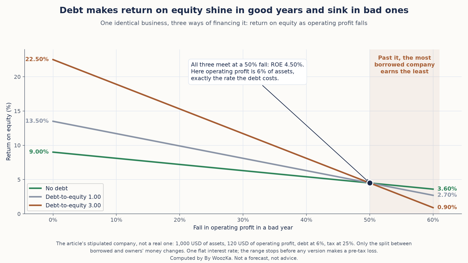
The borrowing that lifts return on equity in a good year makes it fall faster in a bad one. All three versions meet where the business earns exactly what its debt costs, and below that point the ranking flips.
One Decision, Three of These Ratios
Layer 3 closes by saying that any one number can be gamed but the pattern across all of them is much harder to fake. That is worth testing, because the ratios are not independent of each other. Take the debt-free company above and have it do one ordinary thing: borrow $250 and use it to buy back a quarter of its shares.
| Measure | Before | After | Change |
|---|---|---|---|
| Earnings per share | $0.90 | $1.05 | +16.7% |
| Return on equity | 9.00% | 10.50% | +16.7% |
| Net income | $90.00 | $78.75 | -12.5% |
| Debt-to-equity | 0.00 | 0.33 | up |
| Interest coverage | none | 8.00x | new |
| Operating profit | $120.00 | $120.00 | none |
Earnings per share and return on equity rise by the same 16.7%, and they are the same number rather than two similar ones, because the buyback cut both denominators — share count and equity — by an identical quarter. Growth improves. Profitability improves. Meanwhile net income actually fell 12.5% and operating profit did not move by a cent. Three of Layer 3’s four categories moved from a decision that changed nothing whatsoever about the business, and two of them moved in the flattering direction.
So the pattern is somewhat easier to fake than it sounds, because the ratios share denominators and a single financing choice reaches several at once. The category that stayed put is cash generation — the fourth one, and the one the cash flow statement measures. That is the same conclusion Layer 2 reaches from the opposite direction when it calls free cash flow arguably the most important question of the three, and it is worth noticing that the two arguments meet: the number hardest to move with a financing decision is the number worth trusting. It is also, precisely, the red flag of rising reported profits alongside stalling cash, produced here on purpose in a company where nothing operational happened at all.
Which definitions this section runs on, and what it assumes about the company. Every definition used above is this article’s own: return on equity as net income over shareholders’ equity, debt-to-equity as total liabilities over shareholders’ equity, interest coverage as operating profit over interest, and assets equal to liabilities plus equity. The company is stipulated and describes nobody — but the three headline results are identities, not artifacts of the inputs, and the script proves each of them across 324 combinations of assets, financing mix, profitability, interest rate and tax rate rather than only at the numbers printed here. Interest is charged at one flat rate, where real debt is laddered and repriced, and that makes a bad year worse rather than better. The decline scenarios stop before any financing produces a pre-tax loss, deliberately, so that no convention about taxing losses is quietly doing work in the worst row. The buyback retires shares at book value; paying above book makes the earnings-per-share gain smaller, not larger, so that row is the conservative version too. Nothing here models a share price, and no result depends on one. The calculation behind these tables uses exact fractions, reports every figure above, and confirms the one number this article computes for itself — the position that went from $3,000 to $2,200, described as roughly 27% — re-derives before it reports anything. At 26.67%, it does.
A Short Field Guide to Red Flags and Green Flags
Analysis is as much about what makes you walk away as what makes you interested. A few recurring signals, offered as things to investigate rather than automatic conclusions:
Things that warrant caution: rising reported profits while free cash flow stalls or falls; debt climbing faster than the business; margins quietly eroding year after year; revenue that only grows through acquisitions; a business so complicated you can’t explain how it makes money; and heavy dependence on a single customer, product, or supplier. On the encouraging side: a durable moat you can actually name, consistent free-cash-flow generation, a strong balance sheet that could survive a downturn, honest and clear financial reporting, and management that has skin in the game. None of these is a guarantee — they’re the questions a careful analysis keeps asking.
The Honest Limits of All This
Do all four layers well and you will genuinely understand a company far better than the person who bought it off a hot tip. What you will not have is a guarantee, or even an edge over the market — because thousands of professionals are running the same analysis on the same companies, and, as the SPIVA data above shows, most of them still underperform a plain index fund over time.
That’s not a reason to skip the work; it’s a reason to be clear-eyed about why you’re doing it. Analyze companies to know what you own, to avoid the mistakes that hurt beginners most, and to invest deliberately instead of emotionally. For the core of most people’s money, the humble default — broad, low-cost index funds bought steadily over time — quietly beats most stock-pickers anyway, which is a feature, not a failure. Individual company analysis is best treated as something you do with a portion of your money, with your eyes open, once the boring base is already in place.
The natural next steps in this section build directly on this one: What Is a P/E Ratio and How Do You Actually Use It? goes deep on the valuation layer, How to Read an Earnings Report Without an MBA shows you where the statement numbers actually come from, and The Difference Between Trading and Investing frames how much any single analysis should drive your decisions. The weekly plain-English newsletter below is where these ideas get connected over time.
Disclaimer: This article is educational content, not financial advice. I am not a licensed financial advisor, and nothing here is a recommendation to buy or sell any security or asset. Investing and trading involve risk, including the possible loss of the money you invest. Do your own research and consider consulting a licensed financial professional before making investment decisions. Read the full Disclaimer.
Historical and backtested results are hypothetical, carry inherent limitations, and do not guarantee future results. Figures were accurate to the best of my knowledge as of this article’s last-updated date and may have changed.
