Will That Dividend Get Cut? A Field Guide to Dividend Safety
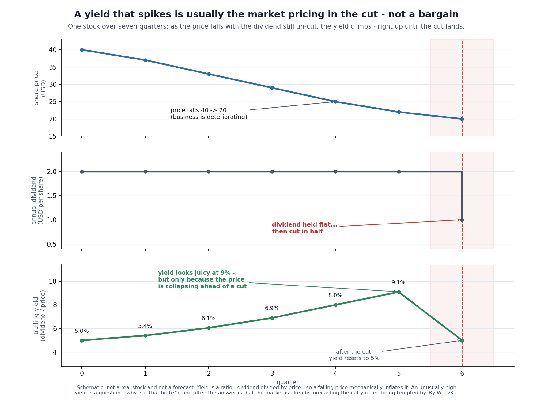 The pattern that catches income investors over and over. The price is falling because the business is deteriorating; the dividend hasn’t been cut yet, so the yield climbs and looks more and more tempting — until the cut arrives and the yield snaps back. The juicy 9% was never spendable. It was a warning.
If you invest for income, the question that should keep you up at night isn’t “which stock has the highest yield?” It’s “which of these dividends is actually going to survive the next bad year?” Those are completely different questions, and confusing them is the single most expensive mistake in dividend investing. A dividend that gets cut usually takes the share price down with it, so you lose on both ends: less income and a smaller pile.
Most people who get burned reaching for income didn’t pick a stock with an obviously reckless payout. They picked one that looked fine — a household name, a fat yield, a long history of paying — and never asked the follow-up question the featured chart is built around: why is that yield so high? This piece is the honest version of how you answer that. It’s a diagnostic, not a stock screen and not a list of names to buy. And I’ll be clear from the start about its limit: no amount of analysis can guarantee a dividend holds, because in the end a dividend is a choice a board makes every quarter, not a contract. What the diagnostic buys you is the ability to tell a payout resting on cash from one resting on hope.
I learned this one by getting it wrong, and not just once. When prices collapsed at the start of the pandemic, companies that had paid 1% or 2% before COVID were suddenly showing 7%, 8%, even 10%, and I went hunting. The screens looked wonderful. I told myself I was buying a high yield in a stable business — which is precisely the sentence this article exists to take apart. A number of those payouts were cut anyway, and some were stopped altogether, because the pandemic had changed the business or the future earnings were no longer there to fund the dividend. The yield had not become generous. The price had fallen because the market already doubted the payout, and I was reading the symptom as the opportunity.
Then I made the second mistake, which cost more than the first. As the prices kept falling I sold at a loss, without any real view on whether the company would recover — because I did not have a view at all. I had bought a number, not a business. I was investing with a gambler’s mindset in that period, and it showed the moment a position moved against me: money with no roots gets shaken out easily. The checks below are worth running. They are also not much use if the reason you are holding something is that a screener sorted a column.
A Yield Is a Ratio, and That Changes Everything
Start with the arithmetic, because it explains most of the trouble. A dividend yield is just the annual dividend divided by the price. Two moving parts, one of which — the price — you don’t control and which moves every second.
That means a yield can climb for two completely opposite reasons. It can rise because the company keeps increasing the dividend while the price sits still: good. Or it can rise because the price is falling while the dividend stays put: often very bad. The number on the screen looks identical either way. A 9% yield tells you nothing about which story you’re in until you look at what the price has been doing.
The featured chart shows the bad version in slow motion. The business is deteriorating, so the price slides from 40 down toward 20. The dividend hasn’t been touched, so as the denominator shrinks, the yield mechanically inflates — 5%, 6%, 8%, 9%. To someone screening for income, quarter five looks like the opportunity of the year. Then the cut lands, the dividend halves, and the yield drops right back to where it started. The high yield was never a gift the market was handing you. It was the market’s forecast of the cut, showing up in the price before it showed up in the dividend. When a yield is a big outlier — well above what similar companies pay — the base case isn’t “free money the market missed.” It’s “the market is pricing in a problem you haven’t found yet.”
The Payout Ratio: Necessary, Not Sufficient
The first real diagnostic tool is the payout ratio — the share of earnings a company pays out as dividends. If a company earns 5 dollars a share and pays 2, that’s a 40% payout ratio, and it means most of the profit is being retained. A payout ratio comfortably under about 60% generally signals room to keep paying even if earnings dip; a ratio pushing past 100% means the company is paying out more than it earns, which is rarely sustainable for long [source: standard financial-analysis definition; Investopedia dividend-payout-ratio explainer].
That’s a genuinely useful first filter, and it’s where most beginners stop. The problem is that the payout ratio uses reported earnings, and earnings are an accountant’s number, not a bank balance. They include non-cash items — depreciation, one-time charges, all sorts of adjustments — that can make profit look healthier or sicker than the actual cash moving through the business. A dividend is paid in cash, not in earnings. So a payout ratio that looks safe on earnings can be hiding a payout that isn’t safe on cash.
The trap, with the arithmetic showing
Both of those ideas — the yield that climbs because the price is falling, and the payout ratio as a first filter — are exact rather than approximate. A yield is a ratio and a payout ratio is a ratio, so what each one implies follows from arithmetic rather than judgment. It is worth seeing the numbers, because they are more unforgiving than the prose.
This is not a forecast and it names no company. No market data is used and nothing here predicts whether any dividend will be cut. The figures are inputs chosen to show the shape of the problem.
Start with a share paying a 3% yield and hold the dividend fixed. Let only the price fall, then apply a cut:
| Price falls | Yield now “shows” | After a 25% cut | After a 50% cut | After a 75% cut |
|---|---|---|---|---|
| 20% | 3.75% | 2.81% | 1.88% | 0.94% |
| 40% | 5.00% | 3.75% | 2.50% | 1.25% |
| 50% | 6.00% | 4.50% | 3.00% | 1.50% |
| 67% | 9.09% | 6.82% | 4.55% | 2.27% |
The second column is the whole trap in one line: the company has not paid a cent more. A 3% yielder that loses 67% of its value advertises 9.09% while writing exactly the same check. The yield did not rise; the denominator collapsed.
Two exact consequences follow, and both are worth carrying around.
A cut of the same size as the price fall returns the yield precisely to where it started. Not roughly — exactly. Drop 67% of the price and cut 67% of the dividend and you are back at 3%. That is the “snaps back” described above, and it is the arithmetic reason the high yield was never a discount.
Buying at the elevated yield does not protect you. Whatever price you paid, a cut of c leaves you with (1 − c) of the income you expected. Someone who buys the 9.09% and then takes a 50% cut is left holding 4.55% on their purchase price — worse than the boring 3% they passed over, on a business that has meanwhile got worse. Getting in late does not change the size of the cut; it only changes who absorbs it.
What a payout ratio actually buys you
The thresholds above — comfortable under about 60%, trouble past 100% — are usually quoted without saying what they mean. What they mean is room. The payout ratio has an exact reading: how far earnings can fall before they no longer cover the dividend at all.
| Payout ratio | Earnings cover the dividend | Earnings can fall this far | Margin |
|---|---|---|---|
| 30% | 3.33× | 70% | wide margin |
| 40% | 2.50× | 60% | wide margin |
| 60% | 1.67× | 40% | wide margin |
| 75% | 1.33× | 25% | thin margin |
| 90% | 1.11× | 10% | thin margin |
| 100% | 1.00× | none | no margin at all |
| 120% | 0.83× | none | already uncovered |
So “under 60%” is not a convention. A 60% payout is the point at which a company can lose 40% of its earnings and still, arithmetically, cover the dividend. At 90% that cushion is down to 10% — an ordinary bad year, not a catastrophe. At 100% there is none left, which is why the number is treated as a line.
One thing this table cannot tell you, and it matters. Headroom is about coverage, not intent: it says nothing about whether management will choose to cut, and plenty of boards cut long before earnings fall that far, while others keep paying past 100% for years by borrowing. It is also computed on reported earnings — an accountant’s number, not a bank balance — which is exactly the limitation the next section takes up. Read it as the ceiling on how much bad news the reported figure absorbs, and then go and check the cash.
Method, so it can be checked rather than taken on trust: yield is dividend ÷ price, so a price fall of x multiplies it by 1 ÷ (1 − x) and a subsequent cut of c multiplies it by (1 − c); coverage is 1 ÷ payout ratio and the headroom is 1 − payout ratio. The script re-derives every cell from explicit dollar amounts rather than the formulas, and separately asserts that a cut equal to the price fall restores the starting yield exactly, that the realized yield is always (1 − c) times the advertised one, and that at the headroom limit earnings equal the dividend to the cent. The figures above are that code’s output rather than numbers entered by hand.
How Often the Flag Is Actually Flying
Everything above is arithmetic on invented inputs, deliberately: the tables say so, and a threshold is easier to understand when no real company is arguing with it. But the thresholds raise a question they do not answer. If a payout past 100% is rarely sustainable, how many high-yield payers are sitting past it right now — and how many are in the comfortable zone this article describes?
That question has an answer, and it can be assembled from public filings rather than asserted. What follows counts 177 US-listed companies whose regular declared dividend was worth at least 5% of their share price on September 15, 2026, funds excluded. Earnings per share and declared dividends come from each company’s own SEC filings; no company is named, nothing here is a forecast, and a payout above 100% is a description of one moment, not a prediction that a dividend will be cut.
The Comfortable Zone Is the Minority
Sorted into this article’s own three bands, with a fourth the article has no band for — companies whose earnings are zero or negative, where no payout ratio exists at all:
| Payout | All | Non-REIT | REIT |
|---|---|---|---|
| Under 60% | 11% | 20% | 6% |
| 60–100% | 16% | 21% | 13% |
| Over 100% | 43% | 29% | 49% |
| No earnings | 29% | 30% | 31% |
| Companies | 177 | 76 | 77 |
Two things fall out of that table, and the second is the one worth carrying around.
The first is the missing near-third of the universe. 29% have no positive earnings at all, which means the payout ratio — the diagnostic this whole section is built on — cannot be computed for them. They are not the safe ones. A company paying a dividend out of no earnings is further along the road this article describes than one at 120%, and it is invisible to the first check most people run. Every percentage quoted “among companies reporting a payout ratio” is therefore flattering by construction, this article’s own included.
The second is that the comfortable zone is the smallest zone of all. Barely a tenth of these companies sit under the 60% mark this article calls comfortable, and only about a quarter are covered by earnings at any level. The reassuring case, in other words, is the exception among high yielders rather than the base case — which is worth knowing before reading a single payout ratio, because it sets what the number is likely to say before you look it up.
Where the Yield Itself Starts to Matter
The article says a yield the market has marked well above a company’s peers is a red flag on its own. Sorting the non-REIT companies by the size of the yield puts a number on where that begins to bite:
| Yield | Companies | Uncovered or no earnings | Median payout |
|---|---|---|---|
| 5–6% | 23 | 35% | 78.4% |
| 6–8% | 25 | 48% | 62.9% |
| 8–10% | 9 | 78% | 107.7% |
| 10–15% | 13 | 92% | 219.3% |
| Above 15% | 6 | 100% | 548.4% |
The share rises without a single reversal, from roughly a third to all of them. But read the median column rather than the headline, because it says something the blanket warning does not: at 5–8% the typical payout is inside this article’s comfortable range — 78.4% and 62.9%, both under the 100% line and the second of them close to the 60% mark. A 6% yield is not, by itself, evidence of a company in trouble. Above 8% the median crosses 100% and then leaves it behind entirely: by the top band the typical company is paying out more than five times what it earns, which is a different kind of number and a different kind of situation.
The two smallest rows carry nine and six companies, so treat their percentages as a direction rather than a measurement. The direction is not subtle.
The Denominator Problem, in the Open
REITs look far worse on this test than everyone else — 49% past 100% against 29% — and the reason is the one this article raises a few paragraphs above: earnings are an accountant’s number. Real estate carries large depreciation charges under GAAP, and the industry’s own supplemental measure exists precisely because of them: Nareit created funds from operations in 1991 “to address the artificial nature of historical cost depreciation and amortization of real estate,” and FFO is net income with real estate depreciation and amortization, and gains or losses on property sales, taken out [source: Nareit, “Funds From Operation (FFO)” glossary entry]. The SEC accepts that Nareit definition as a performance measure in its non-GAAP guidance [source: SEC Division of Corporation Finance, Non-GAAP Financial Measures C&DI, Question 102.01]. A REIT is also required to distribute most of its taxable income to keep its tax status at all, which REITs Explained covers. Running the earnings-based payout ratio across REITs, then, does not measure their dividend safety so much as demonstrate the limitation. The ratio is not wrong; it is being asked a question its denominator cannot answer.
Among the companies that are covered, the coverage is not marginal. The median non-REIT in that group pays out 62.0%, which in this article’s terms is 38.0 points of headroom — earnings could fall by well over a third before the dividend stopped being covered at all. So the picture is not a spectrum running gently from safe to stretched. It is one small group with real room and a much larger one with none.
Method and limits, so this can be checked rather than taken on trust. The universe is a stock screen — US-listed common shares yielding over 5%, funds and closed-end funds excluded — which selects which companies are examined and contributes nothing else except the share price. Every per-share figure is from SEC XBRL company filings: earnings per share is the trailing four quarters, deriving the fourth quarter from the annual figure where a company does not report one separately, and the dividend is the regular declared payment annualized, so a one-off special payment does not inflate it. REIT status is SEC’s own SIC code 6798, not a vendor label. The calculation behind the tables checks every value before it is reported, including this article’s own coverage and headroom arithmetic. Three limits matter. The screen returned 293 companies; 197 have filings this method can read, and 177 of those still yield at least 5% once the yield is rebuilt from the filings themselves rather than taken from the screen — the other 20 are mostly companies whose large payment is a one-off special. The 96 with unreadable filings are disproportionately trusts, partnerships and foreign filers, so these figures describe filers with usable XBRL data, not the whole market. Payout ratios are computed on reported earnings, which is exactly the limitation the next section takes up — the cash test would classify some of these companies differently, in both directions. And this is a single day’s snapshot: it counts how many companies are past a threshold now, and says nothing about which of them will cut, or when, or whether the comfortable ones stay comfortable.
Check the Cash, Not Just the Earnings
This is the upgrade that separates a careful income investor from a yield-chaser, and it’s the point of the next chart.
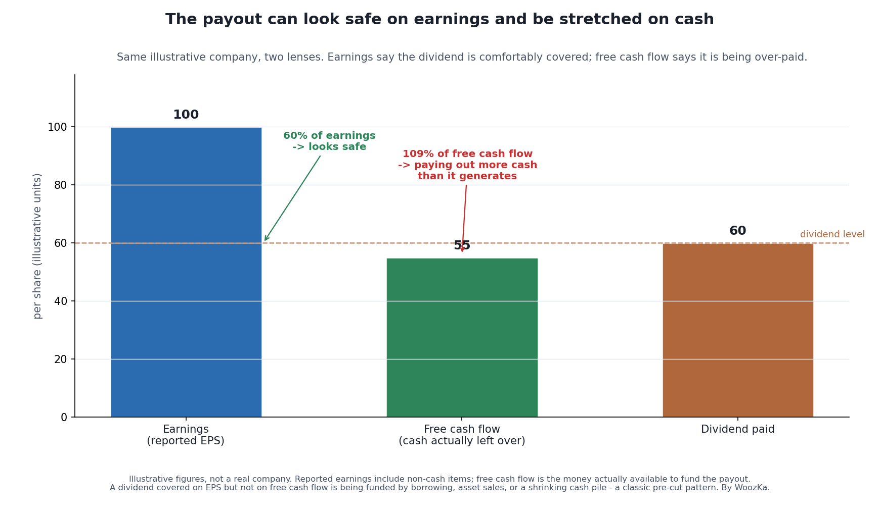 Two lenses on one payout. On reported earnings the dividend looks well covered at 60%. On free cash flow — the cash actually left after the company runs and reinvests in itself — the very same dividend is 109%, meaning it’s being funded by something other than this year’s operations: borrowing, asset sales, or a shrinking cash balance. That gap between “covered on earnings” and “uncovered on cash” is where a lot of cuts are hiding in plain sight.
Free cash flow is the cash a business has left after paying for its operations and the capital spending it needs to keep running. It’s a much harder number to dress up than earnings, and it’s the pool the dividend actually comes out of. When a company is paying out more in dividends than it generates in free cash flow, that shortfall has to be plugged somehow — by borrowing, by selling assets, or by draining the cash pile. None of those can go on forever. A payout that’s covered on earnings but not on free cash flow, year after year, is one of the most reliable pre-cut patterns there is, and it’s invisible to anyone who only checks the earnings-based payout ratio.
I’ll admit this is more work than glancing at a yield, and for a lot of people that’s exactly the argument for owning a diversified dividend fund instead of hand-picking payers — more on that below. But if you are going to hold individual dividend stocks, the free-cash-flow check is the one I’d least want you to skip.
The Balance Sheet Is Often the Real Tell
Earnings and cash flow describe this year. The balance sheet describes how much room the company has when a bad year shows up — and that room, or the lack of it, is frequently what actually decides whether a dividend survives.
The cleanest real example I know is General Electric, because for decades its dividend looked about as safe as a dividend could look. GE was a blue-chip institution; income investors treated the payout as close to a law of nature.
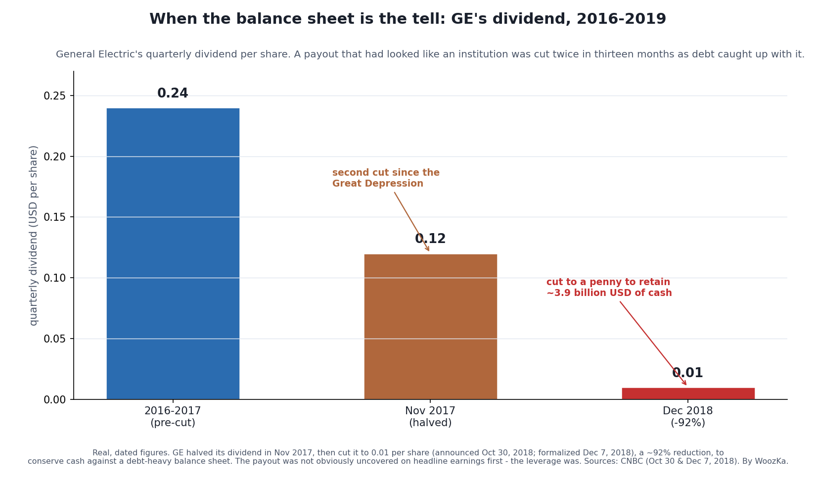 A blue-chip dividend cut twice in thirteen months. GE didn’t fail a simple earnings-payout test on the way down so much as run out of balance-sheet room — years of debt and troubled divisions left no cushion, and the dividend was one of the biggest cash outflows management could stop. When you’re judging a payout, “can they afford it in a good year?” matters far less than “what happens to it in a bad one?”
GE halved its dividend in November 2017 — only the second cut since the Great Depression — and then, in the autumn of 2018, slashed it to a single penny per share, a roughly 92% reduction that let the company hold on to about 3.9 billion dollars of cash [source: CNBC, “General Electric slashes quarterly dividend to just a penny a share,” Oct 30, 2018, and “GE makes it official, lowers dividend to a penny,” Dec 7, 2018 — verified via web search 2026-07-27]. The lesson isn’t “avoid GE.” It’s that a company carrying a lot of debt has far less freedom to protect its dividend when earnings wobble, because lenders get paid before shareholders do, and the dividend is one of the largest discretionary cash outflows a board can switch off in a hurry. A pristine income statement sitting on top of a stretched balance sheet is not a safe dividend. It’s a dividend that’s safe until the first hard year.
A related, quieter trap is cyclicality. A company at the peak of its cycle — a miner, an automaker, an energy producer when prices are high — can show a gorgeous payout ratio precisely because this year’s earnings are unusually fat. Divide the dividend by peak earnings and it looks bulletproof. Then the cycle turns, earnings fall by more than half, and the same dividend that was 40% of peak earnings is suddenly 120% of trough earnings. The payout didn’t change; the denominator did. Cyclical dividends need to be judged against mid-cycle earning power, not the best year on record.
A Checklist You Can Actually Use
Pull those threads together and you get a short set of questions to run before you trust any payout. None of them is a pass/fail gate on its own — they’re more useful as a picture of how much stress a dividend could take before it breaks.
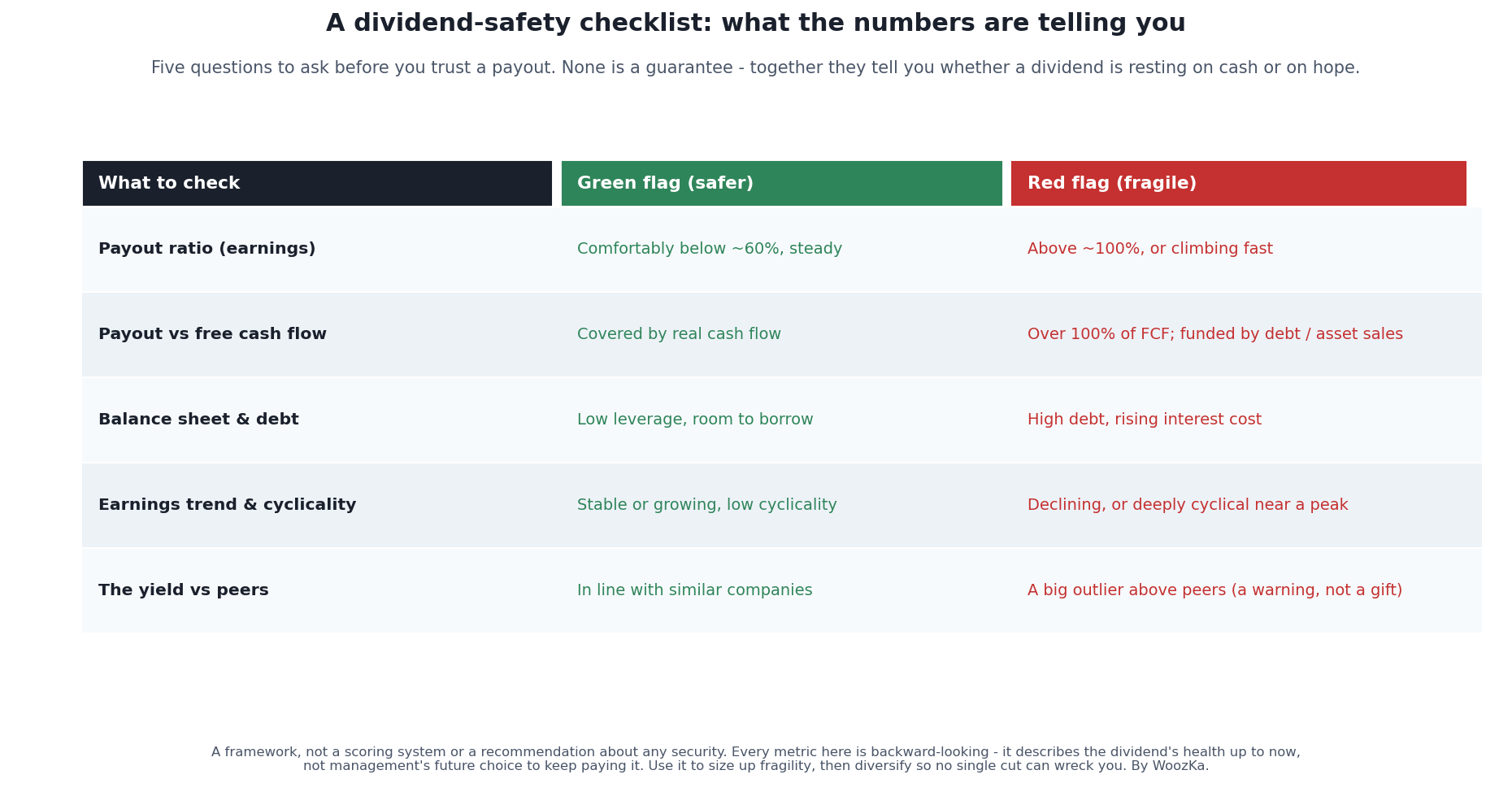 The whole diagnostic on one page. Read down the red-flag column and you’re basically describing the setup before most dividend cuts: a payout that’s stretched on cash, propped up by debt, resting on earnings that are falling or unusually high, and a yield the market has already marked well above the company’s peers. One red flag isn’t a verdict; three or four together is the market trying to tell you something.
| What to check | Green flag | Red flag |
|---|---|---|
| Payout ratio on earnings | Comfortably below about 60%, and steady | Above about 100%, or climbing fast |
| Payout vs. free cash flow | Covered by real cash flow | Over 100% of free cash flow — funded by debt or asset sales |
| Balance sheet and debt | Low leverage, with room to borrow | High debt and a rising interest cost |
| Earnings trend and cyclicality | Stable or growing, with low cyclicality | Declining, or deeply cyclical near a peak |
| Yield vs. peers | In line with similar companies | A big outlier above peers |
Notice what the checklist is and isn’t. It’s a way to judge fragility — how much a dividend depends on everything continuing to go well. It is emphatically not a scoring system that spits out a buy or a promise. Every single item on it is backward-looking. It describes the dividend’s health up to today; it can’t see the strategic decision a board might make next quarter. Which is the honest limitation I want to spend the rest of this on.
The Honest Limits of Any Safety Analysis
Here’s the part most “is this dividend safe?” articles skip, and it’s the most important part.
First, a covered dividend can still be cut. Sometimes management chooses to cut a perfectly affordable dividend because they’ve decided the cash is better spent elsewhere. That’s essentially what AT&T did in early 2022: it cut its dividend from about 2.08 to 1.11 per share — nearly in half — not because it couldn’t scrape the cash together, but because it was reshaping the whole company around the WarnerMedia spinoff and wanted to redirect billions toward paying down debt and reinvesting in the business [source: CNBC, “AT&T to spin off WarnerMedia… cuts dividend,” Feb 1, 2022 — verified via web search 2026-07-27]. Shareholders who’d owned it purely for that high, “reliable” telecom yield got a strategic reset instead. No coverage ratio predicts that, because it isn’t a coverage problem — it’s a choice. A dividend is a decision a board renews every quarter, and diagnostics measure capacity, not intent.
Second, the diagnostic cuts both ways, and being too cautious has a cost too. If you treat every above-average yield as a trap and every bit of debt as disqualifying, you’ll skip plenty of perfectly sound dividends and steer yourself into a portfolio of low-yielding “safe” names that may not actually give you the income you were after. There’s no free lunch in the other direction either. The goal isn’t to eliminate every risk — it’s to make sure you’re being paid for the risk you take, and that you’re not mistaking a value trap for a bargain.
Third, and this is the reflection I keep coming back to: for a long time I thought the skill in dividend investing was finding the highest yield I could talk myself into trusting. It isn’t. The actual skill is boring — it’s checking whether the cash is really there, refusing to be seduced by a number that’s high for a reason, and then diversifying enough that no single cut can hurt you much. That last part quietly does more work than any analysis. A broad dividend fund holds hundreds of payers; when one cuts — and some always will — it’s a rounding error, not a crisis. Concentrate your income in a handful of high-yielders you’re sure are safe, and you’re one surprise announcement away from a bad year. The most reliable protection against a dividend cut isn’t perfect foresight. It’s not needing perfect foresight.
If you take one thing from this, make it the reframe at the top: a high yield is a question, not an answer. Run the question through the payout ratio, the free-cash-flow check, and the balance sheet before you let the number tempt you — and then diversify enough that being wrong about any one of them doesn’t matter much. That’s not as exciting as spotting a 9% yield nobody else noticed. It’s just what actually keeps the income coming.
Where to Go Next
Dividend safety is one piece of a bigger income picture; these cover the rest:
- Dividend Investing 101 — how dividends actually work, the ex-dividend mechanic, and the basics this article builds on.
- Dividend Growth vs High Yield — why a lower, growing dividend often beats a high, static one, and how that changes what “safe” means.
- How to Actually Draw Income From a Portfolio: Total Return vs Living Off the Yield — the bigger argument that how much you can spend has little to do with how much of your return arrives as a dividend.
- The Value Trap: How to Tell Cheap From Cheap for a Reason — the same “why is this so cheap?” discipline, applied to price instead of yield.
- REITs Explained — high-yield real-estate payers with their own coverage metric (funds from operations) and rate sensitivity.
If you want the plain-English, rigor-first read on income investing — the honest version, where every yield comes with the question of whether it will last attached — that’s what the newsletter is for. Subscribe below.
Disclaimer: This article is educational content, not financial advice. I am not a licensed financial advisor, and nothing here is a recommendation to buy or sell any security or asset. Investing and trading involve risk, including the possible loss of the money you invest. Do your own research and consider consulting a licensed financial professional before making investment decisions. Read the full Disclaimer.
Historical and backtested results are hypothetical, carry inherent limitations, and do not guarantee future results. Figures were accurate to the best of my knowledge as of this article’s last-updated date and may have changed.
