Sharpe Ratio Explained: Comparing Strategies on Risk-Adjusted Returns
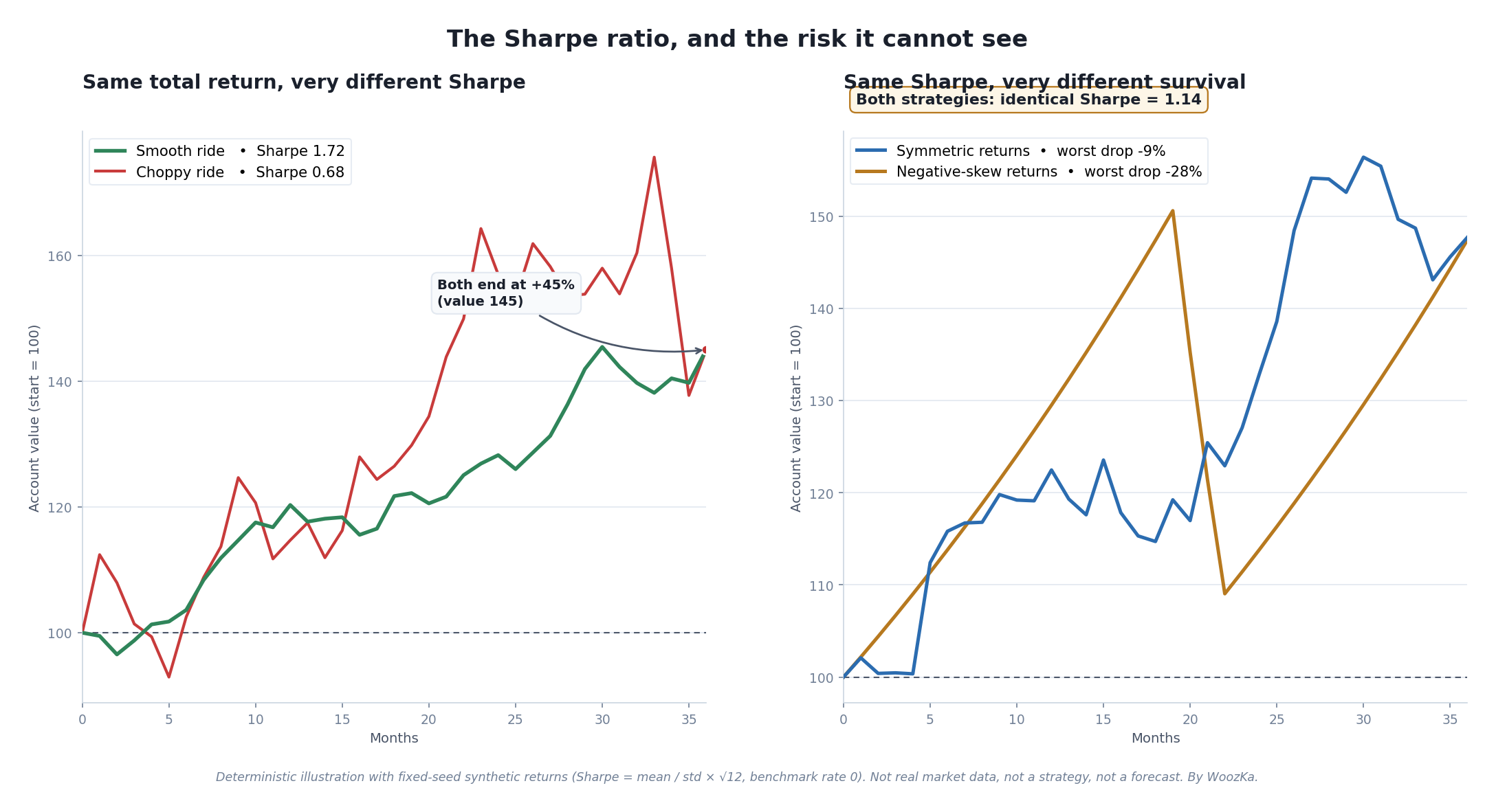
Everything this article argues, in one picture. On the left, the Sharpe ratio does exactly its job: two strategies that end at the same +45% get scored very differently because one delivered the return smoothly and the other put you through a rollercoaster. On the right, the ratio fails at what it can’t see: two strategies with the identical Sharpe of 1.14 can carry completely different worst-case risk, because the ratio is blind to the shape of the losses hiding in the tail.
Two strategies each returned 15% last year. One did it in a smooth, gentle climb; the other did it by lurching up and down, at one point down a third before clawing back. They posted the same return — but they are not the same strategy, and no sane person would trade them as if they were. The Sharpe ratio is the single most widely used number for capturing that difference: it measures return per unit of risk taken, so a smoother path to the same destination scores higher than a terrifying one. It is the lingua franca of fund fact sheets, backtest reports, and manager pitches, and understanding it — including, crucially, what it quietly hides — is part of the basic literacy of judging a trading system.
This is a trading-systems article, so the silo’s non-negotiable rule governs every line: past backtest performance does not predict future results. A Sharpe ratio is a historical description of a track record’s return relative to its volatility over one specific window — never a forecast of what the strategy will do next. A high backtested Sharpe is exactly as much a lucky-sample statistic as a high backtested return, and, as you’ll see, it is arguably more seductive precisely because it looks so authoritative.
What the Ratio Is Measuring
At heart the Sharpe ratio answers one question: how much return did a strategy earn for each unit of volatility it made you endure? Return alone is a vanity number — it says nothing about how much white-knuckling you had to do to collect it. Two strategies that both returned 15% are only equivalent if they made you sweat equally, and they rarely do. The Sharpe ratio charges the return against the “risk,” where risk is defined as the standard deviation of returns — how much the returns bounced around their own average. The higher the Sharpe, the more return you got per unit of that bounce.
The intuition is worth holding onto before the formula arrives: Sharpe rewards smoothness. A strategy that grinds out a steady 1% a month scores far better than one that averages the same 1% a month by alternating +9% and −7% swings, even if they arrive at the same place. That is usually the right instinct — a smoother equity curve is easier to hold, easier to size, and less likely to make you capitulate at the worst moment. It is also, as the second half of this article will show, an instinct that can be gamed and that goes badly wrong for a specific and dangerous class of strategies.
The Formula, Precisely
Getting the formula exactly right matters here, because a wrong or oversimplified version is a specific, checkable error, not a stylistic quibble. The Sharpe ratio is:
Sharpe = mean(R − R_b) ÷ standard deviation(R − R_b)
where R is the strategy’s return in each period and R_b is the return you could have earned over the same period on an essentially riskless benchmark — conventionally the yield on cash or short-term Treasury bills (the “benchmark rate”). The quantity (R − R_b) is the excess return: the reward the strategy earned above simply parking the money in bills. The numerator is the average of that excess return; the denominator is the standard deviation of the excess return, i.e. its volatility. Divide the two and you have reward per unit of variability.
A quick worked example makes it concrete. Suppose a strategy returned an average of 12% a year, the Treasury-bill benchmark yielded 4% over the same span, and the strategy’s annual volatility (standard deviation) was 10%. Its excess return is 12% − 4% = 8%, and its Sharpe is 8 ÷ 10 = 0.8. A different strategy that returned the same 12% but with only 5% volatility would score 8 ÷ 5 = 1.6 — twice the Sharpe for the same headline return, because it delivered it half as bumpily.
Two details trip people up constantly:
Use excess return, not raw return. Subtracting the benchmark rate matters. A strategy that returned 5% in a year when cash paid 5% earned zero excess return, and its Sharpe is zero no matter how smooth it looked — you were not rewarded for taking risk at all. This is exactly the correction Sharpe himself emphasized in his 1994 revision (more on that below): the ratio should compare the strategy to an applicable benchmark, not to zero.
Annualize with the square root of time. Sharpe ratios are almost always quoted on an annual basis so they can be compared, but returns are often measured more frequently. To convert a per-period Sharpe to an annual one, you multiply by the square root of the number of periods in a year: a monthly Sharpe is annualized by ×√12 ≈ 3.46, and a daily Sharpe (using ~252 trading days) by ×√252 ≈ 15.9 [source: standard convention; e.g. the annualization identity Sharpe_annual = Sharpe_period × √(periods/year), as summarized in standard references]. The √ appears because volatility scales with the square root of time while mean return scales linearly — so the ratio of the two scales with √time. Get this wrong (say, multiplying by 12 instead of √12 for monthly data) and you will overstate a Sharpe by nearly 3.5×, which is one of the more common ways a mediocre track record gets dressed up as a great one.
Both the equity curves in the chart above were scored with exactly this formula — annualized Sharpe = mean ÷ standard deviation × √12 on monthly returns, with the benchmark rate set to zero for the illustration.
Where It Came From: Sharpe 1966, and His Own 1994 Warning
The ratio is named for William F. Sharpe, the Nobel laureate who introduced it in a 1966 paper, “Mutual Fund Performance,” in the Journal of Business, where he called it the “reward-to-variability ratio” — a name that describes the mechanics better than the eponym does [source: William F. Sharpe, “Mutual Fund Performance,” Journal of Business 39(1), 1966, pp. 119–138]. He built it to rank mutual funds on the trade-off between their returns and the variability of those returns, and it caught on because it compressed that trade-off into one comparable number.
Nearly three decades later, Sharpe revisited it in a 1994 paper, “The Sharpe Ratio,” in the Journal of Portfolio Management, sharpening the definition to use excess return over an applicable benchmark rather than raw return, and stressing that the benchmark itself can and should change with circumstances [source: William F. Sharpe, “The Sharpe Ratio,” Journal of Portfolio Management 21(1), Fall 1994, pp. 49–58]. The most important thing about that 1994 paper is a piece of intellectual honesty that most people who quote the ratio have never read: Sharpe explicitly warned that his ratio captures only one dimension of performance and should not be used in isolation. The man whose name is on it told you, in print, not to treat it as a verdict. The rest of this article is essentially an elaboration of that warning.
Same Return, Very Different Sharpe
Look again at the left panel of the chart. Both the smooth green line and the jagged red line start at 100 and end at exactly 145 — a 45% total return, identical to the last decimal. Yet the smooth ride earns an annualized Sharpe of 1.72 and the choppy one only 0.68. Same destination; two-and-a-half times the Sharpe for the calmer journey. (These are computed directly from the two synthetic return streams, which were engineered to end at the same value; they are an illustration of the arithmetic, not any real strategy’s results.)
This is the Sharpe ratio doing precisely what it was designed to do, and doing it well. If you had to hold one of these two strategies through the three years, the smooth one is almost certainly the better one to actually own — not because it made more (it didn’t) but because you were far more likely to still be holding it at the end. The choppy strategy’s mid-period plunges are exactly the moments real people abandon a system, converting a temporary dip into a permanent exit. Charging return against volatility is a genuinely useful correction to the naïve habit of ranking strategies by return alone. This is the half of the Sharpe ratio that is straightforwardly good. Now for the half that isn’t.
The same return, priced by volatility alone
Because the formula is closed, what each input does to the answer is exact. Hold the return at 10% and a risk-free rate of 2%, and change nothing but the volatility:
| Volatility | Sharpe ratio |
|---|---|
| 5% | 1.60 |
| 10% | 0.80 |
| 15% | 0.53 |
| 20% | 0.40 |
| 30% | 0.27 |
Every row earned the same 10%. The ratio is doing one thing: dividing by volatility. A fund at 5% volatility scores 1.60 and one at 30% scores 0.27 — a sixfold difference in reputation for an identical result. Halving volatility exactly doubles the ratio, always.
This is not a forecast and describes no real fund. No market data is used; the figures are inputs chosen to span a plausible range.
The input that is a choice, not a measurement
Return and volatility come from the track record. The risk-free rate does not — it is selected by whoever computes the number, and it moves the answer more than most readers expect. Same portfolio throughout, 10% return and 15% volatility:
| Risk-free rate assumed | Sharpe ratio | Against the 0% reading |
|---|---|---|
| 0% | 0.67 | +0% |
| 1% | 0.60 | -10% |
| 2% | 0.53 | -20% |
| 3% | 0.47 | -30% |
| 4% | 0.40 | -40% |
| 5% | 0.33 | -50% |
Nothing about the portfolio changed in any row. Only the yardstick did. Moving from a 0% cash rate to 5% halves the Sharpe ratio, from 0.67 to 0.33.
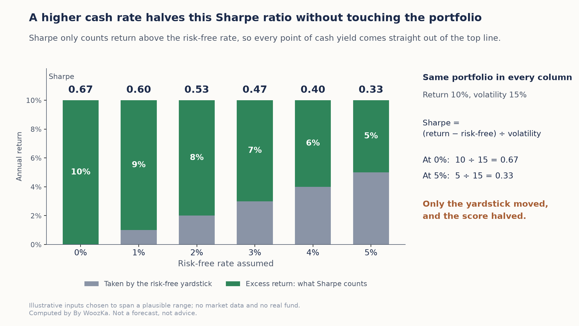
The portfolio is identical in every column; only the cash rate it is measured against changes. Every point of that rate comes out of the numerator, so moving from 0% to 5% halves the score.
Which has a consequence worth carrying: Sharpe ratios computed in different rate environments are not comparable. A strategy that looked excellent when cash paid nothing can score materially worse on identical performance once cash pays 5% — and a track record that spans both is being measured against a moving yardstick. Before comparing two Sharpe ratios, it is worth knowing whether they were computed against the same rate at all.
Method, so it can be checked rather than taken on trust: Sharpe is (return − risk-free rate) ÷ volatility, and every figure above is that formula evaluated directly. The script asserts the result is exactly inverse in volatility and exactly linear in the risk-free rate, that halving volatility doubles it, and that a portfolio returning precisely the risk-free rate scores zero at every volatility. Every Sharpe figure above is printed by that code rather than typed in.
The Blind Spots: What the Sharpe Ratio Cannot See
The Sharpe ratio’s usefulness rests on some assumptions that real trading strategies routinely violate, and when they’re violated the ratio doesn’t just get slightly noisy — it can point you at exactly the wrong strategy. Here are the blind spots, in rough order of how dangerous they are.
It penalizes upside volatility identically to downside. The denominator is the standard deviation of all returns, which treats a surprise +20% month as exactly as much “risk” as a surprise −20% month. But no trader on earth loses sleep over an unexpectedly large gain. A strategy that occasionally rockets upward — a trend-following system that catches a huge move, for instance — is punished by the Sharpe ratio for the very behavior that makes it valuable. Its big winners inflate the volatility denominator and lower its Sharpe, making a genuinely attractive return profile look worse than a duller one. Volatility and risk are not the same thing, and the Sharpe ratio conflates them.
It assumes returns are roughly normal — and so understates tail risk. This is the big one. The standard deviation is a complete description of risk only if returns follow a bell curve. Real strategy returns frequently don’t: they can be skewed (a long tail on one side) and fat-tailed (extreme moves far more often than a bell curve predicts). When returns are negatively skewed — many small gains punctuated by rare, brutal losses — the standard deviation genuinely understates how bad the bad case is, and so the Sharpe ratio overstates how safe the strategy is [source: the normality assumption and its failure for skewed/fat-tailed returns is well documented; see e.g. discussions of the Sharpe ratio’s limitations and the Deflated Sharpe Ratio, which explicitly corrects for non-normality — Bailey & López de Prado, “The Deflated Sharpe Ratio,” Journal of Portfolio Management, 2014].
The classic offenders are strategies that earn a steady premium by taking a hidden tail risk: selling options, selling insurance, carry trades, and other “picking up pennies” profiles that produce a gorgeous, smooth, high-Sharpe track record — right up until the rare event arrives and the whole thing gives back years of gains in a week. Negative-skew strategies have beautiful Sharpe ratios until, suddenly, they don’t. Trend-following and crypto strategies carry fat tails too (in trend-following’s case, often positive skew, which the ratio unfairly penalizes). The lesson runs both directions: the Sharpe ratio flatters the strategy that hides a crash and punishes the one that delivers occasional windfalls.
The right panel of the chart makes this vivid. Both curves have the identical Sharpe ratio of 1.14 — constructed to have exactly the same mean and the same standard deviation, so the ratio literally cannot tell them apart. But the blue “symmetric” strategy’s worst peak-to-trough drawdown is a manageable −9%, while the gold “negative-skew” strategy — the same average return, the same volatility, the same Sharpe — plunges −28% when its clustered losses hit. If you had only the Sharpe ratio to go on, you would rank these two as equals. The drawdown chart says otherwise. One of these you can hold; the other might be the one that ends your run. The Sharpe ratio saw none of it.
It’s inflated by illiquid or smoothed marks. A strategy holding hard-to-price, thinly traded assets — private credit, some structured products, illiquid small-caps — is often marked to stale or smoothed prices that don’t move day to day the way a liquid market would. Smoothed marks have artificially low measured volatility, which artificially inflates the Sharpe ratio. Some of the most impressive-looking Sharpe ratios in finance are partly an artifact of assets that simply weren’t repriced honestly. A suspiciously high Sharpe on an illiquid book should raise your suspicion, not your confidence.
It’s sensitive to the measurement window. A Sharpe ratio computed over a calm, trending stretch will look wonderful; the same strategy measured across a period that includes its worst drawdown will look mediocre. Because it’s an average over a specific window, the number you’re shown depends heavily on which window someone chose to show you — and people showing you a track record get to choose. A Sharpe quoted without its measurement period, and without the number of independent return observations behind it, is close to meaningless.
It’s overfittable — the number people optimize toward. Because the Sharpe ratio is the metric so many researchers tune their strategies to maximize, it is itself a prime target for overfitting. Try enough strategy variations and the luckiest one will post a spectacular in-sample Sharpe from pure chance — the expected best-of-128 in-sample Sharpe among zero-skill strategies is above 2.6, a number that would make most people quit their job [source: Bailey, Borwein, López de Prado & Zhu, “Pseudo-Mathematics and Financial Charlatanism,” Notices of the AMS 61(5), 2014]. That is exactly why the same researchers proposed the Deflated Sharpe Ratio, which discounts an observed Sharpe for the number of strategies tried, the length of the track record, and the non-normal shape of the returns [source: Bailey & López de Prado, “The Deflated Sharpe Ratio,” Journal of Portfolio Management, 2014]. A backtested Sharpe means almost nothing until you know how many configurations were tried to produce it.
Sortino, Calmar, and MAR: Complements, Not Replacements
Each blind spot has spawned a cousin metric that patches it — and it’s worth knowing them, as long as you remember that none of them is a complete replacement; each fixes one problem and inherits others.
The Sortino ratio addresses the upside-penalty complaint. Developed by Frank A. Sortino in the early 1980s, it is built like the Sharpe ratio but replaces total volatility in the denominator with downside deviation — the volatility of returns that fall below a minimum acceptable target — so it only charges the strategy for the volatility that actually hurts [source: the Sortino ratio, developed by Frank A. Sortino (early 1980s), substitutes downside deviation for standard deviation; definition per standard references, e.g. Rollinger & Hoffman, “Sortino: A ‘Sharper’ Ratio,” CME Group]. A strategy with big upside and controlled downside will score better on Sortino than on Sharpe, which is usually fairer. It still assumes you can estimate that downside distribution reliably, which fat tails make hard.
The Calmar ratio and its relative the MAR ratio address the drawdown blindness by dividing return by maximum drawdown instead of by volatility — return per unit of worst-case peak-to-trough pain — so they speak directly to the survival question the Sharpe ratio ignores. (These are covered in depth in the drawdown article.) They’re excellent for the “can I hold this?” question and useless for much else, since a single worst-drawdown number is itself just one lucky historical realization.
The honest summary is that risk is multidimensional and no single ratio captures it. The Sharpe ratio measures reward per unit of total volatility; Sortino measures reward per unit of downside volatility; Calmar and MAR measure reward per unit of worst drawdown. A serious evaluation looks at all of them, notices when they disagree — a great Sharpe alongside a terrible Calmar is a screaming signal of hidden tail or drawdown risk — and treats the disagreement as the most informative thing on the page.
Putting the Number to Work
None of this means the Sharpe ratio is useless — it means it is one instrument on a dashboard, and reading it in isolation is the mistake Sharpe himself warned against. A few working rules:
Compare like with like. A Sharpe ratio is only meaningful against another Sharpe computed the same way — same period length, same annualization, same benchmark, over the same market window. Comparing a strategy’s daily-derived Sharpe to another’s monthly-derived Sharpe, or one measured in a bull market to one measured across a crash, is comparing nothing to nothing.
Distrust a suspiciously high one. In liquid, honestly-priced markets, a sustained annualized Sharpe much above 1 is genuinely hard to achieve and a sustained Sharpe above 2 is rare and worth deep suspicion. A very high backtested Sharpe is more often a symptom of overfitting, smoothed illiquid marks, or a hidden short-tail-risk profile than of a truly superb strategy. The beautiful number is the one to interrogate hardest.
Always read it next to skew, drawdown, and the number of observations. Before you trust a Sharpe, ask: Is the return distribution skewed? What was the worst drawdown? Over how many independent periods — and how many strategy variations — was this measured? The Sharpe ratio is a headline; those questions are the story.
Never let it stand alone. Pair it with a downside metric (Sortino), a drawdown metric (Calmar/MAR), an honest look at the tails, and — above all — the silo’s permanent caveat: even a spotless historical Sharpe is a description of the past, computed on a lucky sample, and is not a promise about the future.
If you haven’t yet been burned by a Sharpe ratio, it’s worth sitting with the common shape of the experience, because it repeats endlessly. Someone shows you a track record with a Sharpe that looks almost too good — a smooth, steady, high-scoring curve that seems to have solved the market. The number does its persuasive work; it feels like rigor, like math, like proof. And then, often, one of two quiet things is true underneath it: either the smoothness was bought by taking a rare, catastrophic risk that simply hadn’t happened yet during the window you were shown, or the wonderful score was the luckiest of a thousand variations someone quietly tried. The traders who don’t get caught are rarely the ones who compute the Sharpe most precisely. They’re the ones who, on seeing a beautiful Sharpe, get more suspicious rather than less — and go looking for the tail, the drawdown, and the number of trials before they believe it.
The Other Gauges on the Dashboard
The Sharpe ratio is one gauge on the dashboard for judging whether a system is worth trading. The rest of the Trading Systems cluster fills in the others:
- How to Backtest a Trading Strategy the Right Way — the pillar. Where the return and volatility that feed a Sharpe ratio come from, and how to measure them without fooling yourself.
- Drawdown Explained: The Metric That Matters More Than Win Rate — the survival metric the Sharpe ratio is blind to; the natural companion to this article, and the reason two identical-Sharpe strategies can be worlds apart.
- Mean Reversion vs Trend Following: Which Strategy Style Fits You? — trend-following’s positive skew is exactly the profile the Sharpe ratio unfairly penalizes; style choice and metric choice are linked.
- Position Sizing Rules for Systematic Traders — a ratio grades a strategy; sizing decides whether you survive its losing streaks long enough for the grade to matter.
- What Makes a Trading System Robust? A Checklist — where Sharpe, drawdown, out-of-sample results, and style-fit all come together into one judgment.
- What Is Overfitting in Backtesting (And How to Avoid It) — why a backtested Sharpe, like every backtested number, is a lucky-sample statistic until you know how many strategies were tried to find it.
If you want the plain-English, rigor-first read on building and judging trading systems — the honest version, where every metric comes with what it can’t tell you attached — that is what the newsletter is for. Subscribe below to get the system-builder’s checklist.
Disclaimer: This article is educational content, not financial advice. I am not a licensed financial advisor, and nothing here is a recommendation to buy or sell any security or asset. Investing and trading involve risk, including the possible loss of the money you invest. Do your own research and consider consulting a licensed financial professional before making investment decisions. Read the full Disclaimer.
Historical and backtested results are hypothetical, carry inherent limitations, and do not guarantee future results. Figures were accurate to the best of my knowledge as of this article’s last-updated date and may have changed.
