On-Chain Data 101: What Metrics Actually Matter?
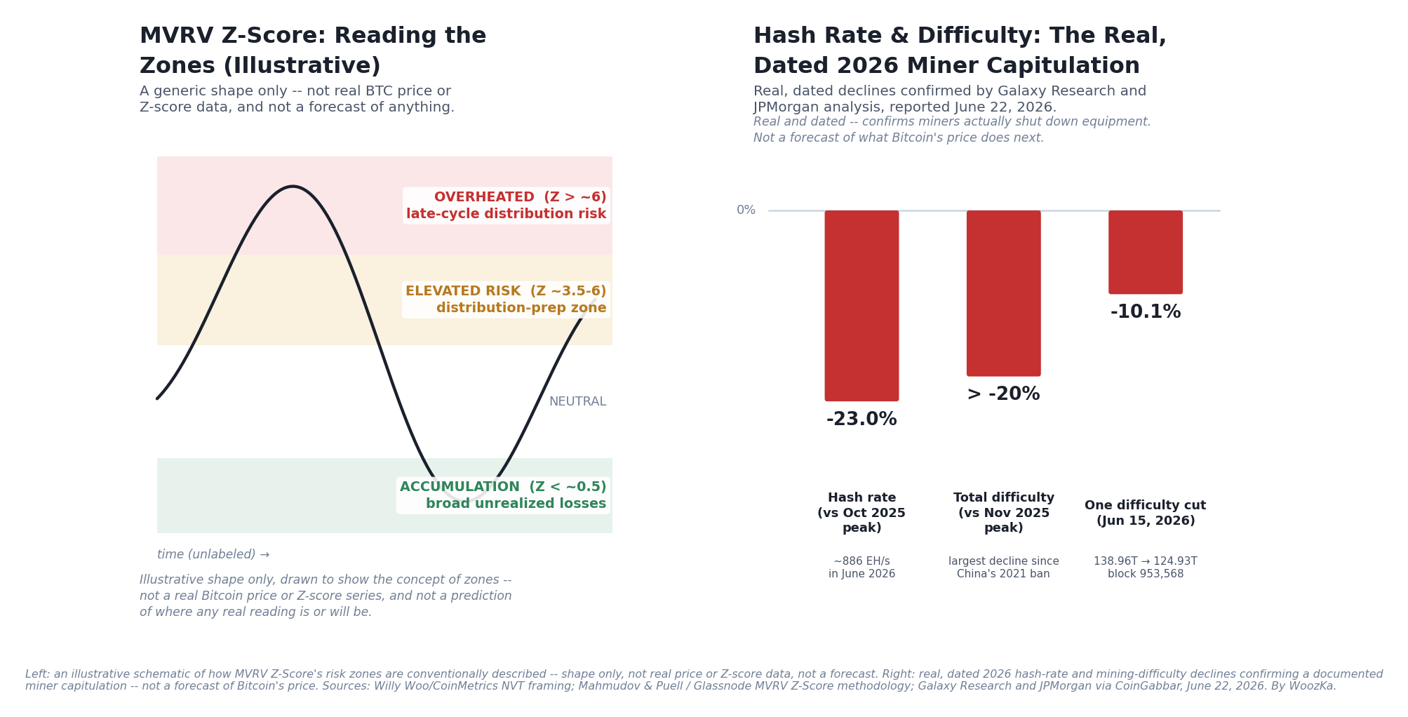
Left: how analysts typically describe MVRV Z-Score’s risk zones — a shape, not a chart of real prices. Right: a real, dated 2026 event where the underlying network data (hash rate, difficulty) documented a miner capitulation before most headlines caught up. Sources: Galaxy Research and JPMorgan via CoinGabbar, June 22, 2026.
If you’ve spent any time on a crypto analytics site, you’ve seen the wall of acronyms: MVRV, NVT, SOPR, exchange netflow, hash rate. They get thrown around as if everyone already knows what they mean and what to do with them. Most beginners quietly nod along, or worse, treat whatever number is flashing red or green as a buy-or-sell signal. Neither reaction is right. On-chain data is public, verifiable information about what’s actually happening on a blockchain — how many addresses are active, how much value is moving, whether the people selling are in profit or loss, how much computing power is securing the network. It’s real data about real activity. It is not a crystal ball, and nothing in this article should be read as a price prediction, a “buy signal,” or a recommendation to time the market. If you’ve read the pillar on buying your first Bitcoin safely, this article extends the same rule: understand the tool before you trust it with money.
This article covers what on-chain data actually is, six metrics worth knowing by name and what each one measures, a real and current 2026 case where the underlying network data documented something before most headlines did, and — the part that matters most — the honest limits of all of it.
What “On-Chain Data” Actually Means
Public blockchains like Bitcoin and Ethereum record every transaction on a ledger anyone can read. On-chain analysis is the practice of pulling structured signals out of that raw ledger — counting addresses, tracking how value moves, measuring the cost basis of coins that change hands — rather than looking only at the price chart [source: standard on-chain-analytics industry framing; Glassnode, CoinMetrics platform documentation]. The appeal is that this data can’t be faked or restated the way a company’s quarterly earnings sometimes can be — a transaction that happened is permanently and publicly recorded. The catch, covered in detail below, is that “can’t be faked” is not the same as “easy to interpret correctly.”
Active Addresses and Transaction Count: The Basic Pulse
The simplest metrics are also the ones most likely to be over-trusted. Active addresses counts how many unique blockchain addresses sent or received a transaction in a given period; transaction count counts how many transactions occurred. Rising numbers are generally read as a sign of growing network usage, and analysts have found a loose statistical relationship between address growth and network value, echoing “Metcalfe’s Law” from telecom networks (a network’s value scales with the square of its number of connected users) [source: general on-chain analytics framing; Metcalfe’s Law analogy as applied to blockchain networks].
The immediate caveat: an address is not a person. One user can generate many addresses; one exchange consolidating customer deposits into a cold-storage wallet can look like enormous “activity” that has nothing to do with new users; a single whale rebalancing between their own wallets shows up identically to thousands of small retail trades. Treat these two metrics as a rough activity pulse, not a precise user count.
NVT Ratio: Bitcoin’s “Too Expensive for What It’s Actually Doing” Check
The Network Value to Transactions (NVT) ratio divides a network’s market capitalization by the U.S.-dollar value of on-chain transactions moving through it over a given period. It was introduced by analyst Willy Woo in 2017 and further developed with the CoinMetrics team, explicitly as a crypto analog to the stock market’s price-to-earnings ratio: instead of earnings, the “activity” a network is being valued against is the transaction volume actually settling on its ledger [source: Willy Woo, original NVT framing, 2017; CoinMetrics/industry documentation on NVT ratio history]. A rising NVT means the network’s market value is growing faster than the real economic activity moving through it — historically associated with periods of speculation outrunning usage — while a falling NVT suggests valuation is being supported by growing real usage [source: same].
Like a P/E ratio, NVT works best as a relative, historical comparison — “high compared to this network’s own history” — rather than an absolute threshold that means the same thing on every chain or in every era. A young, fast-growing network’s “normal” NVT range can look nothing like a mature one’s, and the metric has periodically been refined (a smoothed version, NVT Signal, was proposed specifically because raw NVT was noisy day to day) [source: industry critique and refinement of the original NVT methodology].
MVRV and MVRV Z-Score: Are Holders, on Average, Sitting on a Profit?
Market Value to Realized Value (MVRV) compares a network’s market capitalization to its realized capitalization — the value of every coin priced not at today’s price, but at the price it last moved on-chain. Realized cap is, in effect, an estimate of the network’s aggregate cost basis: what the average holder actually paid, in total, for the coins they’re holding [source: on-chain analytics industry definition, originally developed by Nic Carter and Antoine Le Calvez]. When MVRV is above 1, holders are sitting on an aggregate unrealized profit; below 1, an aggregate unrealized loss.
MVRV Z-Score, developed by Murad Mahmudov and David Puell and later refined by other analysts, normalizes that comparison by historical volatility: (market cap − realized cap) ÷ the standard deviation of market cap [source: Mahmudov & Puell MVRV Z-Score methodology; Glassnode, “MVRV-Z Score”]. The metric is commonly read in rough “zones” — very high readings (historically associated with values above roughly 6) have coincided with periods most participants would call overheated; very low or negative readings (below roughly 0) have coincided with periods most participants would call broad capitulation. A real, dated illustration of why this needs care, not blind trust: in Q4 2021, Bitcoin’s price reached a new all-time high near $69,000 — but the Z-Score reading at that peak was notably lower than its own reading from earlier that same year, a pattern some analysts flagged at the time as a divergence warning ahead of the 2022 decline. After the FTX exchange collapsed in November 2022, Bitcoin’s price fell to roughly $15,500 — a new cycle low — while the Z-Score reading was actually less extreme than it had been a few months earlier, a pattern read by some as a sign of accumulation beneath a falling price [source: on-chain-analytics commentary on 2021–2022 MVRV Z-Score behavior; cross-checked against widely available public MVRV Z-Score chart services]. Both are presented here strictly as historical description, not proof the indicator will behave the same way next cycle.
The honest limits are substantial and worth naming directly: MVRV Z-Score is a risk-zone tool, not a timing tool — it has stayed at extreme readings for weeks or months before any reversal in Bitcoin’s history; an estimated 3–4 million BTC believed permanently lost still inflates the realized-cap baseline the metric depends on; and the metric’s usual thresholds were established before spot Bitcoin ETFs existed, meaning the 2024-and-later era of large, ETF-driven demand may shift what “extreme” looks like going forward [source: industry commentary on MVRV Z-Score limitations, lost-coin estimates, and post-2024 ETF-era recalibration].
SOPR: Are People Selling at a Profit or a Loss?
The Spent Output Profit Ratio (SOPR) looks at every coin that moves on-chain in a given period and compares the price it’s moving at now to the price it was worth the last time it moved — in effect, asking “on average, are the people selling right now doing so at a profit or a loss?” [source: on-chain analytics industry definition, originally proposed by Renato Shirakashi]. A SOPR reading above 1 means coins are, on average, being spent at a profit; below 1, at a loss; a reading hovering right around 1 is often read as a support/resistance-like level, where the market is deciding whether holders are willing to sell near their cost basis. Like the other ratio metrics above, SOPR is descriptive of what already happened on-chain, not predictive of what happens next — it is one more data point to weigh, not a standalone signal.
Exchange Netflow: Where Is the Supply Actually Going?
Exchange netflow tracks the net movement of coins onto or off centralized exchanges — inflow minus outflow, using addresses that analytics providers have identified and labeled as belonging to known exchanges [source: CryptoQuant/Glassnode exchange-flow methodology]. The common (not universal) interpretation: coins moving onto exchanges are commonly associated with an intent to sell, while coins moving off exchanges into private wallets are commonly associated with longer-term holding or self-custody.
Two limitations deserve equal weight to the definition itself. First, exchange-address labeling is an estimate, not a directory — providers maintain and continually update lists of addresses they believe belong to exchanges, and that list is admittedly incomplete and gets revised over time, meaning historical netflow figures can shift as labels are corrected [source: Glassnode’s own published caveat that exchange-balance data may not capture an exchange’s full reserves and is subject to revision as labeling improves]. Second, and specific to 2026: the approval of U.S. spot Bitcoin ETFs in January 2024 introduced a new, large category of institutionally-held Bitcoin that complicates the old “exchange balance = retail sell-side intent” reading. As of April 2026, more than 84% of all U.S. spot Bitcoin ETF assets — roughly $77 billion — sat in custody with a single custodian, Coinbase, meaning large custodial balance changes tied to ETF creation and redemption activity can now register in exchange-adjacent metrics for reasons that have nothing to do with traditional retail buying or selling pressure [source: Forbes, “‘Choke Point’—Bitcoin’s $77B Coinbase ETF Warning Shocks Markets,” April 17, 2026]. Read exchange netflow as one directional clue among several, not as a clean read of who’s about to sell.
Hash Rate and Difficulty: The Network’s Own Stress Gauge — and a Real, Current Example
Hash rate measures the total computing power miners are pointing at a proof-of-work network like Bitcoin, and it matters for a concrete reason: the more hash rate securing the network, the more expensive and difficult a malicious 51% attack becomes [source: Bitcoin network-security literature; general proof-of-work security framing]. Mining difficulty is the network’s own self-correcting response to hash rate — Bitcoin recalculates it roughly every two weeks (every 2,016 blocks) specifically to keep block production near a 10-minute average regardless of how much or how little computing power is currently mining [source: Bitcoin protocol difficulty-adjustment mechanism]. Because difficulty only adjusts in response to what miners are actually doing, a sustained drop in it is one of the more honest, hard-to-fake signals in the entire on-chain toolkit: it means miners, in aggregate, actually turned equipment off.
That’s not a hypothetical example — it’s what the data documented in real time this year. Galaxy Research confirmed on June 21, 2026 that Bitcoin miners had entered a capitulation phase — industry shorthand for miners being forced offline by sustained losses rather than choosing to exit strategically. The underlying numbers: Bitcoin’s mining difficulty fell more than 20% from its November 2025 peak, including a single adjustment on June 15, 2026 (block 953,568) that cut difficulty from 138.96 trillion to 124.93 trillion — a 10.09% drop in one adjustment, the 11th-largest downward adjustment in the protocol’s history. Network hash rate fell to roughly 886 exahashes per second, down about 23% from its October 2025 peak. JPMorgan analysts separately estimated the all-in production cost for publicly listed miners at roughly $78,000 per Bitcoin, against a spot price near $63,970 at the time — meaning miners had been operating below their own breakeven cost for five consecutive months — and noted that six major publicly listed mining companies sold a combined 32,000 BTC in Q1 2026 alone to cover operating costs, a new quarterly record [source: Galaxy Research and JPMorgan analysis (Nikolaos Panigirtzoglou), as reported by CoinGabbar, “Bitcoin Miner Capitulation Confirmed: Difficulty Drops 20% From Peak,” June 22, 2026].
Two things are worth separating clearly here. The difficulty and hash-rate decline is a documented, dated fact — real miners genuinely turned off real machines, and the network’s own difficulty-adjustment mechanism recorded it independently of any analyst’s opinion. What JPMorgan’s analysts then did with that fact — noting that similarly severe miner-capitulation episodes have historically preceded price recoveries, while explicitly stopping short of a bearish-or-bullish call — is an interpretation, not a fact, and this article is not endorsing it as a forecast. History rhyming is not history repeating, and a past pattern following a past capitulation is not a guarantee about what happens after this one. The honest use of this data is to understand what miner economics were actually doing at a specific, dated moment — not to treat it as a countdown to a predictable outcome.
The Same Difficulty Data, With the Arithmetic Done
One number in the section above — a difficulty cut of just over 10% in June 2026 — is doing more work than it appears to. A difficulty adjustment is not a headline about the future; it is a measurement of the fortnight that just ended, produced by the protocol itself with no analyst in the loop. The section calls difficulty “one of the more honest, hard-to-fake signals in the entire on-chain toolkit” and then leaves the reader to take that on trust. It does not have to be taken on trust, because the difficulty series is public. Everything below is arithmetic on the figures already printed above, plus the protocol’s own retarget series, and every result was reproduced in code.
A Difficulty Cut Is a Measurement of the Two Weeks Before It
Difficulty retargets every 2,016 blocks to hold block production near ten minutes — both facts the article states. Run that backwards. If the network cuts difficulty by some percentage, it is reporting exactly how far behind schedule the previous 2,016 blocks fell, because the cut is sized to undo that shortfall precisely.
| If difficulty falls | Average block took | That period ran | vs. the nominal 14 days |
|---|---|---|---|
| 5.00% | 10.53 min | 14.74 days | +0.74 |
| 10.10% (the June cut) | 11.12 min | 15.57 days | +1.57 |
| 15.00% | 11.76 min | 16.47 days | +2.47 |
| 20.00% | 12.50 min | 17.50 days | +3.50 |
So that adjustment is a statement about the weeks before it: the 2,016 blocks before it averaged 11.12 minutes instead of ten, and the “roughly two weeks” the article describes actually ran 15.57 days — a day and a half long. That is what “miners turned equipment off” looks like when it is expressed as a duration rather than a percentage: for eleven days, everyone waiting on a Bitcoin confirmation waited about eleven percent longer than usual, and the protocol noticed before any analyst published on it.
Recomputing the Whole Decline From the Retarget Series
The article reports the fall as “more than 20% from its November 2025 peak.” That figure comes from its cited source. The retarget series itself can be read directly, and it is worth reading, because it answers a question the percentage hides: was this a slow bleed or one event?
| Retarget | Difficulty | Trillions lost |
|---|---|---|
| Peak, in force from Oct 29, 2025 | 155.97 T | — |
| Before the June cut (block 951,552) | 138.96 T | 17.01 |
| After it (block 953,568) | 124.93 T | 14.03 |
Two things fall out of that. The first is a number worth stating precisely: measured from the highest level the series reaches, the decline is 19.90% — a shade under the “more than 20%” reported above, and close enough that the difference changes nothing about the episode. The second is the one the percentage was hiding. Of the 31.04 trillion of difficulty given up between the peak and the June trough, 14.03 trillion — 45.2% of it — went in that single adjustment. Nearly half of an eight-month decline arrived in one step.
That reframes what the June reading was. It is not the confirmation of a trend already well advanced; it is the largest single event in the whole decline, and the article’s own framing — that a sustained drop means miners “in aggregate, actually turned equipment off” — applies with far more force to that fortnight than to the seven months preceding it. What the recomputation does and does not establish:
- It establishes the shape of the decline — gradual for seven months, then one step carrying nearly half of it.
- It establishes that the drop is real and protocol-recorded, independent of any analyst’s characterization of it.
- It establishes nothing whatsoever about what came next. Difficulty is a backward-looking measurement, and this article’s rule against reading on-chain data as a forecast applies to arithmetic on that data exactly as much as to the raw number.
32,000 BTC, Set Against What the Network Actually Issued
The article reports that six listed miners sold a combined 32,000 BTC in Q1 2026 and calls it a quarterly record. A record compared with what is left open. There is a natural yardstick the article already has the pieces for: the block subsidy is 3.125 BTC, which this site’s own halving article puts at roughly 450 BTC a day network-wide. Over the 90 days of Q1 that is 40,500 BTC issued to every miner on earth combined — and the six companies sold 79.01% of it.
That number only means those six were selling their own current production if they were also mining 79% of all Bitcoin, which no one claims. So most of what they sold came from somewhere else:
| If those six mined | Their Q1 output | Sold from reserves |
|---|---|---|
| 10% of global hash rate | 4,050 BTC | 27,950 BTC |
| 20% | 8,100 BTC | 23,900 BTC |
| 30% | 12,150 BTC | 19,850 BTC |
| 40% | 16,200 BTC | 15,800 BTC |
Across every plausible share, the great majority of those 32,000 coins was not newly mined — it was inventory. That is the difference between a business selling its output and a business selling its savings, and it is what the word “capitulation” is pointing at. It also sits consistently beside the cost figure the article quotes: at $78,000 to produce against $63,970 spot, each coin was mined $14,030 below cost, 17.99% underwater, which is a reason to sell inventory rather than a reason to hold it.
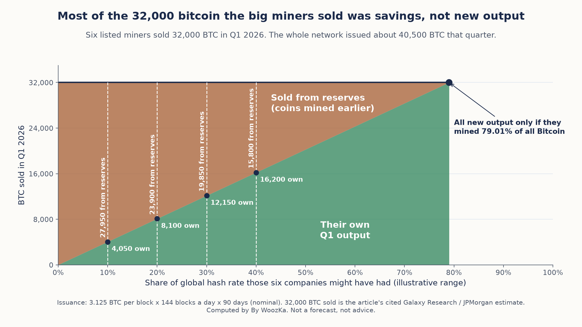
Unless those six companies mined nearly four-fifths of all Bitcoin, most of what they sold was coins they already held, which is what the word capitulation points at.
Where each figure came from, and what stays unverified. The two difficulty levels and the block height are the article’s own, and they were checked against the protocol’s retarget series before anything here was computed: block 951,552 reads 138.96 T and block 953,568 reads 124.93 T, exactly as printed above, and the two are 2,016 blocks apart as a retarget must be; the exact ratio of the two levels gives 10.096%, which the article rounds to 10.09% and the table above to 10.10%, and the series timestamps that retarget one day earlier than the article’s date [source: mempool.space difficulty-adjustment series, blocks 921,312 / 951,552 / 953,568]. The 155.97 T peak comes from that same series. The 2,016-block retarget, the ten-minute target and the 3.125 BTC subsidy are protocol constants the site already publishes. The 32,000 BTC, the $78,000 production cost and the $63,970 spot price are the article’s cited estimates from Galaxy Research and JPMorgan; they could not be independently verified here and are used as given, never as facts this analysis establishes. Issuance is the nominal 450 BTC a day, which assumes blocks land on their ten-minute target — during a slow stretch actual issuance runs below it, so 40,500 is an upper bound and the 79.01% share a lower one. The hash-rate shares in the last table are illustrative levels chosen to bracket the answer, not estimates of any company’s share. No shipped calculator on this site computes difficulty, issuance or mining economics, so none is linked here. Nothing above is a forecast, and no allocation, trade or price expectation is recommended anywhere in it.
The Honest Limits of On-Chain Data, All Together
Every metric above is genuinely useful and genuinely limited, and the limits share a few common threads worth stating plainly, once, instead of scattered as footnotes:
- An address, a wallet, or an “exchange” label is an approximation of a real-world actor, not a verified identity. Every metric above ultimately rests on inference from address behavior, and that inference can be wrong.
- This entire toolkit works best on transparent, long-history, high-liquidity chains — chiefly Bitcoin, and to a lesser extent Ethereum. Metrics like MVRV, built around Bitcoin’s UTXO transaction model and years of price history, are far less reliable applied to smaller-cap altcoins with thin liquidity and short histories, and don’t meaningfully apply to privacy-focused chains that are specifically designed to obscure the on-chain trail these metrics depend on.
- On-chain metrics describe what already happened, not what happens next. They are diagnostic tools, similar in spirit to a doctor’s vital signs — useful for understanding the current state of a system, not for predicting its future with precision.
- No single metric should be read in isolation. The same data source can flash different, sometimes contradictory, readings across different metrics at the same time; the honest practice is cross-referencing several before drawing any conclusion, and still treating that conclusion as probabilistic context, not a signal to act on.
- None of this is, or should be treated as, a timing tool, a buy/sell signal, or a price forecast. That’s true of every metric in this article, and it doesn’t stop being true just because a reading looks extreme.
Where to Go Next
On-chain data is one more lens for understanding what’s actually happening in crypto markets — genuinely useful, and genuinely not a substitute for the risk-management basics this silo keeps coming back to:
- How to Buy Your First Bitcoin Safely: A Step-by-Step Guide — the pillar this article extends: risk management first, price speculation last.
- Crypto Wallets Explained: Hot vs Cold Storage for Beginners — the custody choices that determine whether your own coins even show up cleanly in on-chain data.
- Bitcoin Halving Explained: What Actually Happens to Price? — another example of using real, dated on-chain and price history without turning it into a forecast.
- Crypto Position Sizing: How Much of Your Portfolio Should Be Crypto? — the discipline that matters regardless of what any dashboard is showing you today.
If you want markets explained plainly — risk-first, never hyped, no price targets — that’s what the newsletter is for. Subscribe below.
Disclaimer: This article is educational content, not financial advice. I am not a licensed financial advisor, and nothing here is a recommendation to buy or sell any security or asset. Investing and trading involve risk, including the possible loss of the money you invest. Do your own research and consider consulting a licensed financial professional before making investment decisions. Read the full Disclaimer.
Historical and backtested results are hypothetical, carry inherent limitations, and do not guarantee future results. Figures were accurate to the best of my knowledge as of this article’s last-updated date and may have changed.
