How to Design a Trading Indicator From Scratch
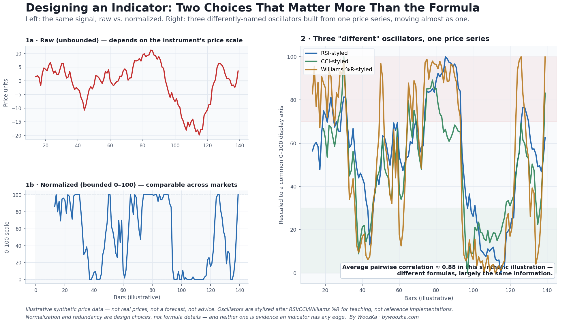 Two of the design choices this article is built around. Left: the same quantity, raw versus normalized — bounding a number changes what it means, and how you compare it across markets. Right: three “different” oscillators built from the same closes, tracking each other almost exactly — a preview of the redundancy trap in the “Avoid the Redundancy Trap” section below.
At some point, almost everyone who gets serious about trading systems has the same idea: what if I built my own indicator? Maybe RSI feels too laggy, maybe a combination of ideas seems promising, maybe it just feels like the next step after learning to read the standard toolkit. This article is not going to hand you a formula and call it an edge — that would violate the one rule this entire cluster is built on, and any article that did it would be lying to you about how indicator design actually works. What it will do is walk through the actual process: the handful of design decisions every indicator-builder makes, whether they realize it or not, and the traps hiding inside each one. Get the process right and a mediocre formula is still useful information. Get it wrong and a brilliant-sounding formula is just an elaborate way to fool yourself.
This is a trading-systems article, so the silo’s non-negotiable rule applies with full force: nothing below is a tradeable formula, and no illustrative example here is presented as an edge. Everything in this piece still has to pass through the same backtesting rigor described in the pillar before it means anything at all.
Before the method, a disclosure, because it is why this article is written the way it is: I have done this at length and it did not work. Across five or six years as a losing trader I taught myself to code indicators on chart platforms and — honestly, not exaggerating — built more than a thousand of them. Asked later what they actually were, the truthful inventory is narrower than the number sounds: new logic built on top of basic indicators, custom versions of other people’s custom indicators, color-coded plots that made a signal easier to spot, new visuals. That list is worth sitting with before you start, because it is where the effort really goes. What follows is the method. Building the indicator is the smallest part of it.
Step Back First: Every Indicator Is the Same Raw Material
Here is the framing that makes indicator design much less mysterious: almost every technical indicator that exists — RSI, MACD, Bollinger Bands, moving averages, stochastics, CCI, on-chain metrics, all of it — is a transformation of the same small set of raw inputs: open, high, low, close, volume, and time. There is no secret sixth data source. An indicator’s “invention” is really a specific sequence of arithmetic choices applied to OHLCV data: which prices to use, over what window, combined how, and displayed in what form.
That reframing matters because it means designing an indicator is not an act of discovering a hidden pattern in the market — it is an act of choosing a lens. Every lens has trade-offs. The rest of this article is about the four choices that determine what kind of lens you end up with, in the order most builders actually confront them.
Choice 1: Normalize It, or Don’t — Bounded vs. Unbounded
The first real design decision is whether your indicator’s output should be bounded (confined to a fixed range, like 0–100) or unbounded (free to take any value, depending on the instrument’s own price scale).
A raw price-based quantity — say, “today’s close minus the close 14 days ago,” in dollars or points — is unbounded. Its size depends entirely on what you’re measuring: that number means something completely different on a $40 stock than on a $4,000 stock, and something different again on a currency pair quoted to four decimal places. You cannot set one meaningful threshold (“alert me above 5”) and use it across instruments, because “5” isn’t a consistent unit of anything.
Normalization fixes that by rescaling the quantity into a fixed, comparable range. The two most common bounded designs in the standard toolkit show the technique clearly:
- RSI (Wilder, 1978) is mathematically constrained to 0–100 by construction — it expresses gains as a share of total price movement, so an RSI of 70 means the same thing on any chart, in any market, at any price level [source: J. Welles Wilder Jr., New Concepts in Technical Trading Systems, 1978].
- The Stochastic Oscillator normalizes differently — it expresses today’s close as a percentage of the recent high-low range — but lands in the same fixed 0–100 range for the same reason: comparability [source: StockCharts ChartSchool, “Stochastic Oscillator”; Fidelity Learning Center].
- CCI (Lambert, 1980) is an instructive middle case. Donald Lambert deliberately scaled it with a constant (0.015) chosen so that roughly 70–80% of readings would fall between −100 and +100 — but CCI is not strictly bounded the way RSI and the Stochastic are; it can and does exceed ±100 in strong moves [source: Donald Lambert, Commodities magazine, October 1980; StockCharts ChartSchool, “Commodity Channel Index (CCI)”]. That is a genuinely different design choice from Wilder’s and Williams’s hard bounds, and worth knowing if you’re modeling your own indicator on CCI’s approach.
- Williams %R (Larry Williams, 1973) mirrors the Stochastic idea onto a 0-to−100 scale in the opposite direction [source: Larry Williams, How I Made $1,000,000 Trading Commodities Last Year, 1979; StockCharts ChartSchool, “Williams %R”].
If your idea is “measure how extended price is versus its recent range,” a bounded design like these is usually the right call — it gives you a stable, cross-market vocabulary of thresholds. If your idea is closer to “measure the underlying trend,” an unbounded design (like a moving average or MACD’s raw line) may be more natural, because forcing trend information into a fixed range can throw away real magnitude information you actually want.
The trap: normalization is not free. Turning a raw quantity into a bounded oscillator requires its own extra step — usually a min/max or percentile transform over some lookback window — and that lookback window is a new parameter you just introduced, with its own overfitting risk (more on that in Choice 4). Choosing to normalize is a real design decision with a real cost, not a cosmetic finishing touch.
Choice 2: Smoothing vs. Lag — There Is No Free Lunch
Every indicator that reduces noise does so by averaging or filtering data over time, and every such filter pays for that noise reduction with lag — it reports the smoothed condition later than the raw, jagged truth would have. This trade-off is structural, not a bug you can engineer away with a cleverer formula: “Two characteristics of moving averages are that they smooth the input data and they lag the input data. Their use and application is almost always a tradeoff between these two characteristics” [source: John Ehlers, “Hilbert Indicators Tell You When To Trade,” Technical Analysis of Stocks & Commodities, V.18:3 (March 2000), 16–27]. The Moving Averages article covers the mechanical version of this trade-off in depth (SMA vs. EMA); if you haven’t read it, that’s the place to see the lag-vs-smoothness trade-off in its simplest form before building on it here.
What’s worth adding at the “designing your own” level is where the more sophisticated attempts at this problem come from. John Ehlers, an engineer by background, spent decades applying digital signal processing — the same mathematics used in audio and radar engineering — to this exact trade-off. His argument is that ordinary linear filters (a plain SMA or EMA) simply cannot have both a smooth response and low lag at the same time; more advanced filter designs, like his “Super Smoother” (derived from a Butterworth low-pass filter), try to push that trade-off frontier further out rather than eliminate it entirely [source: John Ehlers, “On Lag, Signal Processing, and the Hilbert Transform,” Stocks & Commodities, March 2000; Better System Trader, “A New Responsive Indicator for Trading”].
The honest takeaway for someone designing their own indicator: a fancier smoothing algorithm can genuinely move the lag/noise trade-off curve — it is not snake oil — but it cannot abolish the trade-off. If a new filter design looks like it eliminates lag and noise simultaneously with no cost anywhere, look harder at what it’s actually doing (a common culprit is a filter that peeks at data slightly ahead of where it claims to be, which will vanish the moment you try to trade it live rather than eyeball it on a historical chart).
Choice 3: Avoid the Redundancy Trap (Multicollinearity)
This is the trap that’s specific to building your own indicator on top of existing ones, and it’s one of the most underrated ideas in retail technical analysis. Legendary technical analyst John Bollinger states the rule plainly: “A cardinal rule for the successful use of technical analysis requires avoiding multicollinearity amid indicators. Multicollinearity is simply the multiple counting of the same information. The use of four different indicators all derived from the same series of closing prices to confirm each other is a perfect example” [source: John Bollinger, cited in StockCharts ChartSchool, “Multicollinearity”].
The right-hand panel of the chart above shows exactly this. RSI, CCI, and Williams %R have different formulas, different creators, and different decades of origin — but all three are built from the same underlying closing-price series, measuring closely related flavors of the same “how extended is price right now” question. When they move nearly in lockstep, “confirming” a signal by checking two or three of them isn’t three independent opinions agreeing — it’s one opinion, counted two or three times, dressed up to look like consensus [source: StockCharts ChartSchool, “Multicollinearity”].
If you’re designing your own indicator by blending existing ones — say, averaging an RSI-like calculation with a CCI-like calculation and calling the result a “new” composite indicator — ask honestly how much of the two inputs’ movement is actually independent. A useful discipline borrowed from statistics: indicators built from highly correlated inputs (a common practical threshold is above roughly 0.8 correlation) are candidates to drop one, not combine both [source: general multicollinearity-detection practice, statistics literature]. Group your indicators by what they actually measure — trend, momentum, volatility, volume — and be skeptical of stacking several from the same category and calling it extra confirmation. Real diversification of information comes from combining indicators that measure genuinely different things (say, a volume-based indicator alongside a momentum oscillator), not from collecting more oscillators that all read the same closing prices the same way.
Choice 4: Count Your Parameters Before You Curve-Fit Yourself
Every design choice above — which lookback window, which smoothing constant, which normalization range, which threshold counts as “overbought” — is a parameter. And every parameter you add is another dimension along which your indicator can be tuned, consciously or not, to fit the specific slice of history you happened to test it on. This is the exact mechanism the overfitting article covers for whole strategies, and it applies with equal force to a single indicator you’re building: the more knobs, the larger the surface for noise to masquerade as signal, and the paper already cited elsewhere in this silo shows how fast that surface grows — a strategy with just seven independent binary choices already has 128 configurations to search, and searching alone can manufacture an impressive-looking in-sample result out of pure noise [source: Bailey, Borwein, López de Prado & Zhu, “Pseudo-Mathematics and Financial Charlatanism,” Notices of the American Mathematical Society, 61(5): 458–471, 2014].
The practical discipline that follows: count your knobs, and be suspicious of yourself as they accumulate. A common rule of thumb in systematic-trading circles is to keep the number of optimizable parameters small — often cited in the low single digits — precisely because each additional one inflates the odds that what looks like an insight is actually a well-fit accident [source: general algorithmic-trading practitioner guidance on parameter parsimony; echoes Robert Pardo’s “minimize parameters” principle, already cited as the robustness checklist’s first defense]. If your new indicator has a lookback period, a smoothing constant, a normalization window, and two threshold levels, you don’t have one indicator — you have five parameters, each one a separate opportunity to have quietly memorized the past rather than described something real about it. And if you found the “right” combination by trying many and keeping the best-looking one, Campbell Harvey and Yan Liu’s multiple-testing “haircut” logic applies to your indicator exactly as it applies to a whole strategy: the result you kept needs to be discounted for how many you didn’t [source: Harvey & Liu, “Backtesting,” Journal of Portfolio Management, 42(1), 2015].
A Worked Illustration of the Process (Not a Strategy)
To make the four choices concrete without handing anyone a tradeable rule, here is a purely illustrative walk-through of the decision process — deliberately built on a toy quantity, with its usefulness completely unverified, because that’s the honest state of any new indicator before it has been tested.
Suppose the raw idea is: “what share of the last 20 closes finished above their own 20-bar simple moving average?” That’s a real, computable quantity — call it a toy “breadth-of-strength” reading.
- Normalization: this particular quantity is naturally bounded already — it’s a percentage, 0% to 100% by construction, with no extra transform needed. That’s a design win, not a formula, and it’s an accident of this particular idea rather than something true of price-based quantities in general.
- Smoothing vs. lag: the raw daily percentage will be jumpy (one new bar can swing the count by 5 percentage points), so a builder faces the same trade-off as anywhere else: smooth it with its own short moving average for a cleaner read, at the cost of lag, or leave it raw and accept the noise. There is no “correct” answer — it’s the same trade-off as Choice 2, one level up.
- Redundancy check: before treating this as a genuinely new signal, it should be compared against the other momentum/trend indicators already in use — if it moves in near-lockstep with an existing moving-average-based indicator, it isn’t new information; it’s the multicollinearity trap from Choice 3, wearing a different name.
- Parameter count: even this “simple” idea already carries two parameters (the 20-bar window for “above/below” and the 20-bar window for the count itself) before anyone adds a threshold or a smoothing constant. Two knobs is a modest start; five is a different, much riskier animal.
That is the entire worked example: a process, not a signal. Nothing about this toy quantity has been backtested, is claimed to have any edge, or should be used by anyone for anything. The only point it demonstrates is that the four design choices above show up even in the simplest possible new idea — they are not optional steps you can skip by picking a “simpler” indicator to design.
Then Test It Like Everything Else
None of the above tells you whether your finished indicator actually contains useful information — it only tells you how to build it without stacking the deck against yourself before testing even begins. Once you have a design, it faces exactly the same gauntlet as any strategy: an honest backtest, out-of-sample data your design choices never saw, and — for anything serious — walk-forward analysis that re-optimizes and re-tests on rolling windows rather than one lucky split. An indicator that survives that gauntlet has earned the right to be called potentially useful. One that hasn’t is a hypothesis, not a tool, no matter how many of the four choices above you got right.
If you’ve ever built your own indicator, watched it look brilliant on the chart you designed it on, and then quietly stopped mentioning it a few weeks later once new data rolled in, you already know exactly what this article is describing.
Design Errors Worth Catching Early
- Mistaking “different formula” for “different information.” Two indicators built on the same closing-price series are not independent just because their math looks different — check correlation before treating agreement as confirmation.
- Adding smoothing without acknowledging the lag it buys. Every noise-reduction step has a cost; a smoother indicator that turns later is not strictly “better,” it’s a different point on the same trade-off curve.
- Normalizing without noticing the new parameter. The lookback window a normalization step needs is itself a tunable knob, with its own overfitting exposure — it doesn’t disappear just because the output now looks clean and bounded.
- Stacking parameters without counting them. A lookback, a smoothing constant, a normalization window, and two thresholds is five knobs, not one indicator — count them honestly before trusting a backtest built on all five.
- Treating a good-looking in-sample result as proof. The same overfitting math that applies to whole strategies applies to a single new indicator; an impressive backtest on the data you designed it against is close to the minimum bar, not evidence of an edge.
- Publishing or trading a “new” indicator that skipped out-of-sample testing. Every mistake above is forgivable if the finished design still goes through the same walk-forward, out-of-sample discipline as any other rule on this site. Skipping that step is the one that actually costs money.
Counting the Opinions in Bollinger’s Four Indicators
Choice 3 is the one section above that names an exact quantity and then declines to compute it. It quotes Bollinger on “four different indicators all derived from the same series of closing prices,” it publishes a threshold — “above roughly 0.8 correlation” — and it asks you to work out “how much of the two inputs’ movement is actually independent.” That last question has an arithmetic answer and the threshold is a number, so the two can be put together. What follows does that. It overturns nothing above; it reaches this article’s own conclusion by a different route, and finds the effect stronger than the prose suggests.
Bollinger’s sentence is already a model. “All derived from the same series of closing prices” describes one common driver plus whatever each formula does on its own, so write it that way: every indicator is a shared component and a private one, mixed so that the shared part accounts for a stated fraction of each indicator and every pair correlates at exactly that fraction. That is not an assumption bolted onto the section. It is the section’s own sentence, in algebra.
What Four Correlated Indicators Are Actually Worth
Averaging several signals is worth something only to the extent their noise is independent. Setting the variance of the average of N correlated signals equal to the variance of the average of some number of independent ones solves for that number directly — the count of genuinely separate opinions the stack contains.
| Pairwise r | N = 2 | N = 3 | N = 4 | N = 5 | Ceiling |
|---|---|---|---|---|---|
| 0.00 | 2.000 | 3.000 | 4.000 | 5.000 | none |
| 0.50 | 1.333 | 1.500 | 1.600 | 1.667 | 2.000 |
| 0.80 | 1.111 | 1.154 | 1.176 | 1.190 | 1.250 |
| 0.90 | 1.053 | 1.071 | 1.081 | 1.087 | 1.111 |
| 0.95 | 1.026 | 1.034 | 1.039 | 1.042 | 1.053 |
| 0.99 | 1.005 | 1.007 | 1.008 | 1.008 | 1.010 |
Cells are independent opinions held. Read the bolded 0.80 row against the N = 4 column and you have Bollinger’s example at this article’s own threshold: four indicators, four chart panes, four apparent confirmations — and 1.176 independent opinions. Choice 3 calls that “one opinion, counted two or three times.” The arithmetic says one opinion plus about a sixth of a second one. The prose was, if anything, generous.
The 0.00 row is both the sanity check and the section’s own prescription. Indicators that genuinely measure different things count once each, and that is the only row where stacking more of them keeps paying.
The Ceiling Every Stack of Oscillators Runs Into
The more useful fact is what happens as you keep adding. The count of independent opinions does not grow without limit; it converges, and the limit is one divided by the correlation. At 0.80 that ceiling is 1.250, and no finite number of oscillators reaches it.
| Pairwise r | 2nd | 3rd | 4th | 5th | All past the 4th |
|---|---|---|---|---|---|
| 0.00 | +1.000 | +1.000 | +1.000 | +1.000 | no limit |
| 0.50 | +0.333 | +0.167 | +0.100 | +0.067 | +0.400 |
| 0.80 | +0.111 | +0.043 | +0.023 | +0.014 | +0.074 |
| 0.90 | +0.053 | +0.019 | +0.010 | +0.006 | +0.030 |
| 0.95 | +0.026 | +0.009 | +0.004 | +0.003 | +0.014 |
| 0.99 | +0.005 | +0.002 | +0.001 | +0.001 | +0.003 |
Cells are the independent opinions each additional indicator adds. At 0.80 the second one buys +0.111. Every indicator after the fourth — the fifth, the twentieth, the thousandth, all of them together and forever — buys +0.074. The second alone is worth 1.511 times that entire infinite remainder. And the familiar habit of reaching for a fourth oscillator because three looked ambiguous is, at this correlation, worth +0.023 of an opinion.
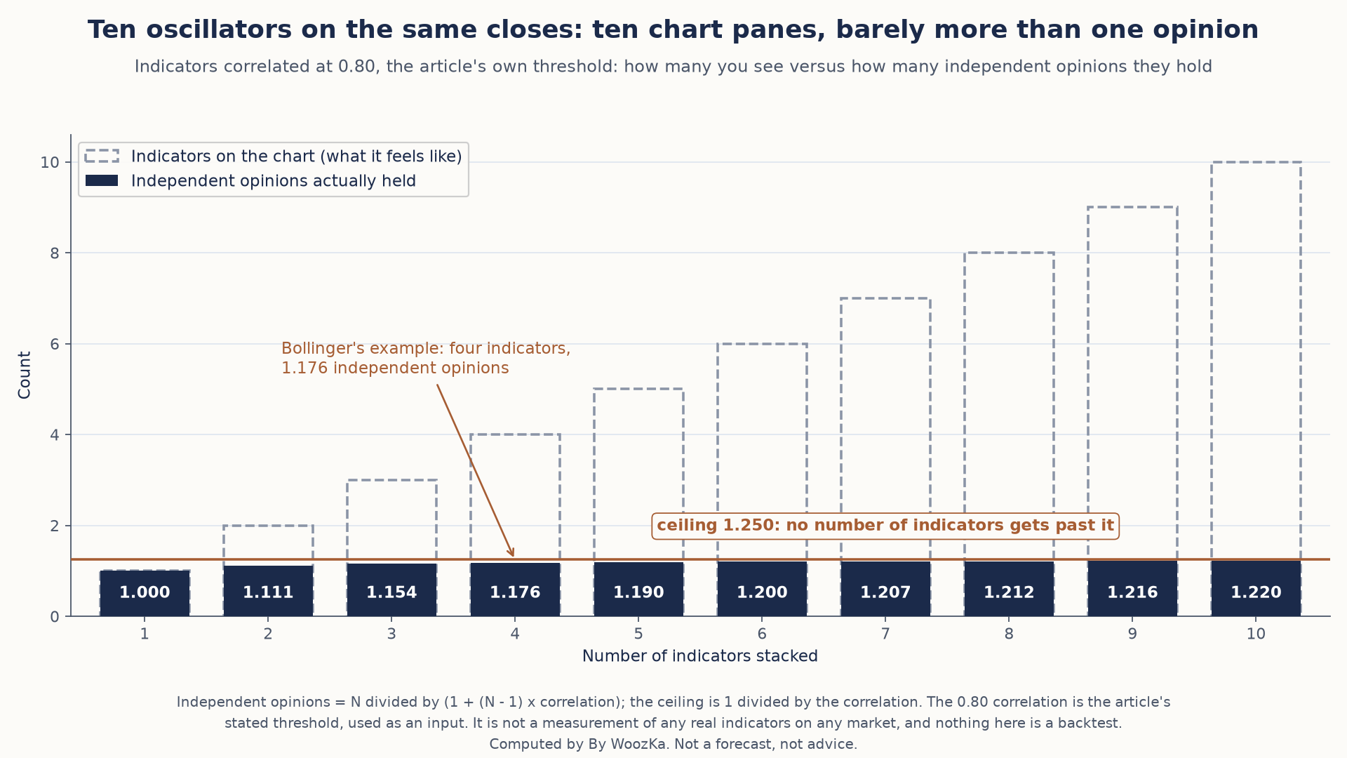 Adding oscillators that read the same closing prices adds panes to the chart, not information. At a 0.80 correlation, even ten of them hold barely more than one independent opinion, and none can get past 1.25.
How Often “Confirmation” Happens With Nothing In It
The section’s sharpest phrase is that agreement among correlated indicators is “dressed up to look like consensus.” That can be priced. How often does a set of correlated signals all point the same way when there is no signal in them at all? Below, the shared driver is pure noise, so every agreement in the table is meaningless by construction.
| Pairwise r | N = 2 | N = 3 | N = 4 |
|---|---|---|---|
| 0.00 | 50.00% | 25.00% | 12.50% |
| 0.50 | 66.67% | 50.00% | 40.00% |
| 0.80 | 79.52% | 69.28% | 62.80% |
| 0.90 | 85.64% | 78.47% | 73.86% |
| 0.95 | 89.89% | 84.84% | 81.58% |
| 0.99 | 95.49% | 93.24% | 91.78% |
Cells are the chance that all N land on the same side at once. At 0.80 two oscillators “confirm” each other 79.52% of the time against a 50% coin flip, and all four line up 62.80% of the time against the 12.50% independence would give — 5.02 times as often, on nothing at all. That multiple widens with the correlation, from 3.20 times at 0.50 to 7.34 times at 0.99.
The comparison worth sitting with runs across the table rather than down it. Four correlated indicators at this article’s own threshold agree more often (62.80%) than two genuinely independent ones do (50.00%). A four-way consensus among oscillators that all read the same closes is therefore weaker evidence than a two-way agreement between indicators that do not — which is Choice 3’s thesis arriving from a direction the section never takes.
One smaller thing the section leaves implicit. At a correlation of 0.80 there are two different correct answers to “how much is shared”: the common price series accounts for 80% of each indicator, while one indicator accounts for 64% of another, the square of the correlation. The quantity Choice 3 actually asks for — the share that is genuinely the indicator’s own — is the remainder, 36%. All three numbers are right, and reaching for the wrong one is the easiest mistake in the section.
How these figures were generated, and the cross-checks they passed. Every figure above was computed in code that re-derives the independent-opinion count from the variance of the average at every cell, cross-checks the agreement probabilities against Sheppard’s closed form at N = 2 and against a 400,000-draw simulation at a fixed seed, and reports nothing unless all of them agree. The correlation is a disclosed input at every step and never a measurement: nothing here measures what RSI, CCI or Williams %R actually correlate at on any instrument, and 0.80 is used throughout only because it is the threshold this article publishes. Nothing here is a backtest — no market data was used, no strategy was tested, and the shared driver is deliberately modeled as noise so that agreement carries no information. This article’s own arithmetic was recomputed and confirmed correct: seven independent binary choices do give 128 configurations, one new bar does move a 20-bar count by exactly 5 percentage points, and a lookback, a smoothing constant, a normalization window and two thresholds do come to five knobs.
Judging Whatever You Build
This article closes out the Trading Systems silo’s design-and-evaluation cluster. The pieces below cover the rest of the toolkit for judging whatever you build:
- Mean Reversion vs Trend Following: Which Strategy Style Fits You? — the two families of edge your new indicator will ultimately be trying to serve.
- Drawdown Explained and Sharpe Ratio Explained — the metrics that judge whether your finished indicator-based system is actually worth running, not just interesting to look at.
- What Makes a Trading System Robust? A Checklist — the questions to put any system built on a new indicator through before trusting it.
- What Is Overfitting in Backtesting (And How to Avoid It) and How to Backtest a Trading Strategy the Right Way — the discipline every design choice in this article ultimately has to survive.
- Moving Averages Explained, RSI Explained, MACD Explained, and Bollinger Bands Explained — the standard building blocks this article assumes you already understand.
If you want the plain-English, rigor-first read on indicators and systems — explained honestly, never hyped — that is what the newsletter is for. Subscribe below.
Disclaimer: This article is educational content, not financial advice. I am not a licensed financial advisor, and nothing here is a recommendation to buy or sell any security or asset. Investing and trading involve risk, including the possible loss of the money you invest. Do your own research and consider consulting a licensed financial professional before making investment decisions. Read the full Disclaimer.
Historical and backtested results are hypothetical, carry inherent limitations, and do not guarantee future results. Figures were accurate to the best of my knowledge as of this article’s last-updated date and may have changed.
