Dollar-Cost Averaging Into Individual Stocks: Smart or Risky?
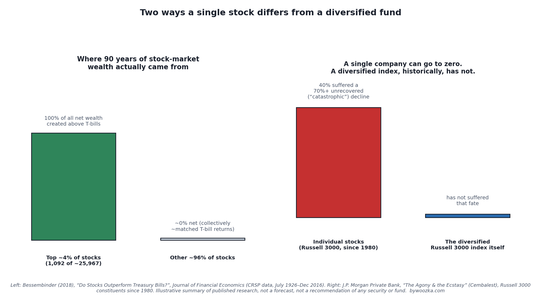 Both panels describe the same underlying fact from two directions: a handful of stocks generate almost all the market’s long-run gain, and a large share of individual stocks suffer a permanent, catastrophic decline — while the diversified index that contains all of them has not. Sources below.
Dollar-cost averaging — investing a fixed amount on a fixed schedule, regardless of price — is usually discussed in the context of index funds: automate a monthly buy into a broad fund and let time do the work. The research on that version is fairly settled: lump sum tends to beat DCA when there’s a lump sum to invest, and DCA’s real value is behavioral, not mathematical.
None of that math changes if you point the same mechanic at a single stock instead of a diversified fund. What changes is everything sitting underneath it. This article isn’t a rerun of the lump-sum-vs-DCA math — read that piece for the mechanics — it’s about the one variable that actually matters here: what you’re dollar-cost-averaging into.
It’s an easy habit to fall into. You set up a recurring buy into an index fund, feel good about the discipline, and then think: why not do the same thing with the stock of the company I work for, or the one everyone’s talking about, or the one that’s already done well for me? The scheduling app doesn’t care what ticker you point it at. The market does.
The Mechanic Is Identical. The Risk Underneath It Isn’t.
Dollar-cost averaging into a single stock works exactly like dollar-cost averaging into a fund: a fixed dollar amount buys more shares when the price is low and fewer when it’s high, pulling your average cost basis toward the cheaper prices in the sequence. Nothing about that arithmetic cares whether the ticker is a 3,000-company index fund or one company’s common stock.
What’s different is what’s inside the position you’re building. A broad index fund is, by definition, diversified — it holds hundreds or thousands of companies, so no single business’s failure can sink the whole position. A single stock is the opposite of that: it is one company’s fortunes, in full, with nothing underneath to catch you if that company specifically goes wrong. DCA doesn’t add diversification. It only changes when you buy into whatever you’ve chosen — it does nothing to change what you’ve chosen.
That distinction is the entire subject of this article, and it’s worth grounding in the actual data rather than intuition.
Why Diversification Exists in the First Place
Diversification reduces a specific, well-defined kind of risk: the risk that’s unique to one company, as opposed to the risk that affects the whole market.
Finance research separates a stock’s volatility into two pieces — market-wide (systematic) risk that no amount of diversification removes, and firm-specific (idiosyncratic or “diversifiable”) risk, which is priced out largely at random once you hold enough different companies together. A landmark study by John Campbell, Martin Lettau, Burton Malkiel, and Yexiao Xu, tracking U.S. stocks from 1962 through 1997, found firm-level volatility running persistently higher than market-level volatility, correlations between individual stocks trending lower over the period, and — as a direct consequence — the number of stocks needed to reach a given level of diversification increasing over time, not decreasing [source: Campbell, Lettau, Malkiel & Xu, “Have Individual Stocks Become More Volatile?”, Journal of Finance, 2001].
Exactly how many stocks are “enough” is genuinely contested in the academic literature, which is itself an instructive fact — one influential early study, Evans and Archer (1968), estimated that meaningful risk reduction tapered off around 8–10 stocks; later work revised that upward, with Statman (1987) arguing for roughly 30–40 holdings, and more recent research pushing the estimate higher still depending on the time period and methodology used [source: Evans & Archer, Journal of Finance, 1968; Statman, Journal of Financial and Quantitative Analysis, 1987]. The specific number keeps moving. The conclusion underneath every version of the estimate doesn’t: a single stock sits at the least-diversified end of that entire spectrum, by definition. One company is a sample size of one.
Where the Market’s Actual Wealth Creation Came From
If diversification is the theory, this is what it looks like in the historical record.
Finance professor Hendrik Bessembinder studied the entire population of roughly 25,967 U.S. common stocks that traded on major exchanges from July 1926 through December 2016 and asked a simple question: which stocks actually created wealth above what an investor would have earned just holding one-month Treasury bills? The answer was strikingly concentrated. The best-performing companies — roughly 4% of the sample, or 1,092 stocks — accounted for all of the stock market’s net wealth creation above T-bills over that 90-year span. The remaining approximately 96% of stocks, taken together, produced lifetime gains that merely matched what an investor would have earned in T-bills. Individually, a slim majority of stocks — about 57.4% — actually had a lifetime buy-and-hold return below the T-bill return, while 42.6% beat it [source: Hendrik Bessembinder, “Do Stocks Outperform Treasury Bills?”, Journal of Financial Economics, 2018].
That is the honest odds picture behind picking any single stock to dollar-cost average into: across nine decades of U.S. market history, the large majority of individual stocks were, at best, dead weight relative to simply holding Treasury bills, and a small handful did nearly all of the work. A diversified fund owns the whole distribution — the 4% and the 96% together — which is precisely why it captures the market’s real return instead of gambling on which bucket a specific pick falls into.
The Other Side of Concentration: Catastrophic, Unrecovered Declines
Concentration cuts both ways — the flip side of “a few winners drive everything” is “plenty of individual stocks fail outright, permanently.”
J.P. Morgan Private Bank’s long-running “Agony & the Ecstasy” research, authored by Michael Cembalest, examined every constituent of the Russell 3000 — an index covering roughly 98% of the investable U.S. equity market — since 1980. It found that 40% of those stocks suffered a “catastrophic” decline: a drop of 70% or more from their peak price, with little subsequent recovery, and that around 40% of stocks also delivered a negative return over their entire lifetime as a public company [source: J.P. Morgan Private Bank, “The Agony & the Ecstasy: The Risks and Rewards of a Concentrated Stock Position,” Michael Cembalest]. Two of the most extreme, well-documented examples: Enron, whose stock peaked near $90.75 in August 2000 and was trading around $0.26 a share by the time the company filed for Chapter 11 bankruptcy in December 2001, wiping out tens of billions of dollars in shareholder value [source: SEC litigation record; press coverage of the Enron collapse, 2001], and Lehman Brothers, whose stock lost roughly 93% of its market value in the run-up to its September 15, 2008 bankruptcy filing — still the largest bankruptcy filing in U.S. history by assets — which left shareholders essentially wiped out [source: coverage and records of the Lehman Brothers Chapter 11 filing, September 2008].
Here is the detail that matters specifically for dollar-cost averaging: a diversified index does not go to zero the way a single company can. The Russell 3000 index itself, across the same 1980-to-present window the “Agony & the Ecstasy” research covers, has never suffered a 70%+ unrecovered decline — even though 40% of its individual constituents did. That isn’t a promise the index can’t fall hard (it absolutely can, and has), and it certainly isn’t a guarantee about the future — it’s a description of a structural difference: a broad index automatically retires companies that fail and keeps weighting toward the ones that survive and grow, so a total, permanent loss of the entire position is a fundamentally different kind of event for an index than it is for a single stock.
The Odds Those Two Sections Imply, Together
This article publishes the wealth-creation distribution in one section and the “how many stocks is enough” debate in another, and never puts them side by side. Doing that is what turns “a diversified fund owns the whole distribution” from a sensible principle into a number.
First, the article’s own arithmetic checks out: 1,092 of 25,967 is 4.205%, so “roughly 4%” is right, and 57.4% plus 42.6% is exactly 100%, so that split is exhaustive.
Beating T-Bills and Creating Wealth Are Not the Same Bar
| What the distribution says | Figure |
|---|---|
| Share of all 25,967 stocks that produced the net wealth | 4.205% |
| Stocks you would have to draw to expect one of them | 23.78 |
| Share of the T-bill beaters that were wealth creators | 9.87% |
42.6% of stocks beat Treasury bills, but only 4.205% did the net wealth creation. So fewer than one in ten of the winners — 9.87% of them — carried the entire result. Clearing the T-bill bar was roughly ten times more common than mattering. That gap is the reason “my pick was up over the period” is much weaker evidence than it feels like.
How Often a Small Portfolio Misses Them Entirely
The diversification section reports Evans and Archer at 8–10 holdings and Statman at 30–40. Those estimates are about damping volatility. Applied instead to the wealth-creation distribution above, the same counts answer a different and blunter question: what are the chances a portfolio that size contains none of the 4%?
| Stocks held | Chance of holding none of the 4% | Chance of holding at least one |
|---|---|---|
| 1 | 95.79% | 4.21% |
| 8 — Evans and Archer’s low end | 70.91% | 29.09% |
| 10 — their high end | 65.07% | 34.93% |
| 30 — Statman’s low end | 27.56% | 72.44% |
| 40 — Statman’s high end | 17.93% | 82.07% |
A ten-stock portfolio — the number the earliest diversification research called sufficient — would have held none of the wealth creators about 65% of the time. Even Statman’s thirty to forty leaves 17.93% to 27.56%, missing them roughly one time in four or five. The two literatures are answering different questions, and that is the point worth carrying: a holding count that is genuinely adequate for smoothing volatility can still be far too small to be likely to own the handful of companies that produced the market’s return. Dollar-cost averaging into one name does not change this distribution — it only changes the price you pay to sit inside it.
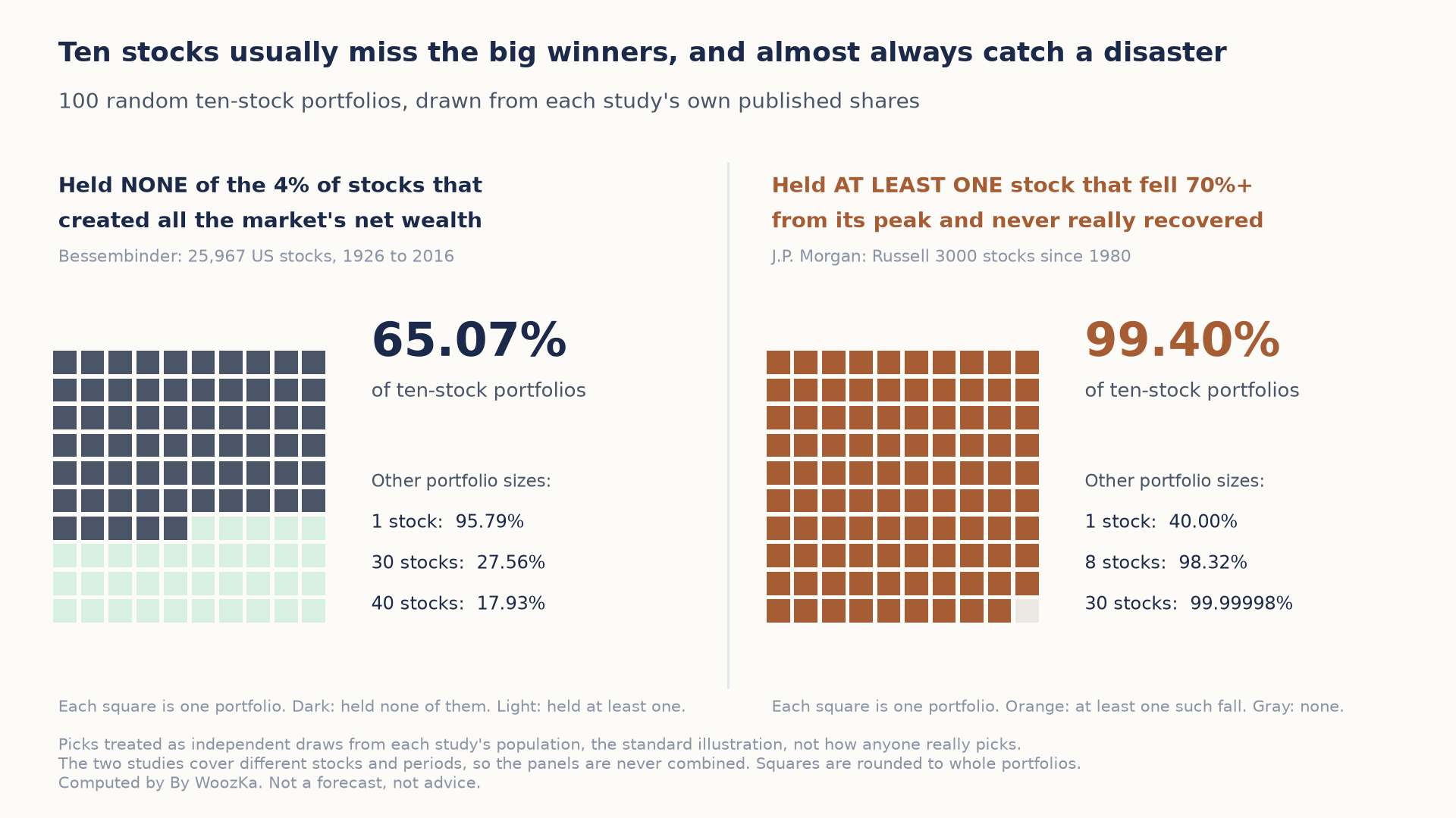 Treating each pick as an independent draw, about 65 in 100 ten-stock portfolios would have held none of the few stocks that produced the market’s gain, while about 99 in 100 would have held at least one catastrophic decline. The two panels use different studies and are shown side by side, never multiplied together.
The Same Draw, Seen From the Downside
The catastrophic-decline research quoted above reports that about 40% of Russell 3000 constituents since 1980 fell 70% or more from their peak without meaningfully recovering. Run as the same kind of draw, that figure compounds in the opposite direction.
| Stocks held | Chance none suffers a catastrophic decline | Chance at least one does |
|---|---|---|
| 1 | 60.00% | 40.00% |
| 8 | 1.68% | 98.32% |
| 10 | 0.60% | 99.40% |
| 30 | 0.00002% | 99.99998% |
At ten individual holdings, at least one catastrophic decline is 99.40% likely on that study’s figure. Both effects run the same way for the same reason: with a distribution this skewed, a small portfolio is very likely to miss the rare thing that matters and very likely to catch the common thing that hurts. An index fund is not merely safer in the vague sense — it removes both draws by owning the whole population.
Sourcing for the two studies above, and what each can and cannot show. Every input above is a figure this article already publishes — Bessembinder’s 25,967 stocks and 1,092 wealth creators, the 57.4%/42.6% T-bill split, the J.P. Morgan 40% catastrophic-decline share, and the Evans-Archer and Statman holding counts. Each figure was recomputed and checked in code first; the article’s own “roughly 4%” was recomputed at 4.205% and its 57.4/42.6 split confirmed exhaustive before anything was built on them. Three limits are real, and the first is the important one. These tables treat picks as independent draws from each study’s own population, which is the standard illustration and not how anyone actually selects stocks — real portfolios are correlated by sector, size and era, which can push the odds either way. The two studies cover different populations and different periods, so their figures are never multiplied together and no combined number appears above. And a historical distribution is a description of what happened, not a probability for any particular company today. No forecast, no stock recommendation and no position size appears anywhere above.
What This Means for Dollar-Cost Averaging Specifically
DCA’s mechanical benefit — buying more shares when the price is down, fewer when it’s up — assumes the asset you’re buying is one that’s likely to recover and grow over time. That assumption is close to a given for a total-market index fund, because a permanent, uncorrected decline to zero for the entire diversified market has no precedent in U.S. history. It is not remotely a given for a single stock, where “the price is down” sometimes means “temporarily cheap” and sometimes means “correctly pricing in that this company is dying” — and the two can look identical in the moment.
That’s the trap dollar-cost averaging can quietly set for a concentrated position: adding a fixed amount every month feels disciplined regardless of which of those two situations you’re actually in. Averaging down into a temporarily depressed but fundamentally sound company is a completely different act from averaging down into a company on its way to zero — and the DCA schedule itself gives you no signal for telling the two apart, because it isn’t designed to. It just keeps buying.
None of this means dollar-cost averaging into a single stock is inherently reckless. A reader who understands a specific business well, who treats it as a small satellite position layered on top of a diversified core rather than a substitute for one, and who has deliberately sized the position so that a total loss wouldn’t be financially catastrophic, is doing something categorically different from a reader who is quietly funneling a growing share of their investable savings into one company because a recurring buy feels productive. The mechanism is identical in both cases. The risk being taken on is not.
So: Smart or Risky?
The honest answer is that dollar-cost averaging is neutral — it’s a scheduling tool, not a risk-management tool — and the real question was never really about DCA at all. It’s about concentration: whether you’re comfortable putting an increasing share of your invested money behind the fortunes of one company, knowing that the historical evidence shows most individual stocks are dead weight or worse relative to a diversified fund, a meaningful share suffer catastrophic and unrecovered declines, and only a small number account for essentially all of the long-run gain.
If the goal is building wealth reliably over decades, the evidence above is a large part of why a broad, diversified index fund is the sensible default core position — the approach this site’s Autopilot Plan is built around — with any single-stock conviction bets, if you choose to make them at all, sized as a small, clearly bounded addition on top, not a replacement for it. Nothing here is a recommendation to buy, sell, or avoid any particular stock; it’s a description of what the data says about the category of decision, so you can make it with your eyes open.
Worked example: ten shares at $50, ten more at $40 and ten at $30 is 30 shares for $1,200 — a blended cost of $40.00. At $45 the position is worth $1,350 and is up $150, or 12.5%, even though the price is still 10% below where the first buy went in. The Stock Average / Average-Down Calculator takes any number of lots and returns the blended cost and the breakeven price.
Disclaimer: This article is educational content, not financial advice. I am not a licensed financial advisor, and nothing here is a recommendation to buy or sell any security or asset. Investing and trading involve risk, including the possible loss of the money you invest. Do your own research and consider consulting a licensed financial professional before making investment decisions. Read the full Disclaimer. Historical and backtested results are hypothetical, carry inherent limitations, and do not guarantee future results. Figures were accurate to the best of my knowledge as of this article’s last-updated date and may have changed.
If you’re weighing a single-stock position against a diversified core — or you just want the research-backed version of “should I keep adding to this” applied to your own situation — subscribe below for the weekly read this blog uses to think through exactly that kind of decision.
