When Everyone’s Talking About Stocks: Crowd Euphoria as a Warning Sign
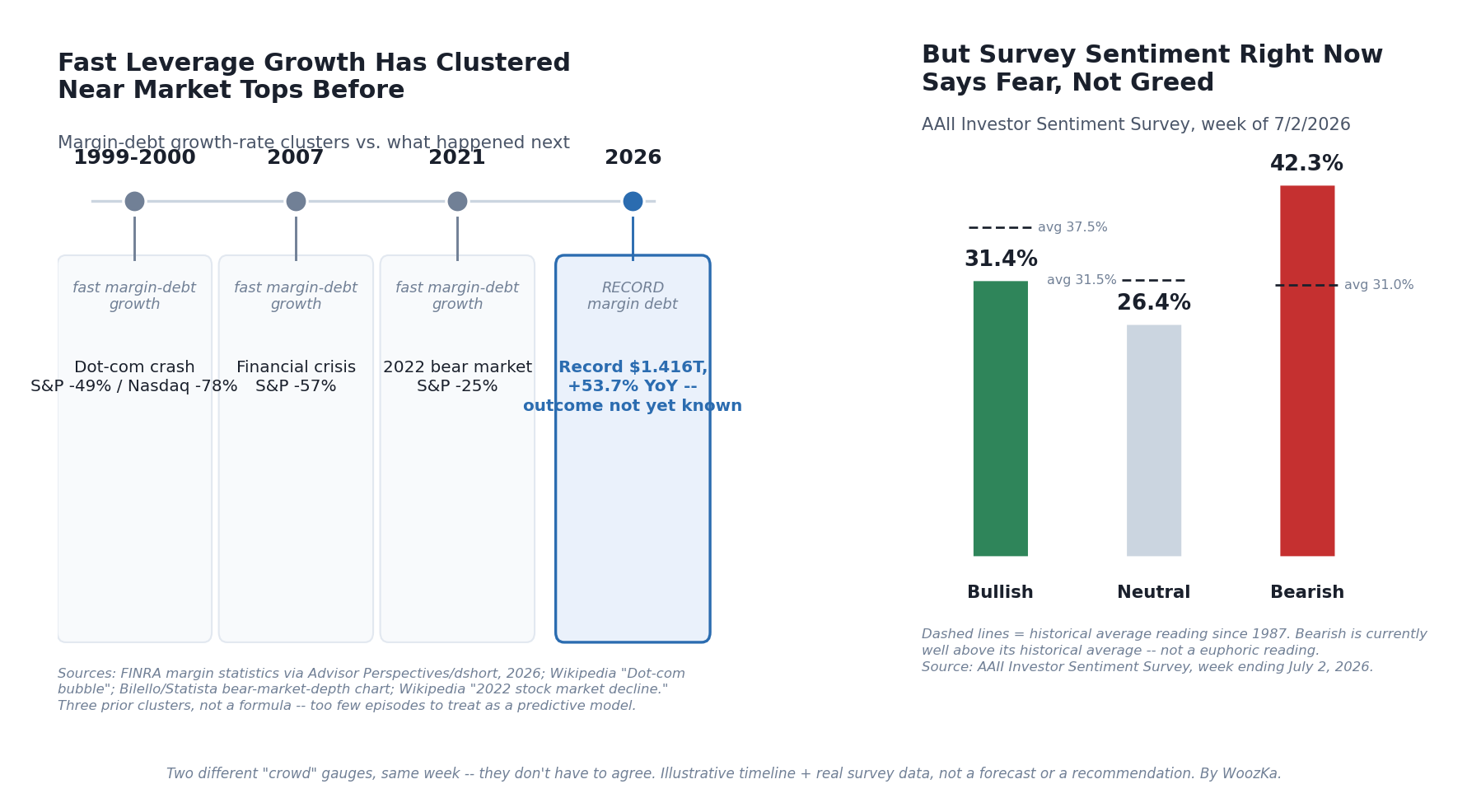
Two different “crowd” signals, read on the same day, can disagree — which is exactly why neither one is a crystal ball. Sources: FINRA margin statistics via Advisor Perspectives, 2026; AAII Investor Sentiment Survey, week of July 1, 2026.
Before anything else: nothing in this article is a signal to buy, sell, or exit the market today, and nothing here tells you where any index is headed next. This is a piece about a single behavioral guardrail — the “greed rule” in The Autopilot Plan — and about being honest regarding what “everyone’s talking about stocks” actually predicts, historically, and what it doesn’t.
The greed rule is the mirror image of the fear rule: when the news turns bearish, the Autopilot Plan says increase your recurring investment; when euphoria sets in — when investing stops being a niche interest and becomes something everyone around you is suddenly doing — the plan says reduce your recurring contribution, modestly and temporarily. Not sell. Not short. Not exit. Just ease off the accelerator for a while, the same way you’d ease off spending during a personal income squeeze.
Why “Everyone’s Talking About It” Became a Signal at All
The idea has a real intellectual pedigree, not just folk wisdom. Sir John Templeton, one of the most successful contrarian investors of the 20th century, is widely quoted as saying that “bull markets are born on pessimism, grow on skepticism, mature on optimism, and die on euphoria” — a line repeated so often across financial commentary that its exact original source (a specific speech, letter, or interview) is difficult to pin down with certainty, but the sentiment is consistently attributed to him [source: Franklin Templeton maxims; widely cited in investment commentary]. The logic is straightforward: by the time an idea has become common knowledge and nearly everyone who wants to buy already has, there are fewer new buyers left to push prices higher — and a lot of people who bought late, often with borrowed money, ready to sell at the first sign of trouble.
Alan Greenspan, then the Federal Reserve chairman, gave the idea its most famous label in a speech on December 5, 1996, at the American Enterprise Institute titled “The Challenge of Central Banking in a Democratic Society,” asking aloud “how do we know when irrational exuberance has unduly escalated asset values?” [source: Federal Reserve, December 5, 1996 speech]. The market dipped briefly on the remark — and then continued rising for more than three years before the dot-com crash actually arrived, which is itself the first honest lesson here: naming euphoria correctly doesn’t tell you when it ends.
The Famous Anecdotes (and Why to Hold Them Loosely)
Two stories get repeated constantly in this context, and both deserve more scrutiny than they usually get.
The first is the “shoeshine boy” story: Joseph P. Kennedy, father of the future president, is said to have gotten a stock tip from a shoeshine boy in 1929 and concluded that if shoeshine boys were picking stocks, the market must be over-owned — so he sold out before the crash. The story appears in a 1965 Kennedy biography, but no contemporary (1929-era) source for it has been found, and some historians who’ve looked into Kennedy’s actual, well-documented trading behavior around that period consider it embellished or invented after the fact [source: financial-history research compiled at barrypopik.com; multiple investment-commentary retrospectives]. It’s told constantly anyway, because the lesson — when speculation reaches people with no independent reason to be in the market, that’s information — doesn’t depend on the anecdote being literally true.
The second is the “magazine cover indicator”: the idea that when a mainstream, non-financial-specialist publication puts a market call on its cover, that call is often close to a turning point — because by the time an idea is common enough to be cover material, the point of maximum sentiment (in either direction) has often already been reached. The single most cited example runs the other way from euphoria: BusinessWeek’s August 13, 1979 cover, “The Death of Equities,” declared that inflation was permanently destroying the case for owning stocks. Three years later the market bottomed and began a rally so large that the S&P 500’s total return (with dividends reinvested) was up nearly 7,000% from that 1982 low over the following decades, and the index returned roughly 18% a year over the 20 years after the cover ran [source: Bloomberg, “It’s Been 40 Years Since Our Cover Story Declared ‘The Death of Equities,’” August 2019]. That’s a fear-side example, not a greed-side one — proof the same mechanism cuts both ways: extreme, universally shared sentiment of either flavor has historically been a better sell signal on itself than a forecast of what comes next.
For an actual greed-side parallel, look to September 1999, when columnist James Glassman and economist Kevin Hassett published Dow 36,000, arguing the Dow Jones Industrial Average — then around 10,000-11,000 — was set to roughly triple to 36,000 within a few years because stocks were fundamentally underpriced relative to bonds [source: Wikipedia, “Dow 36,000”; Fortune, November 2021]. The dot-com crash began within months of publication. The Dow did eventually cross 36,000 — in November 2021, 22 years later, after the dot-com bust, September 11, the 2008 financial crisis, and the 2020 pandemic crash had all happened in between [source: Fortune, “Remember ‘Dow 36,000’?”, November 2021]. The book wasn’t wrong that stocks go up over time. It was a near-perfect artifact of the exact moment optimism peaked.
What You Can Actually Measure (Rather Than Just Vibes)
Anecdotes are memorable but not measurable. A few real, ongoing gauges try to quantify crowd sentiment directly:
The AAII Investor Sentiment Survey has polled a panel of individual investors every week since 1987 on a single question — do you expect the stock market to be higher, the same, or lower six months from now? — and reports the bullish/neutral/bearish percentages plus the “bull-bear spread” (bullish minus bearish) [source: AAII, Investor Sentiment Survey methodology]. It’s used as a contrarian gauge: historically, unusually high bullish readings have tended to precede weaker-than-average subsequent returns and a higher chance of a pullback, while unusually bearish readings have tended to precede stronger-than-average returns [source: AAII sentiment survey historical analysis; The Dow Theory, sentiment-survey commentary]. The historical average split is roughly 37.5% bullish, 31.5% neutral, and 31% bearish. As of the week ending July 1, 2026, the actual reading was 31.4% bullish, 26.4% neutral, and 42.3% bearish — a notably bearish-tilted reading, not a euphoric one [source: AAII Investor Sentiment Survey, week of July 1, 2026]. Worth sitting with: the most direct crowd-sentiment survey available says fear, not greed, as of this writing.
The CNN Fear & Greed Index blends seven inputs — price momentum against the 125-day moving average, the number of stocks at 52-week highs versus lows, the McClellan Summation breadth index, the put/call options ratio, junk-bond demand versus safer bonds, the VIX volatility index, and the spread between stock and Treasury returns — into a single 0 (extreme fear) to 100 (extreme greed) score, weighting each component equally [source: CNN Business, Fear & Greed Index methodology]. As of July 7, 2026, it read approximately 44, inside CNN’s “neutral” band and leaning toward fear rather than greed [source: CNN Business Fear & Greed Index; Benzinga market summary, July 7, 2026]. CNN labels the two ends of that scale “extreme fear” and “extreme greed” but publishes no numeric cut-point for either band, so a specific trigger number is a convention readers bring to it rather than something the index states; a reading in the mid-40s isn’t a euphoria signal on any of the usual ones.
Margin debt — money investors borrow against their brokerage accounts to buy more securities — is a different kind of gauge: instead of asking people how they feel, it measures how much leveraged conviction they’re actually putting behind it. FINRA’s margin debt data (which goes back to January 1997) hit a record $1.416 trillion in May 2026, up 8.5% from April and up 53.7% year-over-year — the fastest pace of margin-debt growth the dataset has recorded outside of three earlier periods: late 1999 into early 2000, mid-2007, and spring 2021 [source: FINRA margin statistics; Advisor Perspectives/dshort, “Margin Debt Jumps 8.5% in May to New Record High,” June 2026]. FINRA has since published two more months, and May 2026 is no longer the peak: the series ran to $1.502 trillion in June 2026 before easing to $1.417 trillion in July [source: FINRA, Margin Statistics, debit balances in customers’ securities margin accounts, July 2026 reference month]. Each of those three earlier clusters preceded a major market decline — the dot-com crash, the 2007-2009 financial crisis, and the 2022 bear market, respectively — though the lead time varied (margin-debt peaks or growth-rate peaks led the eventual market top by roughly six months in 2000, four months in 2007, and two months in 2021) [source: Advisor Perspectives dshort margin-debt/market-top analysis, 2026]. What happened after each of those declines began is real and dated: the Nasdaq fell about 78% and the S&P 500 about 49% peak-to-trough in the 2000-2002 dot-com bust; the S&P 500 fell about 57% in the 2007-2009 financial crisis; and the S&P 500 fell about 25% from its January 3, 2022 peak to its October 12, 2022 trough [source: Wikipedia, “Dot-com bubble”; Charlie Bilello / Statista bear-market-depth chart; Wikipedia, “2022 stock market decline”]. What happens after the current, fourth cluster is not yet known as of this writing — that gap is the whole point of the next section.
Where the “Signal” Actually Breaks Down
Here’s the honest tension sitting in the chart above: as of mid-2026, the leverage gauge (margin debt) is at a record, fast-growing extreme that has historically clustered near market tops, while the two sentiment gauges (AAII, CNN Fear & Greed) both read fear or neutral, not greed. If “crowd euphoria” were a single, reliable dial, these would move together. They don’t, and that’s normal — different indicators measure different things (how people feel vs. how much borrowed money they’re actually deploying), and they can and do diverge for extended stretches.
That’s one honest limit. There are several more, and they matter more than the anecdotes:
- Extremes can persist for a long time before anything happens. Greenspan flagged “irrational exuberance” in December 1996; the dot-com crash didn’t begin until March 2000 — more than three years later, during which the Nasdaq roughly tripled again. Anyone who treated the speech as a sell signal missed a large chunk of the remaining bull market.
- A euphoria reading doesn’t tell you the size or timing of what follows. The 2000, 2007, and 2021 clusters were followed by declines of dramatically different depth and speed (about 49%, 57%, and 25% respectively) and duration. There’s no formula that converts “sentiment is stretched” into “here’s exactly what happens next and when.”
- Retail mania moments are real but don’t always mark the top. GameStop’s stock ran from about $17.25 at the start of January 2021 to an intraday high near $483 on January 28, 2021 — nearly thirty times its price at the start of the month, in under four weeks, fueled by retail investors organizing on Reddit’s r/wallstreetbets against hedge funds that had shorted more than 140% of the stock’s available float [source: Wikipedia, “GameStop short squeeze”; Cato Institute, “The GameStop Episode,” 2021]. It’s a genuine, well-documented mania. But the broader S&P 500 didn’t peak until roughly 11 months later, in early January 2022 — the GameStop spike was a symptom of the broader retail-euphoria period (Schwab added a record 3.2 million new brokerage accounts in Q1 2021 alone, more than all of 2020’s roughly 2.4 million, while Robinhood’s user base roughly doubled from about 10 million in 2019 to 13 million in 2020 [source: CNBC, April 2021]), not a precise, tradeable timestamp for the index top.
- Every one of these tools is backward-looking and probabilistic, not predictive. They describe what tends to follow certain conditions on average, across a small number of historical episodes — not what will happen this time. A handful of data points (three or four major cycles) is not a large enough sample to treat any of this as a formula.
Three Gauges, With the Subtraction Done
Every number needed to settle the tension described just above is already printed in this article, and in each case it is printed as a pair that never gets combined. A survey whose headline statistic is defined here by name and then left uncalculated. An index whose construction is described here, and whose actionable thresholds are described here, in different sentences. Three episodes whose lead times and depths are both listed, alongside the observation that a handful of data points is not a large enough sample — a statement this article makes and does not price. What follows combines each pair and nothing else: no outside data is used, no reading is projected forward, and nothing below says anything about what any market does next.
The bull-bear spread, actually subtracted
This article names the AAII “bull-bear spread (bullish minus bearish)” as the survey’s headline statistic, then prints two full splits and subtracts neither. The subtraction takes one line each.
| AAII split | Bullish | Neutral | Bearish | Bulls minus bears |
|---|---|---|---|---|
| Historical average | 37.5% | 31.5% | 31.0% | +6.5 |
| Week of Jul 1, 2026 | 31.4% | 26.4% | 42.3% | −10.9 |
| Difference | −6.1 | −5.1 | +11.3 | −17.4 |
The reading sits 17.4 points below its own historical spread, and the composition of that move is the part worth reading twice. Bulls are at 0.8373× their usual share — a real shortfall, but a modest one. Bears are at 1.3645×, and they account for 64.9% of the whole 17.4-point move on their own. What the bears gained, 11.3 points, is within one rounding step of the 11.2 points that bulls and neutrals gave up between them, so this is not enthusiasm cooling into indifference; it is enthusiasm and indifference both converting into expressed pessimism. A euphoria gauge would have to be read upside down to make this a euphoria reading. (The July split sums to 100.1 rather than 100.0, which is the survey’s own rounding and not an error here.)
Seven equal weights cap what any one signal can do
This article states two things about the CNN index a few paragraphs apart: it blends seven inputs, weighting each equally, and it runs from 0 at maximum fear to 100 at maximum greed. Those are the facts CNN publishes; it attaches no numeric cut-point to any of the bands its gauge labels. So the question the construction can answer on its own is not where the line sits but what a single loud indicator is arithmetically able to do. Below, some number of inputs sit pegged at their extreme and the rest sit exactly at the midpoint.
| Inputs pegged | Greed side | Fear side |
|---|---|---|
| 1 | 57.1 | 42.9 |
| 2 | 64.3 | 35.7 |
| 3 | 71.4 | 28.6 |
| 4 | 78.6 | 21.4 |
| 5 | 85.7 | 14.3 |
| 6 | 92.9 | 7.1 |
| 7 | 100.0 | 0.0 |
One input pegged at its maximum, with the other six neutral, produces 57.1. That is 7.1429 points off the midpoint — 14.29% of the 50 points separating neutral from the pole — and it is a ceiling, reached with the dial jammed as far as it goes. Since the cut-point is not published, the answerable form of the question is what any candidate trigger would cost: reaching 60 takes 2 of the seven, 65 and 70 take 3, 75 takes 4, 80 and 85 take 5, and 90 takes 6, with the fear side an exact mirror at 40, 35, 30, 25, 20, 15 and 10. Across that entire range the answer is never one. That is this article’s own rule — that the greed rule “triggers on a cluster of signals, not a single headline” — recovered from the construction of one of the gauges rather than asserted beside it, and recovered without needing to know where the line has been drawn. It also puts the current reading in proportion. At 44, with six inputs neutral, the seventh would have to sit at 8.
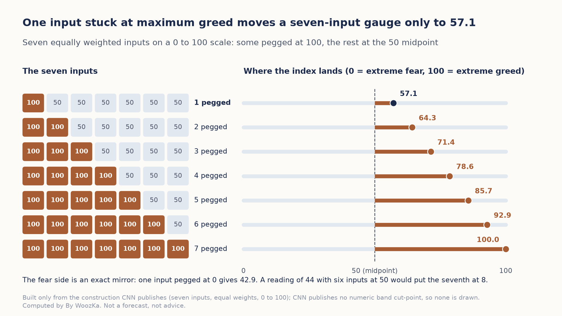
Because the seven inputs are weighted equally, a single input jammed at its extreme can move the index only from 50 to 57.1, and every higher level needs several inputs moving together. That is the article’s cluster-of-signals rule, read straight off the gauge’s construction.
What three episodes will carry, and what they will not
The lead times and the declines are both listed here, in the same paragraph and the one after it, and the article says the lead time “varied” without saying by how much. Ratios, taken against the smallest of each:
| Cluster | Lead time | S&P 500 fall | vs shortest lead | vs shallowest fall |
|---|---|---|---|---|
| 1999–2000 | 6 months | 49% | 3.00× | 1.96× |
| 2007 | 4 months | 57% | 2.00× | 2.28× |
| 2021 | 2 months | 25% | 1.00× | 1.00× |
The lead times span 3.00× and the declines 2.28×, which is what “varied” is worth in numbers. The tidiness is the trap: 6, 4 and 2 is an exact arithmetic sequence, falling by the same two months each time, and it is very hard to look at without seeing a countdown. But three distinct values can be arranged six ways, and exactly one of those six is strictly decreasing — a shape that shows up one time in six by accident alone, and one time in three if either direction would have been read as a pattern. The depths are the useful control, because they came from the same three episodes and are not even monotone: the deepest decline followed the middle lead time, not the longest. Pairing the two gives a correlation of 0.7206, which sounds like a relationship until the same three depths are shuffled against the same three lead times: four of the six possible pairings produce a correlation at least that strong, and one reaches 0.9608. A figure that two arrangements out of three would have matched or beaten is not evidence of a link. All of which supports the caution this article already states, in the article’s own numbers rather than as a disclaimer beside them: three episodes are enough to notice a pattern and not enough to be owed one.
Method and limits, set out so the arithmetic can be checked rather than believed. Every input is a figure this article already prints — the two AAII splits, the seven equally weighted inputs on their 0-to-100 scale, the reading of 44, and the three lead times with the three declines — and nothing external is added. No calculator is linked because none of the twelve on this site computes a survey spread, an equally weighted index or a correlation; the work is done in code, and every figure above was checked before it was reported. The second table models the non-pegged inputs as sitting exactly at the midpoint, which is the arrangement most favorable to a single signal and therefore the one that makes the ceiling a real ceiling rather than an assumption. The third table treats the three episodes as three observations and does nothing else with them: no fourth lead time is estimated, and this article’s own statement that the current cluster’s outcome is not yet known is left exactly as it stands. This article’s own arithmetic recomputes and holds — $17.25 to $483.00 is 28.0×, which is the “nearly thirty times” it claims; the record $1.416 trillion with its stated 8.5% monthly and 53.7% annual growth implies $1.3051 trillion in April and $0.9213 trillion a year earlier, which is internally consistent; the Dow at 10,000–11,000 reaching 36,000 is 3.27× to 3.60×, or “roughly triple”; Schwab’s 3.2 million against 2020’s 2.4 million is 1.333×; and Robinhood’s 10 million to 13 million is +30.0%. Nothing above is a forecast, and no allocation or trade is recommended anywhere in it.
How to Actually Use This (The Greed Rule, Applied Carefully)
Given all of that, here’s the honest, narrow way the greed rule is meant to work inside the Autopilot Plan:
- It adjusts your ongoing contribution rate, not your existing holdings. The greed rule never means selling stock you already own, timing an exit, or shorting the market. It only means dialing back how much new money you add to your recurring investment for a stretch — a modest, pre-decided reduction (the Autopilot Plan frames this as roughly 20-50% below baseline, mirroring the fear rule’s bump in the other direction), not stopping entirely.
- It triggers on a cluster of signals, not a single headline. One euphoric magazine cover, one retail mania stock, or one bullish AAII reading in isolation means very little. The rule is meant to activate when several independent signals — elevated leverage, stretched sentiment surveys, saturation of investing into non-investor social conversation, retail account-opening surges — line up at the same time, the way they did in 1999-2000, 2007, and 2021.
- It never becomes a reason to leave the market. The base rule of the Autopilot Plan — steady, automatic investing into a broad benchmark ETF — keeps running underneath the greed rule at a reduced pace, not a paused one. The point isn’t to predict the top and get out; it’s to avoid adding fuel at the exact moment the crowd (and your own emotions) are most likely to be at their least rational, while staying invested for whatever comes next.
- It’s a discipline for your behavior, not a forecasting claim about the market. If someone tells you sentiment data lets you reliably call tops and bottoms, the historical record — Greenspan’s three-year-early warning, the wildly different depths of the 2000/2007/2022 declines, sentiment gauges disagreeing with leverage gauges as of this writing — doesn’t support that claim.
There’s a particular moment a lot of long-time investors describe: the first time a person with no prior interest in the market — a relative, a coworker, someone at a party — brings up a specific stock or crypto unprompted, excited, sure it’s an easy win. It rarely feels alarming in the moment; it usually just feels like everyone’s finally “getting it.” Looking back, a lot of people can point to a stretch just like that, right before things got a lot more volatile than anyone at the party expected.
The Honest Bottom Line
Is “everyone’s talking about stocks” a real signal? The historical record says yes, in the loose sense that Templeton described: widespread, borrowed-money-fueled, non-specialist enthusiasm has clustered near several major market tops, and the mechanisms proposed for why (fewer remaining buyers, more leveraged and fragile positioning, decision-making driven by social proof rather than analysis) are coherent, not just superstition.
But the same record says the signal is loose, slow, and sometimes contradictory. It gave a three-year-early warning in 1996-2000. It doesn’t tell you whether the eventual decline will be a relatively mild 25% or a devastating 57%. And as of mid-2026, it’s actively split — leverage at a record extreme, sentiment surveys reading fear. None of that supports using it to time an exit. What it supports is exactly the narrow, behavioral use the greed rule was built for: a pre-committed reason to ease off adding new money when the crowd (and you) are at your most excited, while staying invested through whatever comes next.
Disclaimer: This article is educational content, not financial advice. I am not a licensed financial advisor, and nothing here is a recommendation to buy or sell any security or asset. Investing and trading involve risk, including the possible loss of the money you invest. Do your own research and consider consulting a licensed financial professional before making investment decisions. Read the full Disclaimer.
Historical and backtested results are hypothetical, carry inherent limitations, and do not guarantee future results. Figures were accurate to the best of my knowledge as of this article’s last-updated date and may have changed.
