Bollinger Bands Explained: Volatility, Squeezes, and Mean Reversion
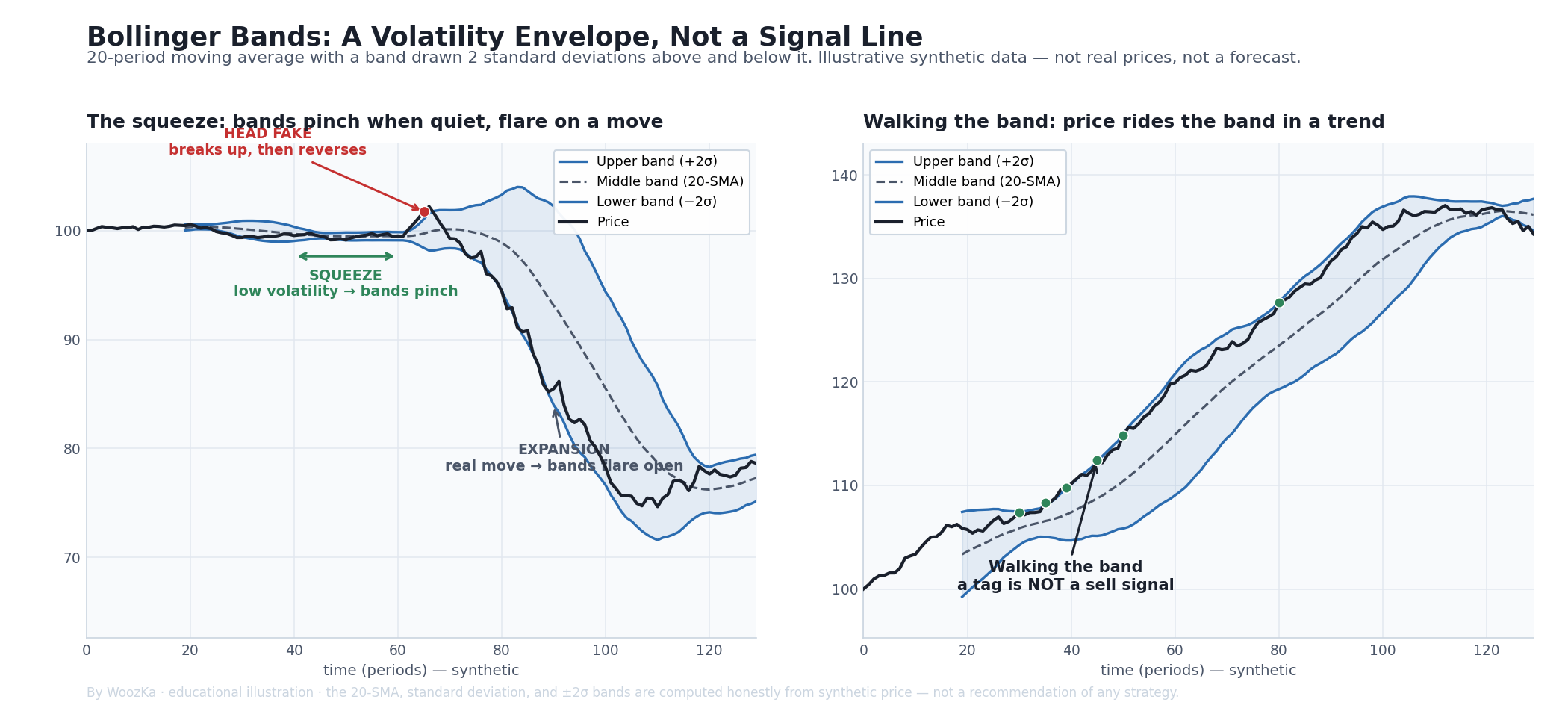 The whole indicator in one picture. Left: the bands are a 20-period moving average with an envelope drawn two standard deviations above and below it, so they squeeze shut when the market goes quiet and flare open when it moves. Right: in a real trend, price tags the band over and over — which is exactly why a band touch is not a trade. Everything below is about reading this honestly.
Bollinger Bands are on almost every charting platform, and they are one of the most intuitively appealing indicators a beginner meets: two lines that hug the price and seem to mark where it is “too high” or “too low.” That appeal is also the trap. The single most common way Bollinger Bands are misused is to treat a touch of the upper band as a sell and a touch of the lower band as a buy — and the person who created the indicator has said, in plain words, that this is wrong.
Here is the honest framing up front: Bollinger Bands are a volatility envelope, not a signal generator. They measure how far price is currently straying from its own recent average, relative to how volatile it has recently been — nothing more. They tell you whether the market is quiet or wild, and where the current price sits inside that range. They do not tell you which way price will go next, and no band touch they produce is a reliable trigger on its own. This guide covers what the bands actually measure, the exact formula, the “squeeze” and the “walk,” the famous 95% figure that is not really 95%, the specific ways people misuse the tool, and what the evidence honestly says about whether trading them “works.”
If you have not read the companion piece on moving averages, it is worth a look first — because the center of a Bollinger Band is just a moving average, and once you see that, the rest of the indicator is only a measure of volatility drawn around it.
Worth saying before the mechanics. Testing strategies on prop-firm accounts, I had backtests come back with profit factors above 20, above 30, and one above 70 — and traded live, or backtested across a different period, those same strategies lost and the account blew up. I raise it on this page because a squeeze is exactly the kind of setup that tests beautifully: a clean, rule-shaped signal, easy to encode and easy to make look good over a chosen window. What the bands measure, below, is accurate. Turning that into a rule is a different problem, and in my own experience out-of-sample and walk-forward testing still were not enough to close it.
Three Lines, One Volatility Measure
Bollinger Bands were developed by John Bollinger, a technical analyst and portfolio manager, in the early 1980s; “Bollinger Bands” is his registered trademark [source: Britannica Money, “Bollinger Bands”; Wikipedia, “Bollinger Bands”; bollingerbands.com]. He was after something a plain moving average cannot show: not just the average price, but how unusual the current price is given how much the market has been moving lately. A stock that is 3% above its average is doing something very different in a sleepy, low-volatility stretch than in a wild one — and Bollinger’s insight was to let the market’s own recent volatility set the scale.
His tool for “recent volatility” is the standard deviation — a standard statistical measure of how spread out a set of numbers is around their average. When recent prices have been calm and clustered, the standard deviation is small; when they have been swinging, it is large. Bollinger drew a band a fixed number of standard deviations above and below a moving average, so the envelope automatically widens when volatility rises and narrows when it falls [source: Fidelity, “What Are Bollinger Bands?”; StockCharts ChartSchool, “Bollinger Bands”]. That breathing motion — the bands opening and closing with volatility — is the whole point of the indicator, and it is what separates Bollinger Bands from a fixed-percentage envelope.
The indicator has three lines, and keeping them straight is half the battle:
- The middle band — a simple moving average of price, conventionally over 20 periods. This is the baseline everything else is measured against.
- The upper band — the middle band plus a set number of standard deviations (conventionally two) of price over the same window.
- The lower band — the middle band minus that same number of standard deviations.
The Formula (It’s Just an Average Plus a Volatility Measure)
Here is the entire calculation, using the default settings almost every platform ships with — a 20-period simple moving average and 2 standard deviations [source: StockCharts ChartSchool; Fidelity; Britannica Money]:
- Middle band = 20-period SMA of closing prices
- Upper band = middle band + (2 × the standard deviation of the last 20 closing prices)
- Lower band = middle band − (2 × the standard deviation of the last 20 closing prices)
The standard deviation is calculated over the same 20-period window as the average, so both the center and the width update on every new bar [source: StockCharts ChartSchool; Fidelity]. That’s it. If you read the moving averages article, you already understand the middle line; the only new idea is the volatility measure that sets the band width.
John Bollinger chose 20 and 2 for daily charts, and — importantly — he treated them as a starting point, not a law. His own guidance is that if you lengthen the average you may need to raise the multiplier slightly (he cites roughly 50 periods with 2.1 deviations) and if you shorten it you may lower the multiplier (roughly 10 periods with 1.9), so that the bands still contain a sensible share of price [source: StockCharts ChartSchool; bollingerbands.com]. There is nothing sacred about 20/2 — they are conventions, and as with every indicator in this silo, that fact matters a great deal when we get to whether the bands “work.”
Two companion measures come from the same three lines, and both are Bollinger’s own:
- %b tells you where price sits inside the bands:
%b = (price − lower band) ÷ (upper band − lower band). It reads 1.0 at the upper band, 0.0 at the lower band, and 0.5 at the middle — a clean way to describe “near the top of the envelope” without eyeballing it [source: StockCharts ChartSchool, “%B Indicator”; TradingView, “Bollinger Bands %b”]. - BandWidth tells you how wide the envelope is:
BandWidth = (upper band − lower band) ÷ middle band. It rises when volatility expands and falls when it contracts, which makes it the natural way to spot the “squeeze” below [source: StockCharts ChartSchool; TrendSpider, “Bollinger Band Width and %B”].
The “95%” Figure Is Not Really 95%
You will read almost everywhere that “about 95% of price stays inside the bands.” That number comes from a statistics classroom: in a perfectly normal (bell-curve) distribution, roughly 95% of observations fall within two standard deviations of the mean. It is a tidy story, and it is not what actually happens in markets.
John Bollinger himself has pointed out that in practice, with the default 20/2 settings, the bands tend to contain closer to 88–89% of price action, not 95% [source: Wikipedia, “Bollinger Bands,” citing Bollinger’s own material; StockCharts ChartSchool]. There are two honest reasons for the gap. First, price returns are not normally distributed — they have “fat tails,” meaning extreme moves happen far more often than a bell curve predicts, so more price pokes outside the bands than the 95% figure implies. Second, the standard deviation here is computed on a small rolling window of just 20 numbers, which is too little data for the classroom statistics to apply cleanly [source: Wikipedia, “Bollinger Bands”]. Bollinger has been explicit that the percentage of data outside the bands is not fixed and should not be assumed constant into the future [source: Wikipedia, “Bollinger Bands”].
Why does this matter for how you use the tool? Because the moment you believe “a tag of the band is a rare, 95th-percentile, two-sigma event,” you start treating every touch as an extreme worth fading. It isn’t. Band tags are common, they cluster, and — as the next section shows — in a real trend they happen again and again without anything reversing. The statistics do not license the trade.
Putting numbers on the gap
Both of those explanations can be measured, because Bollinger Bands are arithmetic and nothing else — an average and a standard deviation taken over the same window of prices. That means the containment rate can be computed straight from the formula, on inputs that are chosen and disclosed rather than scraped from a market. Doing so retires the second explanation above and moves most of the weight off the first.
This is not a backtest. No price history was used and none is implied; nothing here says whether trading the bands makes or loses money. The figures below are what the formula does when it is fed inputs whose behavior is known exactly.
| Bands | Textbook bell curve | Random noise | Random walk |
|---|---|---|---|
| 20/1 | 68.27% | 66.94% | 44.42% |
| 20/1.5 | 86.64% | 86.26% | 68.93% |
| 20/2 | 95.45% | 95.81% | 88.22% |
| 20/2.5 | 98.76% | 99.18% | 97.37% |
| 20/3 | 99.73% | 99.92% | 99.73% |
The middle column is the classroom assumption the “95%” claim is imported from: independent, normally distributed observations. The right-hand column changes exactly one thing — the numbers are allowed to accumulate, the way a price does, so each bar is the previous bar plus a normal step. There are still no fat tails and no volatility clustering anywhere in it.
The second explanation does not survive this. On independent normal data a 20-period window contains 95.81% at two standard deviations — slightly more than the textbook 95.45%, not less. Estimating the average and the deviation from the same twenty numbers does bend the result, but it bends it the wrong way to explain a shortfall.
What does explain it is far more ordinary. Simply letting the series accumulate drops containment to 88.22% — which is the 88–89% Bollinger reports, reproduced without a single fat tail. The gap between the classroom 95% and the observed 88% is not mainly a story about extreme events. It is what the bands do on a series that wanders, which is every price series there is.
Fat tails have not been abolished; they are real, and they matter in the far tail, where this test and reality part company. But they are not what turns 95 into 88.
Why the bands run late: they always judge an endpoint
The mechanism is worth seeing, because it explains why the shortfall is structural rather than incidental. Bands are drawn for the newest bar, using the window that ends on it — so the bar being judged is always at the edge of its own sample. On a wandering series the edges of a window sit furthest from that window’s average, while the middle sits closest:
In a 20-bar window, the newest bar falls inside two standard deviations 88.22% of the time. A bar from the middle of the same window falls inside 98.73% of the time. Same data, same bands, same arithmetic — the only difference is where in the window the bar sits, and the indicator only ever asks about the worst position.
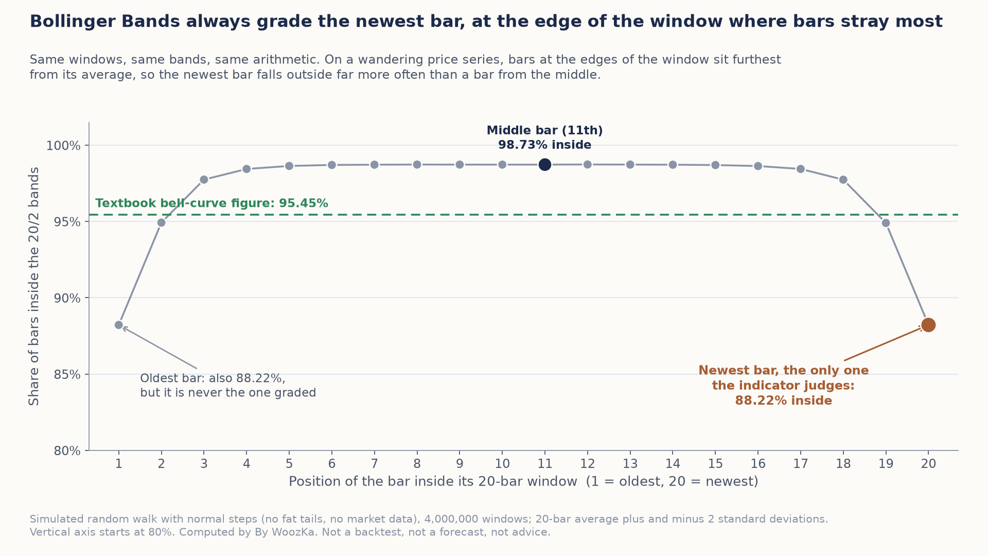 Same windows and same bands: a bar from the middle of the window is inside 98.73% of the time, but the newest bar, the only one the indicator ever judges, is inside just 88.22%.
A ceiling nobody mentions
One more consequence follows from the arithmetic alone, with no assumptions about markets at all. Because the deviation is measured over the same n prices that produced the average, price can never sit further from that average than the square root of n − 1, whatever happens:
| Window | Inside 2 sd (random walk) | Furthest reading possible | Can a 3 sd band be touched? |
|---|---|---|---|
| 10-period | 91.89% | 3.000 sd | no — unreachable |
| 20-period | 88.22% | 4.359 sd | yes |
| 50-period | 86.06% | 7.000 sd | yes |
| 100-period | 85.34% | 9.950 sd | yes |
So a “five-sigma move” on a 20-period Bollinger is not rare. It is impossible — the reading cannot exceed 4.359. And a 3 standard deviation band on a 10-period window can never be touched at all, because the ceiling there is exactly 3.000. If a setting cannot produce a signal, no amount of waiting will make it produce one.
Notice also that longer windows contain less, not more: 10-period bands hold 91.89% while 100-period bands hold 85.34%. Lengthening the window does not make band tags rarer.
Method, so it can be checked rather than taken on trust: the middle band is a simple 20-period average and the outer bands are that average plus and minus k times the population standard deviation of the same 20 prices, exactly as the indicator is drawn. The random-noise column is exact, from the closed-form distribution; the random-walk column is a simulation of 4,000,000 windows with a fixed seed, stable to within 0.07 of a percentage point across seeds; the ceiling is closed-form and proved in the script’s own assertions. The figures above come straight out of that code; none was typed in by hand.
The Squeeze, the Walk, and the Bounce
Three behaviors are what people actually watch Bollinger Bands for. Each is genuinely useful as context, and each comes with a caution that usually gets dropped.
1. The squeeze. When volatility falls, the standard deviation shrinks, and the bands pinch tightly together — a “squeeze.” Bollinger identified the squeeze as the setup that most interested him: unusually low volatility, measured by BandWidth falling to a relative low, tends to precede a period of higher volatility — a larger move [source: StockCharts ChartSchool, “Bollinger Band Squeeze”; bollingerbands.com]. The caveat is the part hype leaves out: the squeeze tells you a bigger move is more likely, but it says nothing about direction [source: StockCharts ChartSchool; think, “Bollinger Bands Squeeze”]. And Bollinger warns of the “head fake” — price breaks out of a squeeze one way, sucks traders in, then reverses and runs the other way [source: StockCharts ChartSchool, quoting Bollinger on Bollinger Bands]. A squeeze is a heads-up that the market is coiling, not a prediction of where it uncoils.
2. Walking the band. In a strong trend, price does not politely bounce between the bands — it “walks” one of them, tagging the upper band over and over in an uptrend (or the lower band in a downtrend) without reversing. This is where the single biggest misuse lives, and Bollinger’s own words are the antidote: “There is absolutely nothing about a tag of a band that in and of itself is a signal” [source: John Bollinger, Bollinger on Bollinger Bands, McGraw-Hill, 2001, p. 112, as quoted by Schwab, “Bollinger Bands: What They Are and How to Use Them”]. A tag of the upper band is not automatically a sell, and a tag of the lower band is not automatically a buy. Overbought is not necessarily bearish; a series of upper-band tags is often a sign of strength, not exhaustion [source: StockCharts ChartSchool; Schwab, “Bollinger Bands”]. The right panel of the chart above is this lesson in one picture.
3. The bounce (mean reversion). In a range-bound, non-trending market, price does tend to oscillate between the bands — drift up to the upper band, fall back toward the middle or the lower band, and repeat. This is the “mean reversion” the title mentions, and it is real in a range. But it is the exact opposite of walking the band, and the same event — a tag of the upper band — means “likely to revert” in a range and “likely to continue” in a trend. That is why knowing which regime you are in matters more than the tag itself, and why no source that understands the tool presents the bounce as a standalone rule.
What the Bands Are Not Telling You
None of these mistakes is exotic. They are the default way Bollinger Bands get used, which is exactly why they are worth spelling out.
Misuse #1 — “Sell the upper band, buy the lower band.” This is the headline error, and the creator of the indicator has explicitly rejected it. Tags are not signals. Fading every band touch works only in a range and gets you run over in a trend, precisely when the losses are largest.
Misuse #2 — Trading the squeeze as if it had a direction. A squeeze forecasts volatility, not direction. Betting a particular way on a squeeze alone — with no confirmation from price structure — is guessing, and the head fake is built to punish exactly that guess.
Misuse #3 — Believing the 95% story. Treating a band tag as a rare two-sigma event leads to over-trading the touches. In real, fat-tailed markets the bands hold only about 88–90% of price, tags are common, and they cluster in trends.
Misuse #4 — Forgetting the bands lag. The middle band is a 20-period average of past prices, and the standard deviation is measured over that same past window. Like every moving-average tool, Bollinger Bands describe where price and volatility have already been; they react after the fact, not before it [source: StockCharts ChartSchool; LuxAlgo, “Leading vs Lagging Indicators”]. A band that has just widened is telling you volatility already rose.
Misuse #5 — Optimizing 20/2 until a backtest looks good. Because 20 and 2 are conventions, it is tempting to test hundreds of period/deviation combinations against historical data and keep whichever produced the best return. That is not tuning — it is curve-fitting the past, and it produces settings that describe old noise beautifully and predict nothing. The backtesting pillar and the overfitting article exist for exactly this trap.
Misuse #6 — Using the bands alone. Bollinger’s own method pairs the bands with an independent indicator — classically volume-based — specifically so the second tool is not derived from the same price data [source: bollingerbands.com; StockCharts ChartSchool]. A single price-derived envelope can never tell you more than price already contains.
What the Evidence Says About Trading Them
This is the honest heart of the article, and the place a lot of trading content quietly cheats. The truthful answer is: the evidence is genuinely mixed, it depends heavily on the market and the approach, and simple band-touch rules have often failed to beat a buy-and-hold benchmark once trading costs are counted.
On the skeptical side, Lento, Gradojevic, and Wright (2007) tested Bollinger Band trading rules and found that, after accounting for transaction costs, the bands were consistently unable to earn profits in excess of a buy-and-hold strategy — though they noted results improved somewhat with a contrarian (fade-the-band) rather than a breakout approach [source: Lento, Gradojevic & Wright, “Investment information content in Bollinger Bands?”, Applied Financial Economics Letters 3(4), 2007, pp. 263–267]. In other words, the naive mechanical version — the one most beginners reach for — did not clear the bar of simply holding.
On the other side, there are conditional positive results. A study of the constituent stocks of the Taiwan 50 index found statistically significant positive abnormal returns from taking long positions when price tagged the lower band — a contrarian read at the lower band — while at the upper band a momentum stance (continuation, not reversal) fit the data better [source: Ni, Day, Huang & Yu, “The profitability of Bollinger Bands: Evidence from the constituent stocks of Taiwan 50,” Physica A: Statistical Mechanics and its Applications 551, 2020, article 124144]. Notice what that finding actually says: the same band tag called for opposite behavior at the top versus the bottom — which is the regime problem, formalized. It is not a rule you can apply blindly.
And here is the thread that ties it back to this whole silo. The moment you try to turn “it worked on the Taiwan 50, 2005–2018, with these settings” into a system, you are one step from optimizing the period and the multiplier until the backtest gleams — which is the overfitting risk the backtesting pillar exists to warn about. Settings tuned to one market’s history are settings fit to noise, and they routinely fail on data they have never seen.
So the non-negotiable disclaimer for everything in this silo applies here with full force: past performance, backtested or live, does not predict future results. Bollinger Bands are not a money machine, and any source presenting a particular band setup as a reliable win is either selling something or hasn’t tested it honestly.
How Disciplined Traders Use Them
None of the above means Bollinger Bands are useless — it means they are context, not a trigger. Used honestly, here is the role they tend to play. (As always in this silo, none of this is presented as a profitable setup; no indicator delivers that, and every rule built on the bands is only worth anything after it survives a proper backtest.)
As a volatility gauge. The most defensible use is the simplest: are the bands narrow or wide? Narrow means the market is quiet and a bigger move may be building; wide means volatility is already elevated. That is real information about the environment, independent of any directional claim.
As a “where are we in the range” read, via %b. In a market you have already judged to be range-bound, %b puts a number on how stretched price is inside the envelope — useful context, not an instruction, and worthless the moment the market starts to trend.
With the regime identified first. The tool flips meaning between trends and ranges, so the first question is always which one am I in? Reading a band tag as a reversal in a strong trend — or as continuation in a dead range — is how the bands drain an account. Decide the regime, then let the bands describe it.
Confirmed by something not derived from price. Bollinger’s own design pairs the bands with an independent indicator so the confirmation is genuinely independent. If the bands and that second tool disagree, that is information, not an order.
Then test it honestly — this is the step most people skip. If you are going to turn the bands into a rule (a squeeze breakout, a %b threshold, a lower-band bounce), run it through a proper backtest: out-of-sample data, realistic transaction costs, and a strict limit on how many settings you try. A band configuration that only “works” at one precise period-and-deviation pair, with costs ignored, is almost certainly fitted to the past — which is exactly what the mixed academic record above should lead you to expect.
If you have ever bought a stock the moment it tagged the lower band, sure it was “oversold,” only to watch it walk that band straight down for another week, you already know the feeling this article is trying to spare you. The band did its job — it reported that price was unusually far below its recent average. What failed was the assumption that “unusually far” is the same thing as “about to turn.”
The Mistakes That Get Traders Run Over
- Selling the upper band and buying the lower band on sight. The indicator’s creator says a tag is not a signal. In a trend, price walks the band; fading every touch gets you run over.
- Trading a squeeze as if it pointed somewhere. A squeeze forecasts a volatility expansion, not its direction — and the head fake is built to punish a directional guess made on the squeeze alone.
- Believing the 95% story. Real markets have fat tails; the bands hold roughly 88–90% of price with the default settings, so tags are common, not rare extremes.
- Forgetting the bands lag. The middle band and the volatility width are both measured over past bars. The bands describe where price and volatility have already been.
- Hunting for the “best” period and deviation on historical data. That is curve-fitting. Optimized-to-the-past settings are the textbook route from a great backtest to a live loser.
- Using the bands alone. One price-derived envelope can’t tell you more than price already does. Confirm with something independent, identify the regime, and manage risk — always.
The Building Blocks Beneath the Bands
The bands are assembled from parts explained elsewhere in this silo, and judged by the same testing standards as everything else here:
- Moving Averages Explained: SMA vs EMA — the middle band is a moving average; if the volatility math here felt fast, start there.
- RSI Explained: How to Use It Without the False Signals and MACD Explained — the other indicators in this cluster, each with its own honest limitations and false-signal patterns, so you build rules on components you understand.
- How to Backtest a Trading Strategy the Right Way — the pillar every Bollinger Band rule should pass through, including why a hand-tuned 20/2 replacement is a textbook overfit.
- What Is Overfitting in Backtesting (And How to Avoid It) — the deeper dive on the trap that turns “optimized” band settings into out-of-sample disappointments.
If you want the plain-English, rigor-first read on indicators and systems — explained honestly, never hyped — that is what the newsletter is for. Subscribe below.
Disclaimer: This article is educational content, not financial advice. I am not a licensed financial advisor, and nothing here is a recommendation to buy or sell any security or asset. Investing and trading involve risk, including the possible loss of the money you invest. Do your own research and consider consulting a licensed financial professional before making investment decisions. Read the full Disclaimer.
Historical and backtested results are hypothetical, carry inherent limitations, and do not guarantee future results. Figures were accurate to the best of my knowledge as of this article’s last-updated date and may have changed.
