The Question Everyone Argues About Is Worth 3.7%
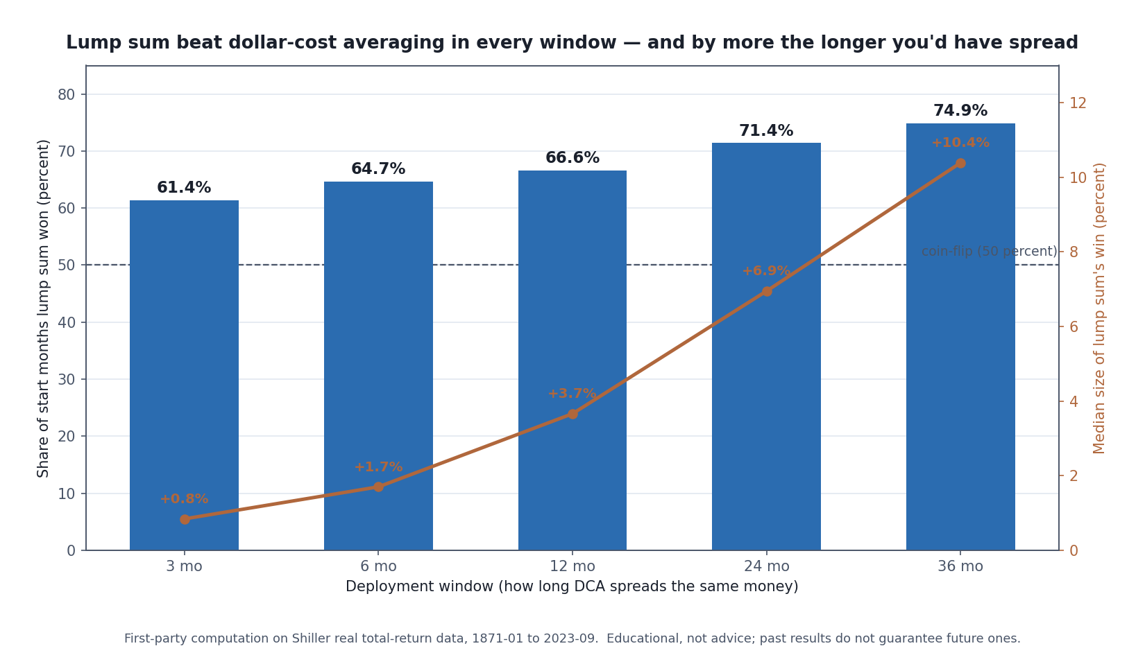
Deploying a windfall all at once beat spreading it in across every deployment window I tested — and the longer you spread, the bigger the average edge for going in at once. First-party computation on Shiller’s Yale data, 1871–2023. Not advice, not a forecast.
I didn’t want to write another “lump sum versus dollar-cost averaging” post. There are thousands of them, they mostly say the same thing, and the thing they say is basically correct. So instead of restating anyone’s summary, I pulled Robert Shiller’s monthly US market data — the full record back to 1871 — and ran the comparison myself. Same money, same end date, every start month in 150 years. Then I sat with the result for a while, because it told me something I didn’t expect: the question everyone argues about is small, and the question almost nobody asks is the one that actually cost me years.
Let me give you the small answer first, because it’s the one you came for, and then the bigger one, because it’s the one I wish someone had put in front of me when it mattered.
What I actually measured
The setup is deliberately plain. You have a fixed amount to put to work — call it a windfall: a bonus, a rollover, an inheritance, the proceeds of a sale. You can invest it all at once (“lump sum”), or you can split it into equal monthly buys spread over some window (“dollar-cost averaging,” DCA). Both strategies deploy the same total and get valued on the same end date, which is the only way the comparison is honest. I measured the ratio of the two ending values across every possible start month from 1871 to 2023. A ratio above 1 means lump sum finished ahead.
Everything runs on Shiller’s real total-return series, so it’s already inflation-adjusted and has dividends reinvested — no nominal sleight of hand. The data I used ends in September 2023; I’m reporting what the record through that date shows, not implying it runs to this morning. The calculation was done in code, so the numbers below are reproducible rather than asserted. If you want the concept explained from scratch first, the companion piece Dollar-Cost Averaging: The Evidence, the Math, and the Limits walks through the mechanics; this one measures them.
The small answer: lump sum wins about two-thirds of the time, by about 3.7%
Over a 12-month deployment window — the one most of these arguments implicitly assume — lump sum beat DCA in 66.6% of the 1,821 start months, with a median win of 3.66%. Round it: two-thirds of the time, by about 3.7%. That’s the number the internet has been fighting about — and in a moment I’m going to show you why quoting it on its own is close to useless.
It reproduces the standard result almost exactly. Vanguard’s well-known study, run on different markets and a different window, landed on lump sum winning “about two-thirds of the time” [source: Vanguard, “Cost averaging: Invest now or temporarily hold your cash,” 2023; and the earlier 2012 Vanguard cost-averaging research]. Getting the same answer from a completely independent dataset is reassuring — it means the finding is real and not an artifact of one firm’s method. It also means I can now poke at it in ways a summary can’t.
The reason lump sum usually wins isn’t subtle: markets go up more months than they go down, so any money you’re holding back in cash is, on average, missing the drift. Spread the deployment over a longer window and you hold more cash for longer, so the average penalty grows. That’s exactly the shape in the chart above — lump sum’s win rate climbs from 61.4% at three months to 74.9% at three years, and the median edge grows right alongside it. Waiting costs more the longer you wait. Simple, and durable.
The number moves depending on when you happened to be standing there
Before we go further I want to undercut the figure I just gave you, because quoting “66.6%” as though it were a property of markets is the thing that bothers me most about how this topic gets written up. It’s an average taken across a century and a half of conditions that have almost nothing to do with each other, and averages of unstable things are the most confident-sounding numbers in finance.
So I split the same 1,821 start months by what the market was actually doing when the money arrived.
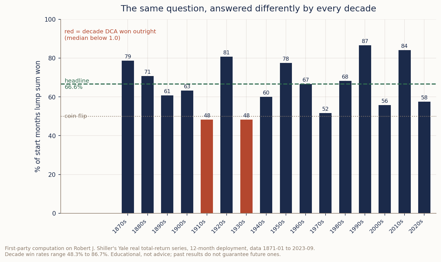
Same question, same method, same data — asked once per decade. The answer ranges from a coin flip to near-certainty, and in two decades it inverts entirely.
By decade, the lump-sum win rate runs from 48.3% to 86.7%. If you deployed money in the 1990s, going all at once won 87% of the time. If you deployed in the 1910s or the 1930s, it won 48% — worse than a coin flip — and in both of those decades the median outcome was below 1.0, meaning dollar-cost averaging won those decades outright. The tidy two-thirds figure describes no particular decade. It’s the center of gravity of a distribution that swings 38 percentage points.
Entry conditions matter too, in the direction you’d guess but by an amount worth naming:
| When the money arrived | Lump sum won | Median | 5th percentile |
|---|---|---|---|
| Market above its 12-month average | 70.4% | +4.3% | 0.904 |
| Market below its 12-month average | 58.3% | +2.3% | 0.817 |
| At or near an all-time high | 72.8% | +4.9% | 0.899 |
| More than 20% below the prior peak | 63.4% | +2.8% | 0.838 |
Deploying into an uptrend won 70.4% of the time; deploying into a downtrend, 58.3%. And look at the last column — entering below the 12-month average doesn’t just lower your odds, it deepens the bad case, dragging the 5th percentile from 0.904 to 0.817.
There’s an irony in that table worth sitting with. The safest-feeling moment to go all-in — after a big fall, when everything is “on sale” — is not where lump sum did best. Buying at an all-time high was. That’s not advice to buy highs; it’s evidence that the intuitions people use to time this decision point the wrong way.
So take the 66.6% for what it is: a summary of a question whose real answer is “it depends, and it depends a lot.” I’ll keep using the headline number because it’s the honest central estimate, but anyone quoting it at you — including me, three paragraphs ago — is compressing a very unstable thing into one decimal place.
The part the win rate hides
Here’s where a single headline percentage starts to lie by omission. “Wins two-thirds of the time by 3.7%” describes the middle of the distribution. It says nothing about the tail — and the tail is the entire reason a careful person might still choose DCA.
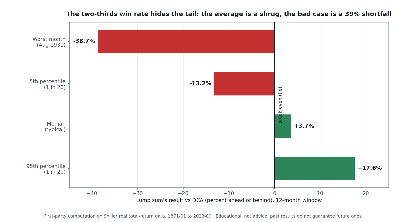
The average is a shrug; the tail is not. In the worst start month in the record — August 1931, straight into the teeth of the Depression crash — going all at once left you with 61 cents for every dollar the patient investor ended with. DCA’s value was never in the average. It was here.
The median lump-sum outcome is a tidy +3.7%, and the good tail is unremarkable — the 95th percentile is +17.6%. But the 5th percentile is −13.2%: one time in twenty, going all-in left you meaningfully behind. And the worst single start month in 150 years, August 1931, ended with lump sum holding 61 cents for every dollar the DCA investor had — a 39% shortfall, because dumping everything in just before the market fell most of the way to its Depression low was about the most expensive timing imaginable. The five next-worst months are almost all 1931 and 1937 too. These aren’t hypotheticals I invented to scare you; they’re specific, named, checkable months in the real record.
So the honest framing isn’t “lump sum wins.” It’s: lump sum wins the average by a little, and loses the disaster by a lot. DCA is not a return strategy that happens to lose most of the time. It’s insurance. You pay a small, near-certain premium — that 3.7% of expected edge you’re giving up — to cap the size of the worst outcome. Whether that trade is worth it depends entirely on something the data can’t see: whether you’d actually stay invested through the disaster, or bail at the bottom and lock the loss in for real.
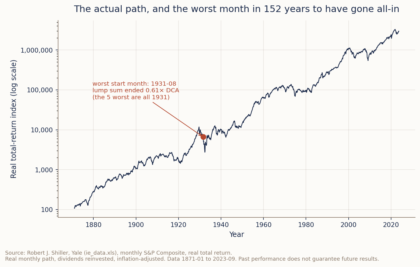
This is the actual path, not a smooth curve — every crash in the record is in there. The dot is August 1931. The point of showing the real line is that the tail above isn’t an abstraction: it’s a specific month, on a specific part of this chart, that a real person could have picked.
That’s not a rhetorical flourish. It’s the whole decision, and I’ll come back to it, because it’s where my own experience contradicts the spreadsheet.
“But surely it depends on whether the market is expensive”
This is the objection everyone raises, and it’s a good one. Going all-in feels obviously dumber when stocks are already pricey. So I split every start month by its starting valuation — the cyclically-adjusted P/E (CAPE) — into five buckets from cheapest to most expensive, and checked how often lump sum won in each.
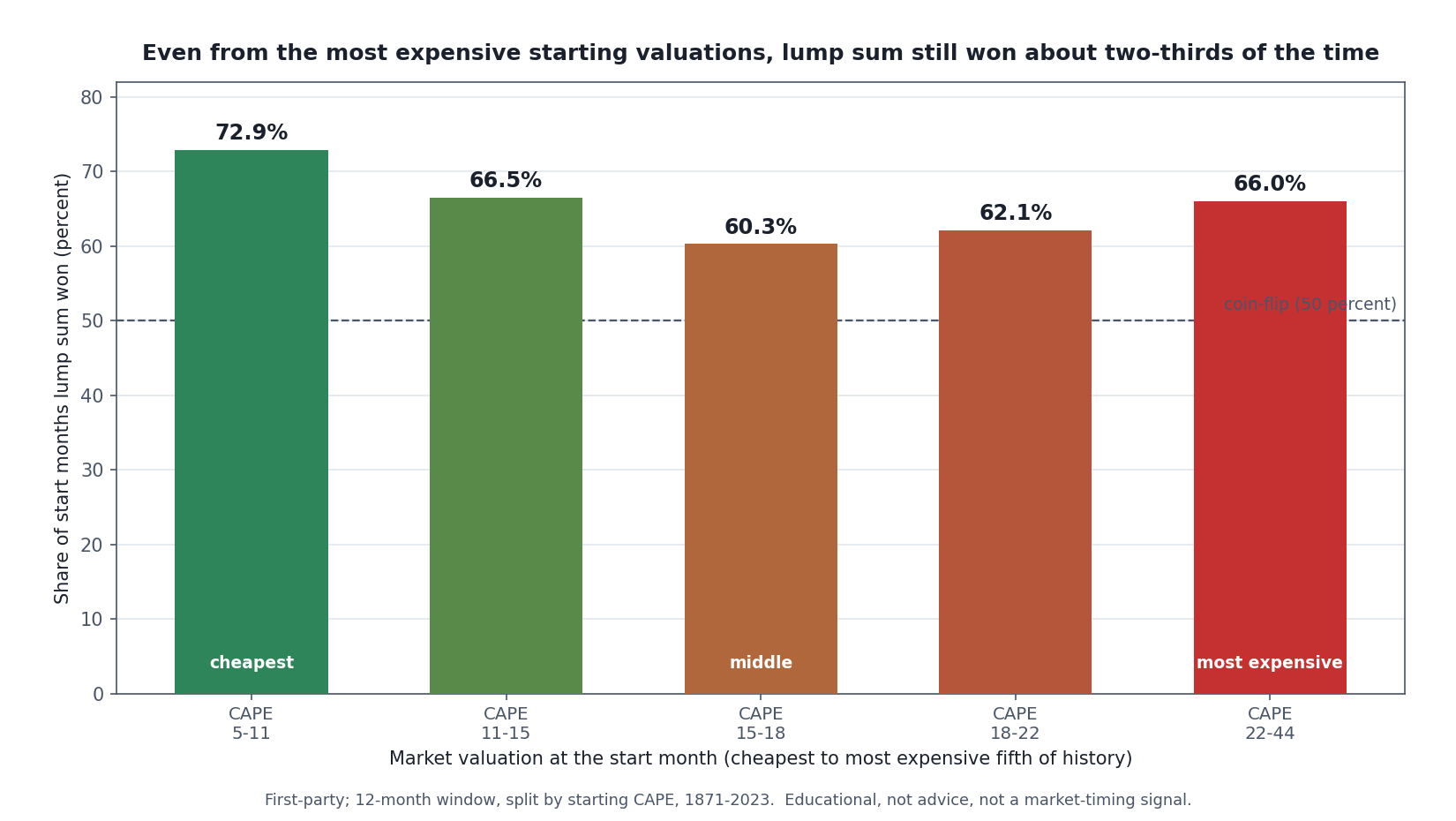
Starting from an expensive market does dent lump sum’s edge — the win rate is highest from the cheapest quintile — but it never flips. Even from the priciest starting valuations in history, going all at once still won about two-thirds of the time. Valuation is a weak dial here, not a switch.
The pattern is real but weak. From the cheapest markets in history, lump sum won 72.9% of the time; from the most expensive, 66.0%, with a dip to 60.3% in the middle. So yes — expensive starting points make DCA relatively more attractive. But “relatively more attractive” still means lump sum won roughly two out of three times even from the top valuation quintile, which includes the dot-com peak. If you were hoping the data would bless “the market’s expensive, so I’ll spread it in,” it half-blesses it at best. The dial moves; it doesn’t reverse.
There’s a subtler point buried in here that I want to flag rather than oversell: the middle quintiles are noisier than a clean “cheaper is better” story would predict. Valuation explains a little of the variance in who wins, and a lot less than the folklore assumes. If your plan hinges on timing your deployment to valuation, the data is telling you that lever is smaller than it feels.
The robustness check nobody runs: where does the idle cash sit?
Most treatments of this question quietly assume your undeployed DCA cash earns nothing. That’s a thumb on the scale against DCA — real money waiting to be deployed usually sits in a money-market fund or T-bills earning something. So I ran it both ways: once with idle cash earning zero real return, and once with idle cash parked in Shiller’s real bond-return index. The second case is deliberately generous to DCA.
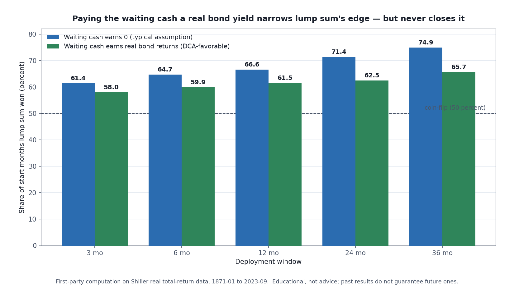
The fairest possible version of DCA — paying your waiting cash a real bond return the whole time — still loses more often than it wins. Giving the sidelined money a decent yield narrows lump sum’s edge but never erases it. The drag isn’t that cash earns nothing; it’s that cash isn’t stock.
Even in the DCA-favorable case, lump sum still won a majority at every window — 61.5% at twelve months versus 66.6% with dead cash. Letting the waiting money earn a bond return helps DCA, but it doesn’t change the verdict, which tells you the effect isn’t really about the yield on idle cash. It’s about the fact that the money isn’t in the higher-returning asset yet. You can’t earn the equity premium on money that’s still in the on-deck circle.
One more finding, and it’s the one that surprised me most while I was writing the code. I checked whether the answer depends on how long you hold after the deployment finishes — invest over 12 months, then hold for one more year versus thirty more years. It doesn’t. The lump-sum-versus-DCA ratio is identical to fifteen decimal places (the largest difference across all start months was 0.0000000000000007). Once both strategies are fully invested, they own the same asset in a fixed ratio, and every later year multiplies both by the same number. The entire contest is decided inside the deployment window. Holding period afterward is irrelevant. That’s a small, clean, provable fact, and it reframes the question: you are not choosing a long-term strategy. You are choosing how to spend a few months.
Now the bigger question — the one that actually cost me
Everything above is the small answer, and I’ve given it to you as honestly as I can measure it. Here’s the part that took me a long time to be willing to say out loud.
The lump-sum-versus-DCA choice is worth a median 3.7%, settled inside a one-year window, on money you already decided to invest. It’s a rounding error next to the decision that sits underneath it, which nobody frames as a decision at all: whether to deploy the money into a long-term plan in the first place — or to try to do better than a plan.
I started with very little money, and I decided a long-term plan was too slow to matter at that size. Why grind a fixed amount into an index fund when the balance was small enough that the compounding looked like a rounding error? The answer, I concluded, was to learn to trade my way to a bigger number faster. What followed is the ordinary sequence, and I’d bet you can see it coming even though I couldn’t. A run of early luck that I read as skill. Confidence out of that luck that got me sized larger than I should have been. Then a loss that I refused to take — because taking it meant admitting the decision was wrong — so I held until it was big enough that I had no choice. Repeat that a few times, and it’s the losses that compound, not the money. Had I put a fixed amount into an index fund across those same years, or honestly just saved it, I’d be well ahead of where all that effort actually left me.
So here’s what my own history does to the tidy 3.7%. That number is the prize for winning the argument everyone has. The argument I actually needed to lose was a different one: I believed a long-term plan was too slow to matter, and that belief is the one the data flatly contradicts. The lump-sum-versus-DCA debate is a debate between two people who have already made the important decision correctly — they’re just haggling over the last few percent of the entry. I wasn’t in that room. I was outside it, convinced the room was for suckers.
There’s a question I should answer plainly, because it’s the one you’d ask me if we were talking: have I ever actually had a windfall — a bonus, a rollover, the proceeds of a sale — and had to make this exact call? Not in the way the studies imagine. My money went in the smaller, monthly, unglamorous way, when it went in at all. So I’m not going to dress up an anecdote I don’t have.
But I do have a position, and it’s stronger than the data I just showed you.
Putting a lump sum in at once only pays if two things go right. You have to buy inside what is honestly an absurdly small window of timing, and then you have to not waver. That second one is where people break. If you don’t have much investing experience, or if you’ve ever had your mental capital run down to nothing, you will waver — not because you’re weak, but because that’s what a drawdown does to a person who hasn’t been through one. I’ve watched my own mental capital hit the floor, and I can tell you the account balance is not the thing that runs out first.
The people who survive in financial markets are one of two kinds. Either they lost a lot and actually took the lesson, or they learned early how not to lose much and they keep their own rules. Both of those are descriptions of temperament, not of expected return.
So what would I actually tell a friend over coffee
Here’s where I part company with my own numbers, and I’d rather say it outright than bury it.
The data above is mine. I computed it, I stand behind it, and it says: put the lump sum in. Two-thirds of the time that wins, by a median 3.7%, and spreading it over longer windows only widens the gap. If you want the historically stronger play, that’s it, and nothing in what follows makes those numbers wrong.
I still tell everyone around me to average in. No matter what.
That is not me hedging, and it isn’t false modesty about the analysis. It’s that the study and the person are answering different questions. The study asks which sequence of purchases ended with more money, assuming somebody held on throughout. It has no way to represent the somebody. Lump sum is tempting precisely because we’re human and greedy — the arithmetic is right there and the impatience is right there with it — and I think it’s genuinely hard for an ordinary person to pull off, not because they can’t do the math but because the math isn’t the hard part.
Look again at the tail I showed you earlier. The 5th percentile leaves the all-at-once investor 13.2% behind, and August 1931 left them at 61 cents on the dollar. Those aren’t the cases where you calmly note that your expected return was higher. Those are the cases where a person with no reserve of nerve sells at the bottom and converts a paper gap into a permanent one. The measurement can’t see that happening. I can, because it happened to me in a different market.
So my honest answer is layered. If you have real experience, you’ve sat through a bad drawdown without touching the account, and you know your own rules well enough to keep them under pressure — go ahead, the data is on your side and you’re the investor the study assumes. If you’re not sure whether that describes you, then you’re not that investor yet, and the 3.7% is the cheapest insurance premium you will ever be offered.
And there’s a second thing, which is the one I actually care about. Averaging in isn’t a single technique — done carelessly it’s just procrastination with extra steps. There’s a way to stage your buying that works and a way that only feels safe. That’s its own piece rather than a paragraph here; the closest thing on this site to the version I’d defend is the autopilot plan below.
One last thing, the biggest. Make sure you’re arguing about the right question. If you’re agonizing over three months versus six while some part of you still suspects the boring index plan is beneath you and you could do better by being clever — put the deployment question down. The clever version is the one that cost me years. The boring plan you’re trying to optimize by 3.7% is the one that quietly wins.
Where to go next
- Dollar-Cost Averaging: The Evidence, the Math, and the Limits — the concept explained from the ground up, with the worked mechanics behind the measurement here.
- The Lever You Actually Control: Why Your Savings Rate Beats Your Return for Years — the other half of “the important decision isn’t the one you’re arguing about.”
- The Autopilot Plan — what deploying-into-a-plan actually looks like as a repeatable habit.
- The Power of Compounding Explained: Why Time Beats Timing — why “too slow to matter at that size” is the exact trap, and why it’s wrong.
If you want markets explained plainly — measured, never hyped, and honest about what the data can’t tell you — that’s what the newsletter is for. Subscribe below.
Disclaimer: This article is educational content, not financial advice. I am not a licensed financial advisor, and nothing here is a recommendation to buy or sell any security or asset. Investing and trading involve risk, including the possible loss of the money you invest. Do your own research and consider consulting a licensed financial professional before making investment decisions. Read the full Disclaimer.
Historical and backtested results are hypothetical, carry inherent limitations, and do not guarantee future results. Figures were accurate to the best of my knowledge as of this article’s last-updated date and may have changed.
